*This portfolio presents my work in a manner that respects the Non-Disclosure Agreements (NDA) I am bound to. Details have been generalized and do not disclose any sensitive information. The information is for demonstrative purposes only, aiming to highlight my capabilities while upholding the highest standards of professionalism and confidentiality.For any inquiries or clarifications, please get in touch with me directly.*
Following the conferral of my Undergraduate degree in Product Design and Computer Science, I was poised to start my Graduate program studying Mechanical Engineering. However, due to the misalignment between my Undergraduate and Graduate studies, I wanted to take some time to learn more about what Mechanical Engineering meant to me. More specifically, I wanted to hone the manufacturing sub-components I learned about as a product designer and have work experience in a relevant field.
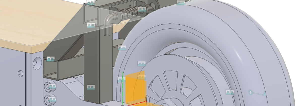
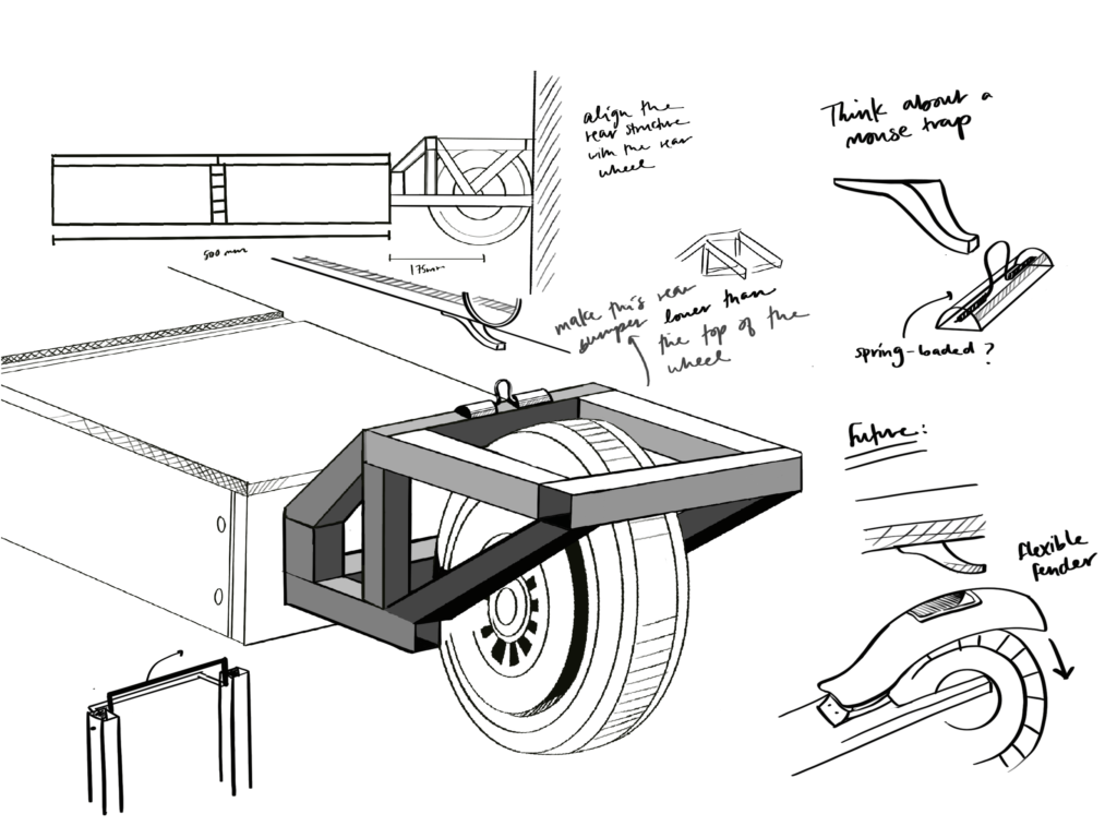
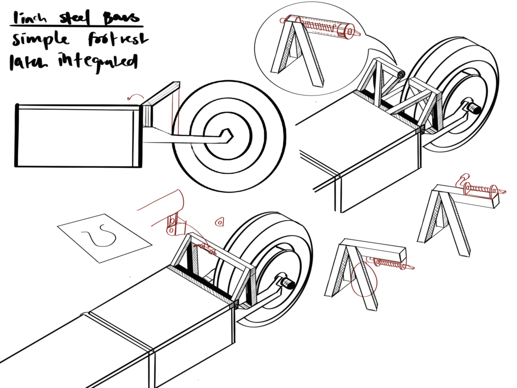
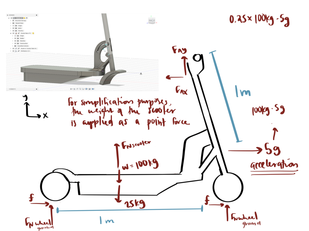
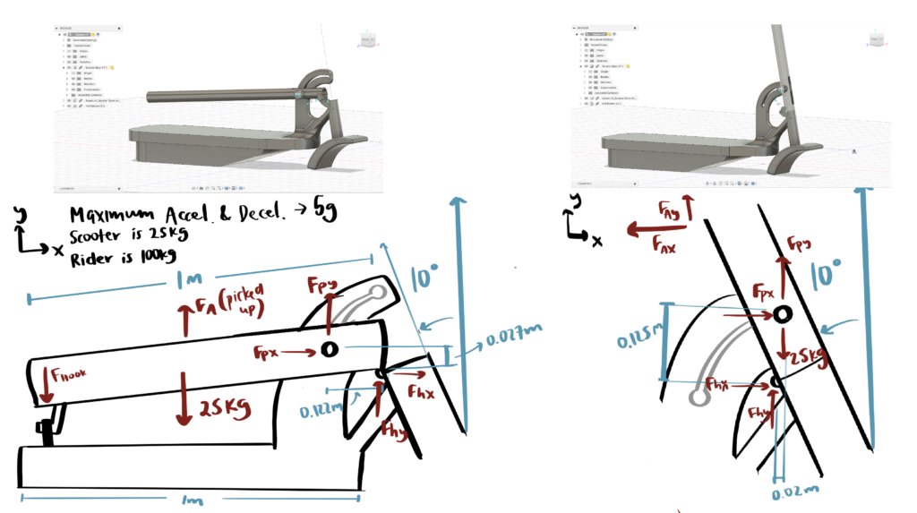
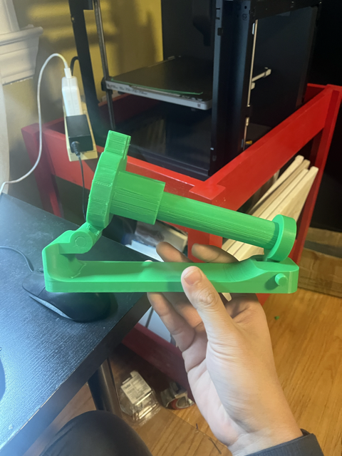
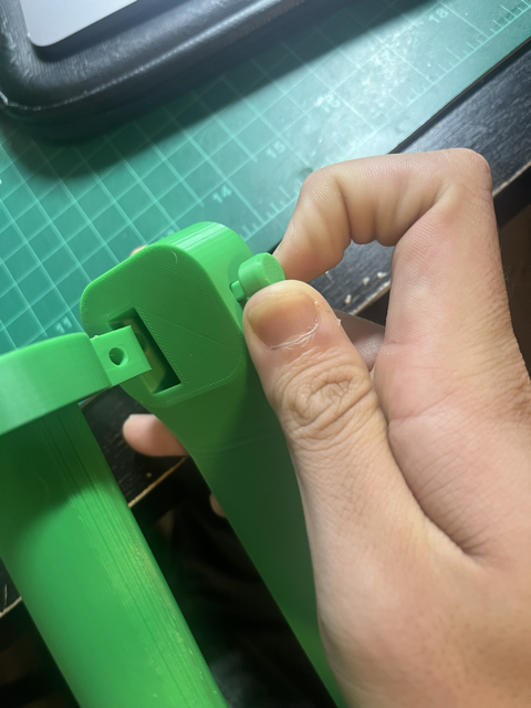
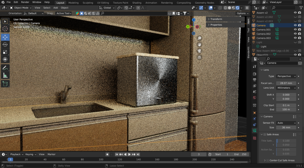
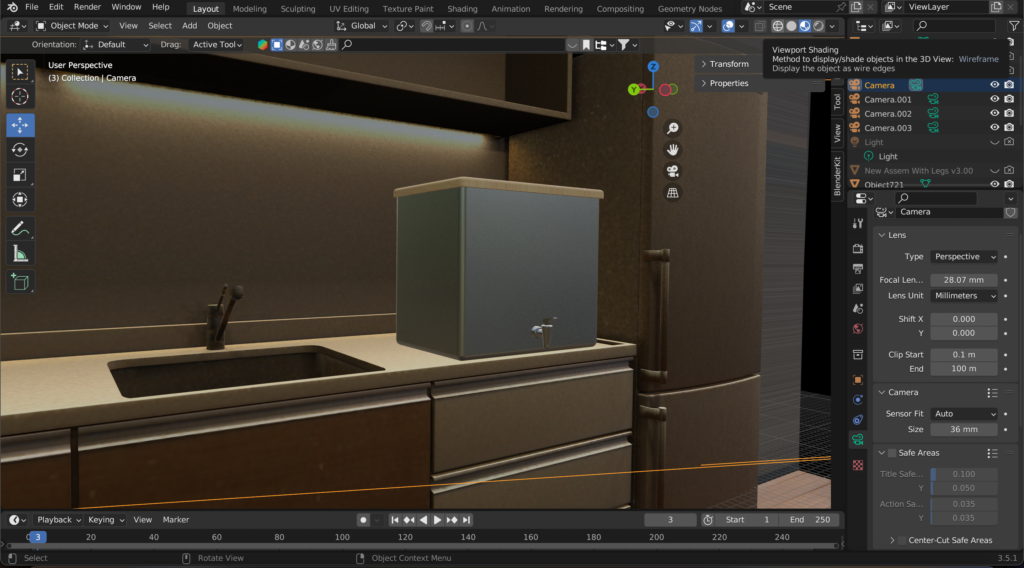
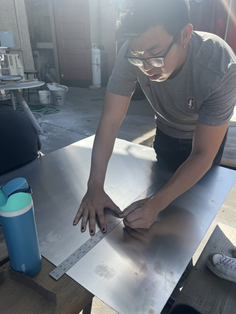
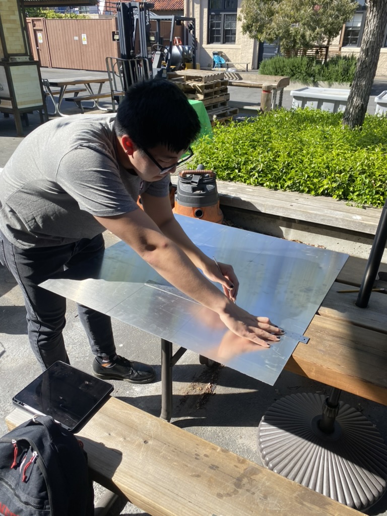
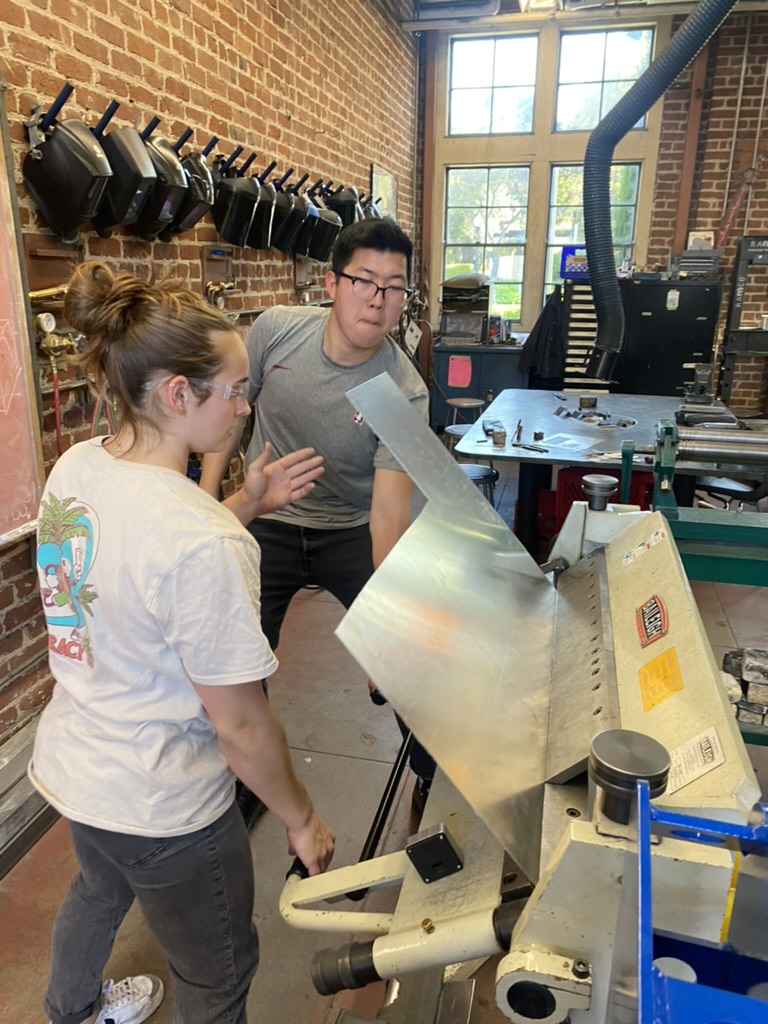
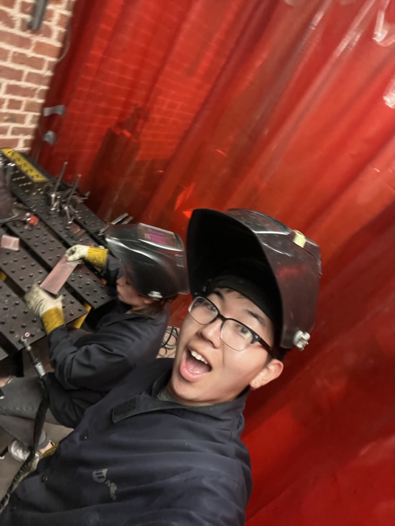
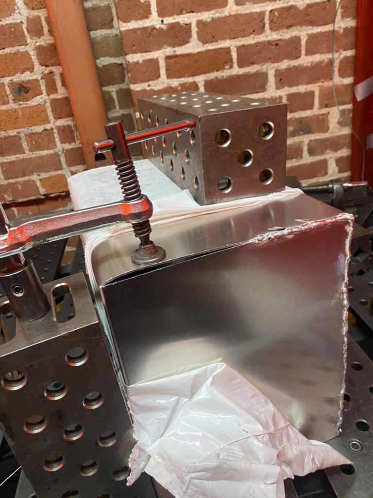
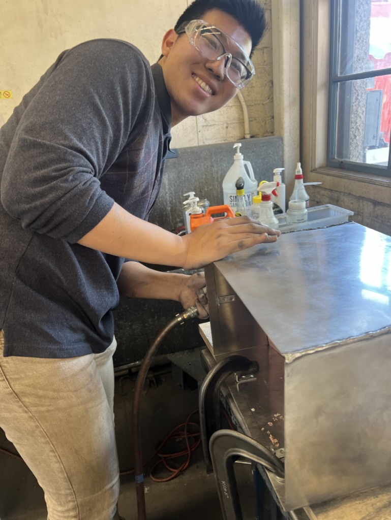
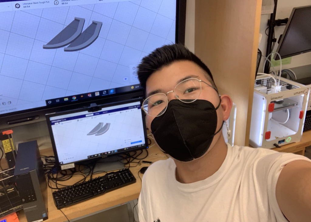
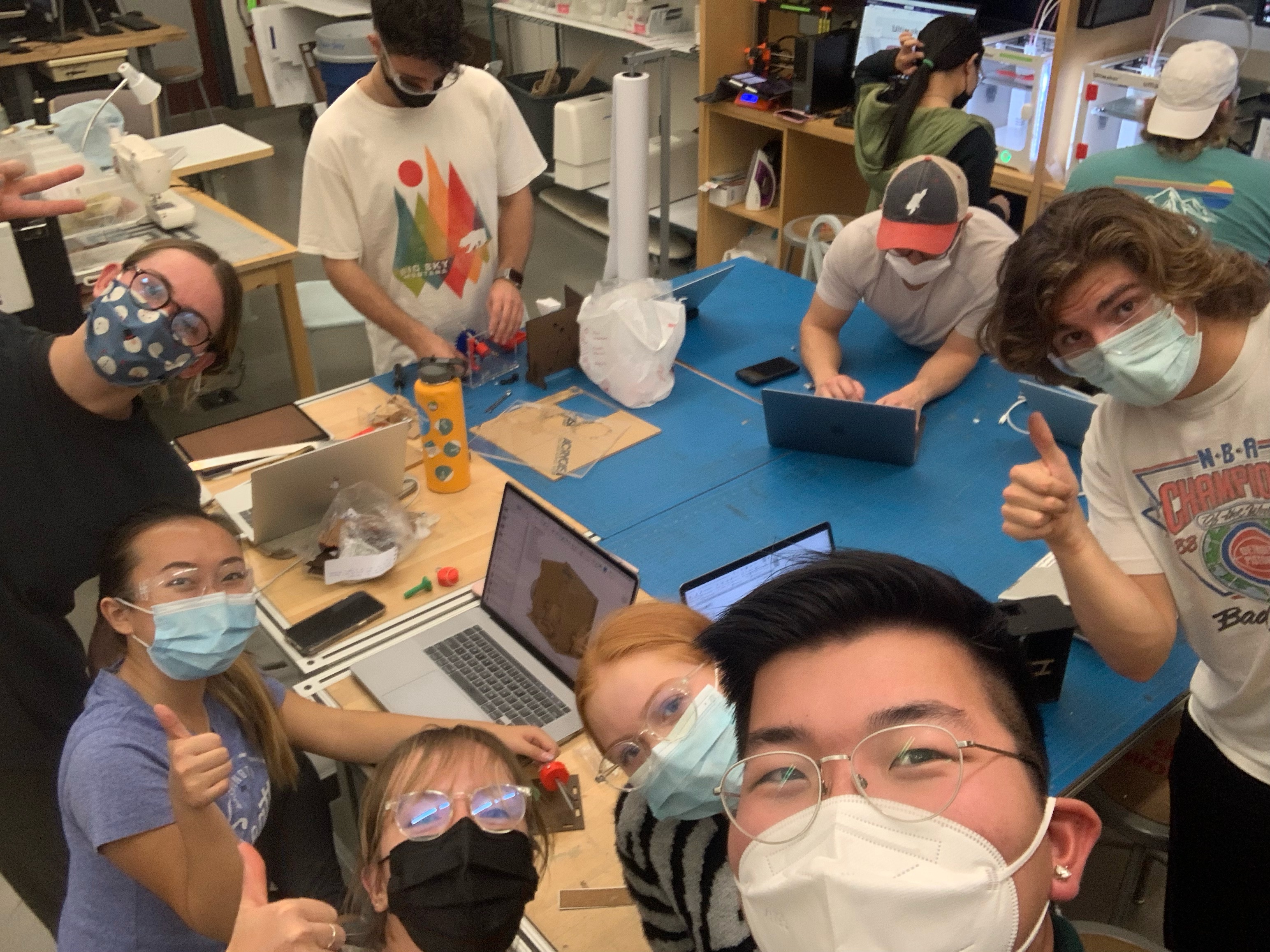
Following an extensive application process, I was selected as the Mechanical Engineering contractor for Buoyant Aero, a startup company focused on bringing a new electric scooter model to market. Due to the terms of my NDA, I am not able to share many details of the specifics of my work experience, but I will share high-level takeaways.
During this three-month position, I had a hand in designs, calculations, CAD sketches, and physical manufacturing.
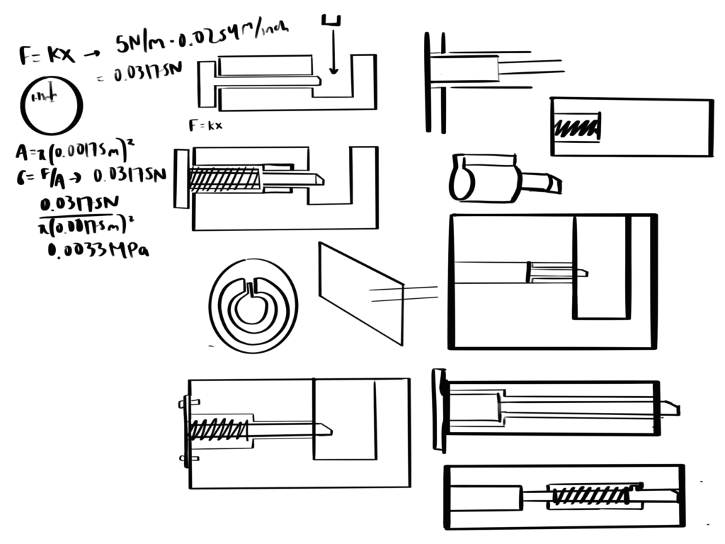
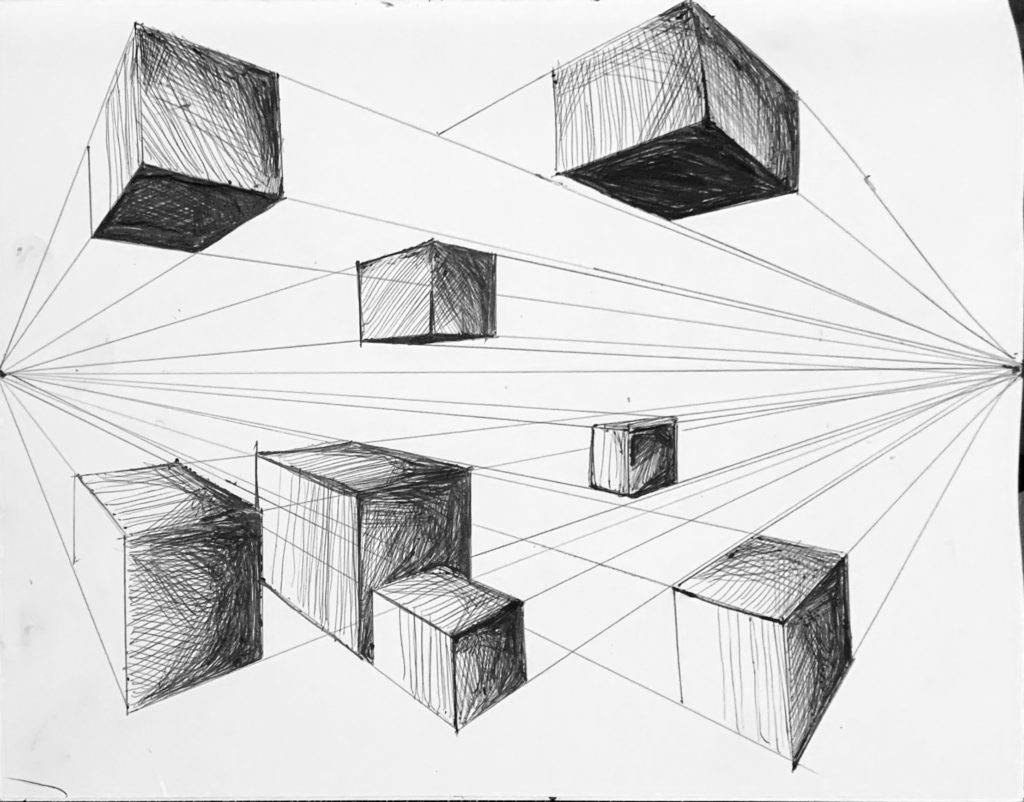
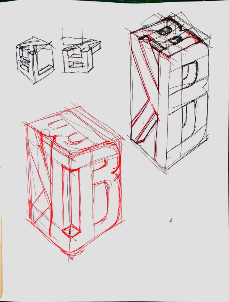
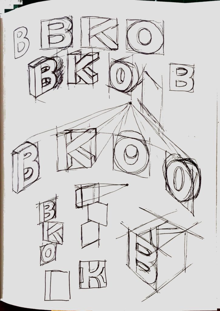
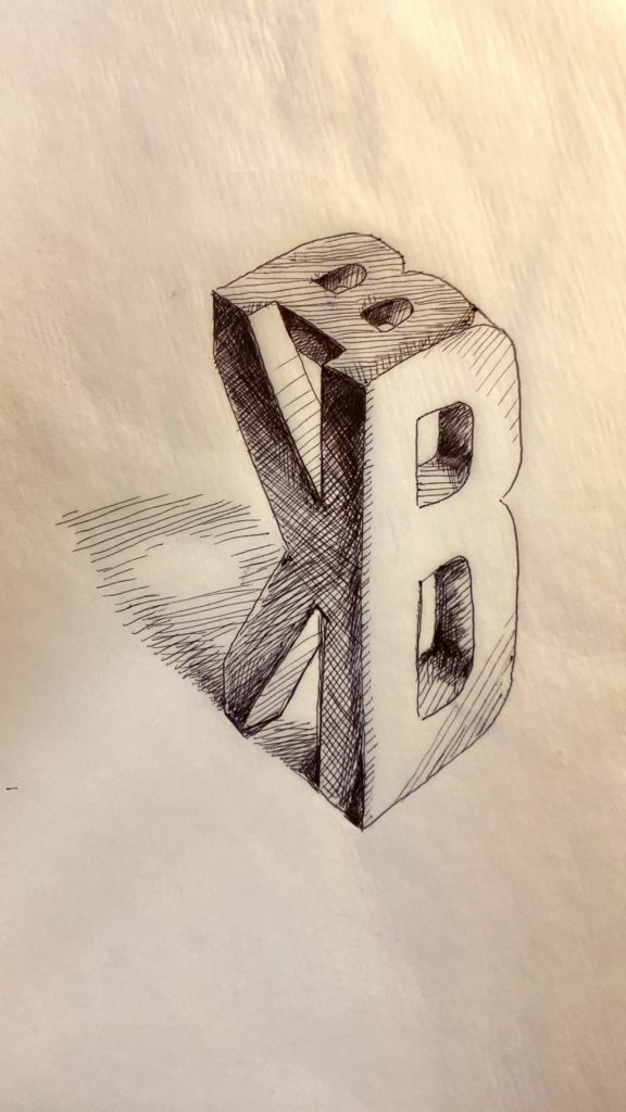
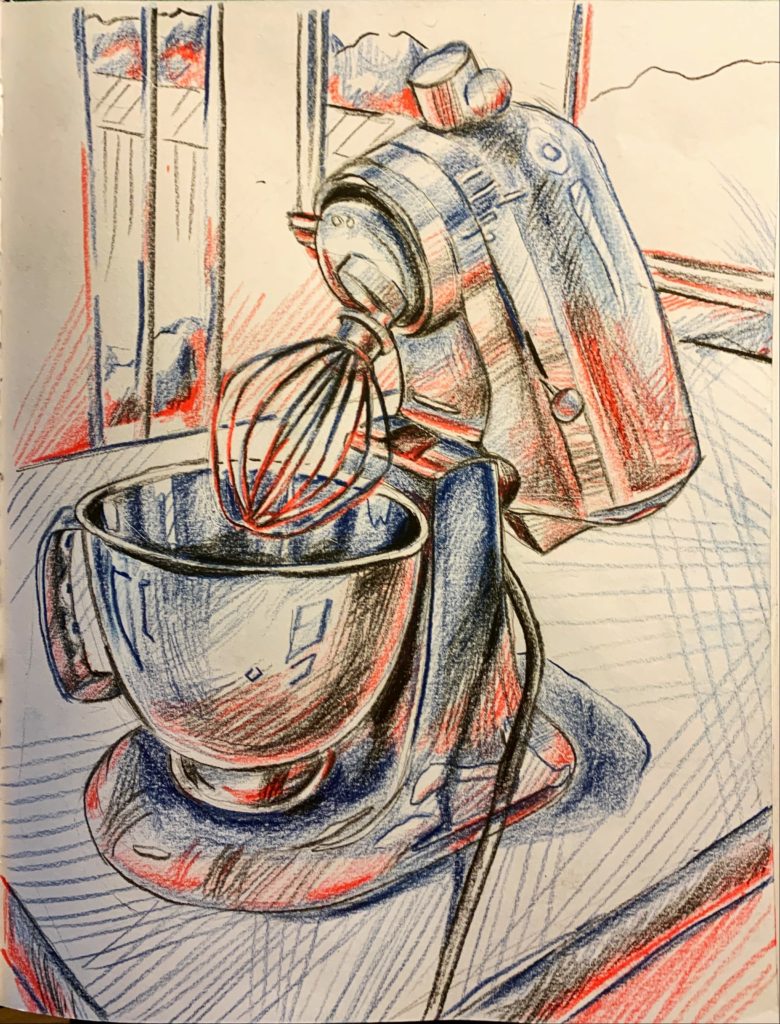
Sketches
I created many sketches, from concept designs to FBDs–fashioning aesthetics with mechanical principles to understand how the scooter design could function and improve. In addition to those shown, I created low-fidelity sketches to ideate new ideas to implement within the scooter design and high-fidelity sketches to hone the aesthetic vision of the final design.
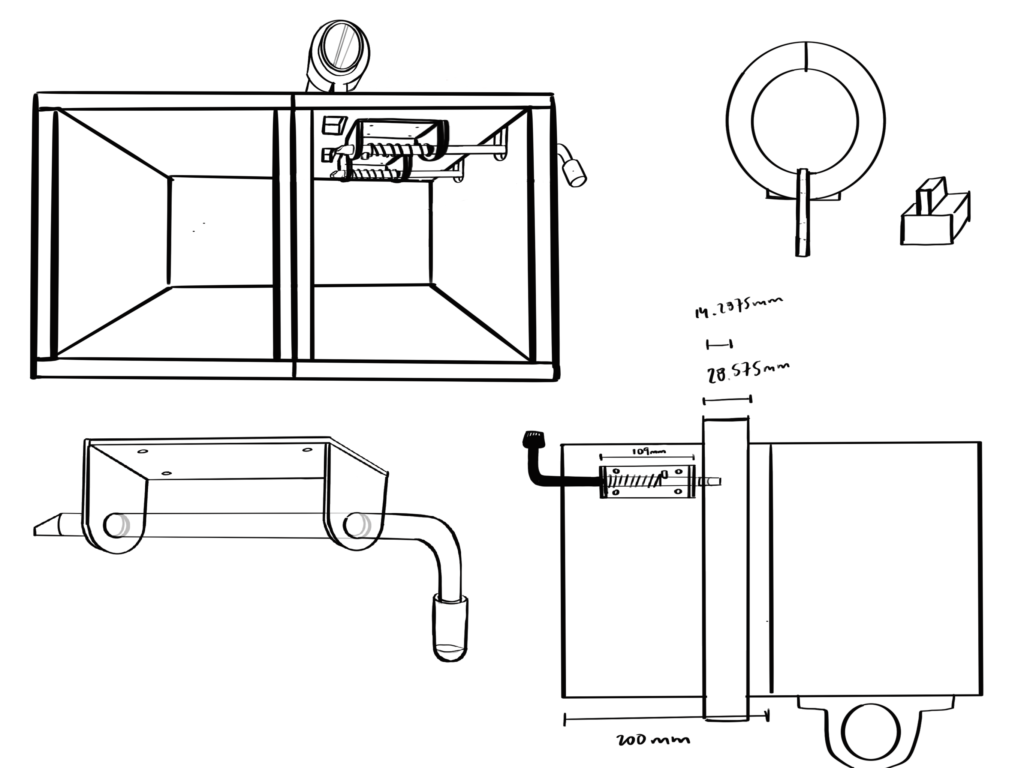
CAD
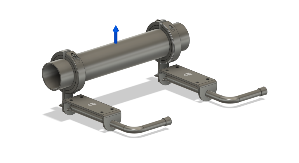
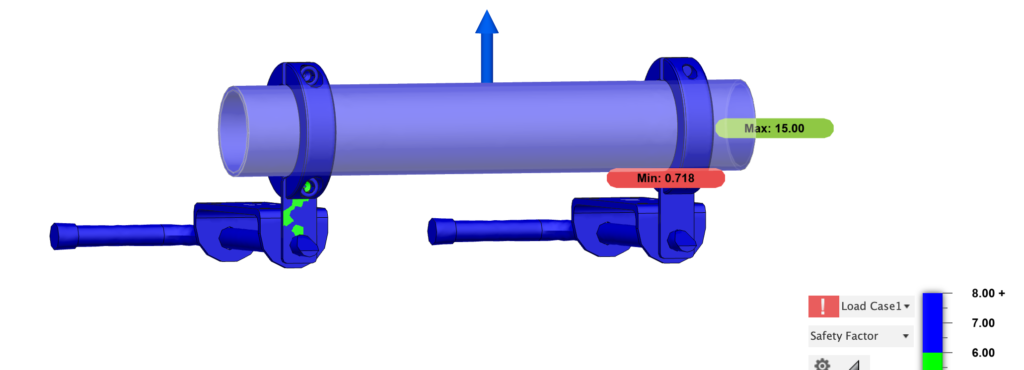
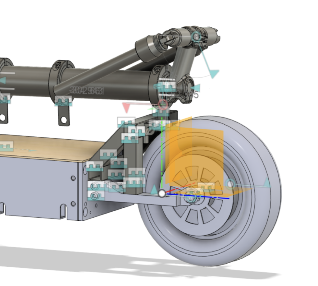
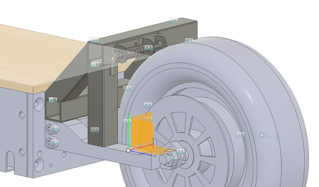
Utilizing Fusion 360, I modeled and simulated key elements of the scooter with custom-designed and off-the-shelf parts (models in the images have been greatly generalized). For a lot of the CAD, I favored off-the-shelf parts over custom designs to easily facilitate the physical manufacturing prototyping process. These CAD models are more focused on functionality and ensuring that–in the case of simulations–the safety factor is adequate.
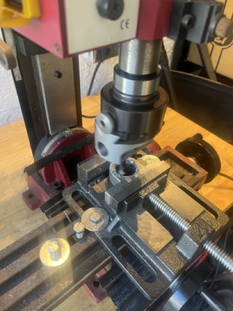
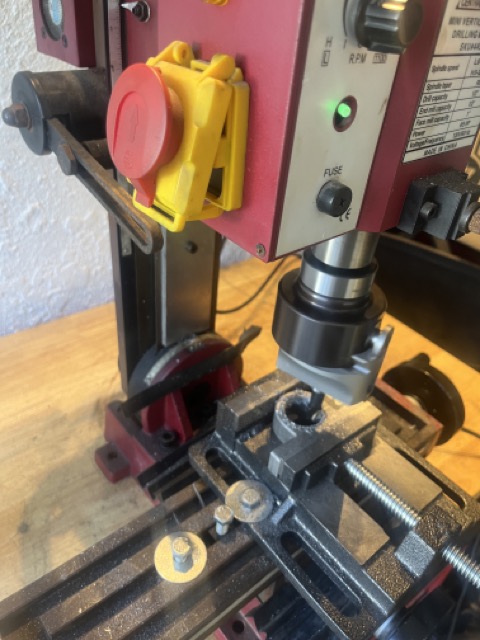
Machining
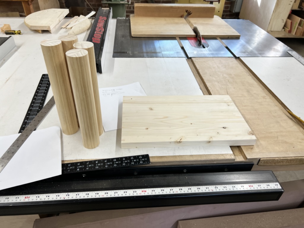
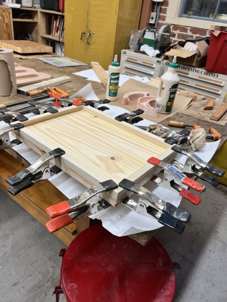
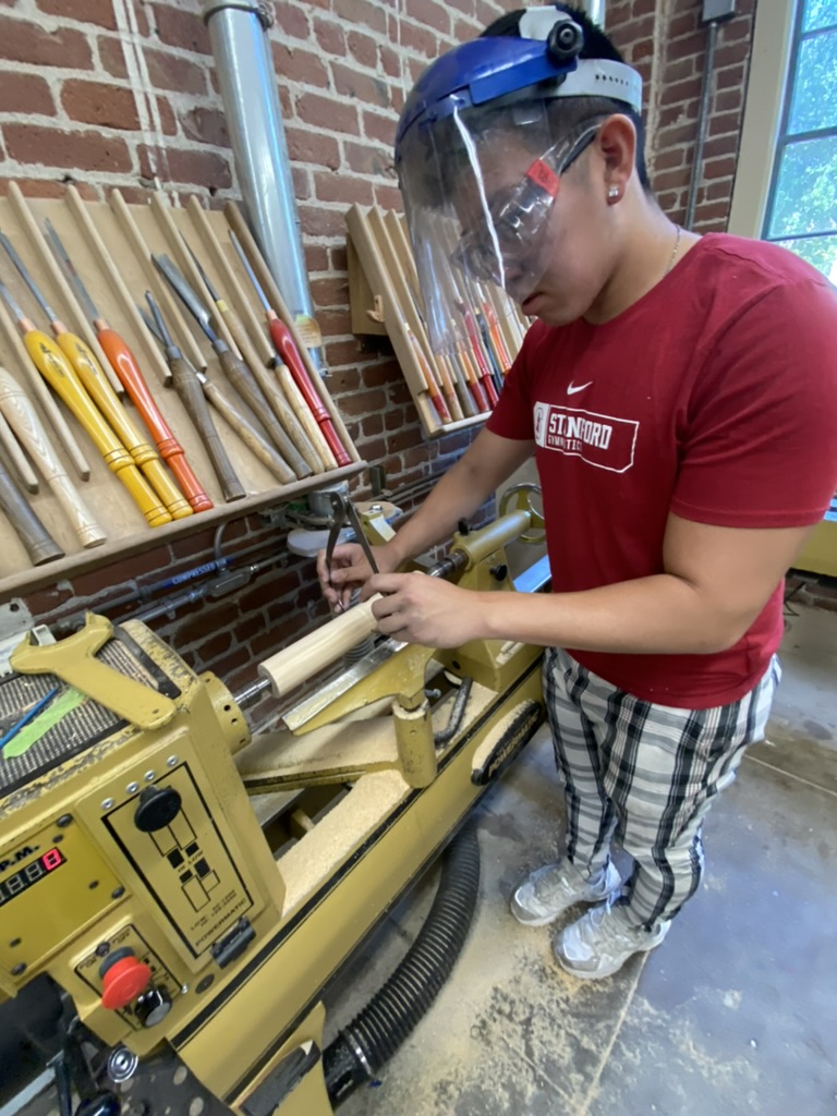
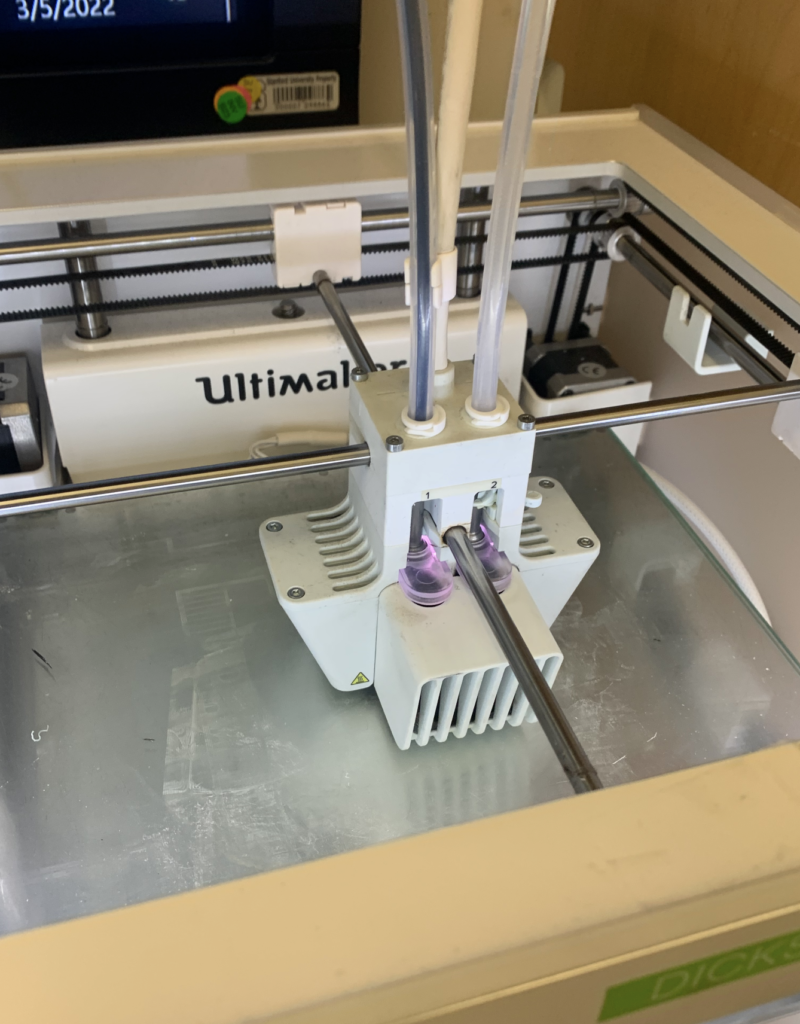
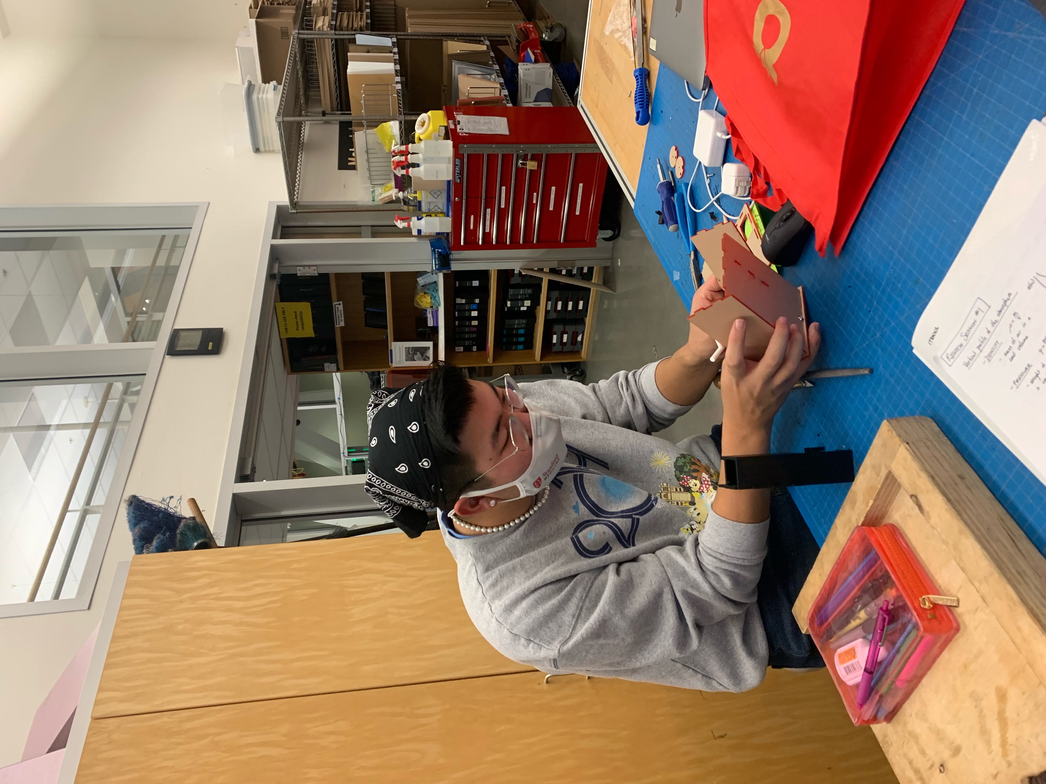
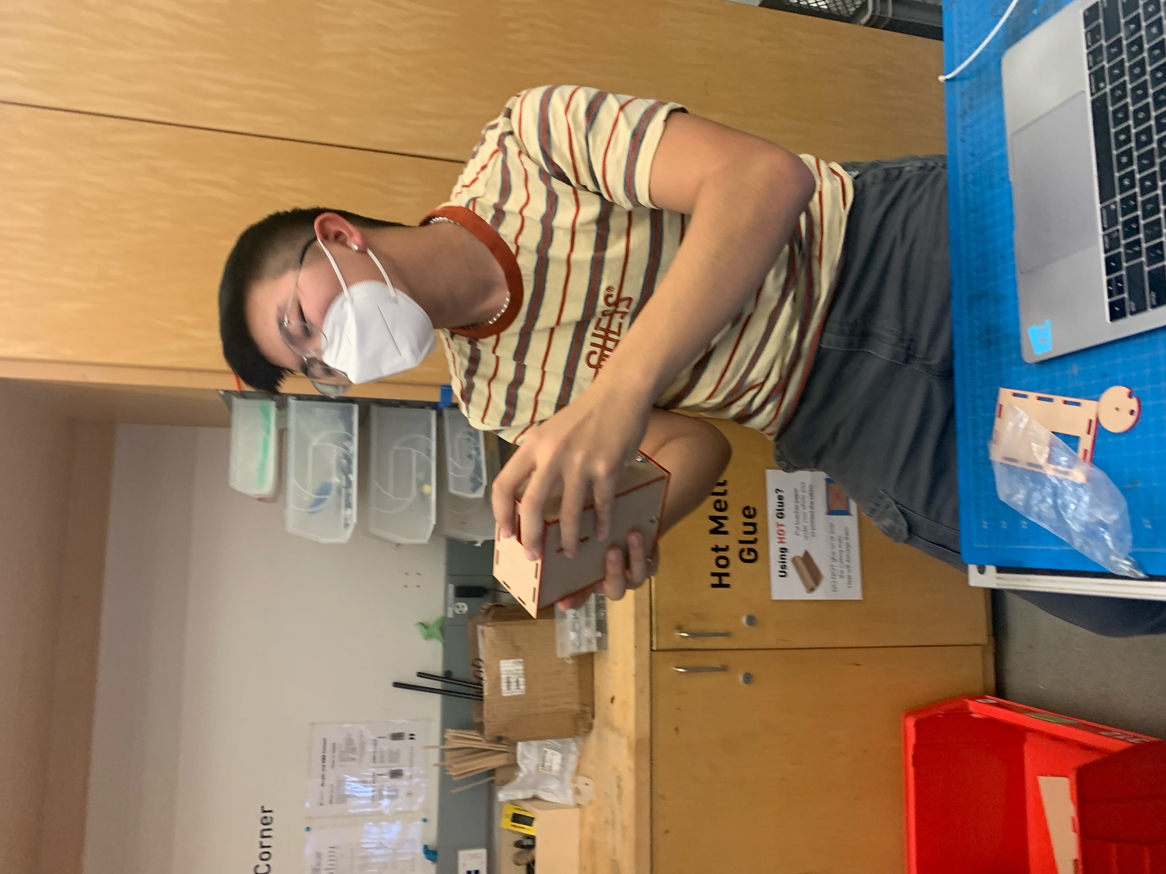
With a 3D printer and a sense of resourcefulness, I helped bring some of the sketches and CAD to life. My team utilized rapid prototyping and modified off-the-shelf pieces to create a functional scooter prototype.
Processes Utilized:
Milling, Turning, Boring
3D Printing
Cutting and Assembling
Key Takeaways
Organization
Throughout this experience, I focused extensively on my organizational abilities. I took the initiative to maintain a very thorough slide journal to log my daily achievements and takeaways. Each day, I updated the slides with specific agenda items, questions, and obstacles. This allowed me to keep a record of everything I had done, the respective timeline of which everything was completed, and to keep myself accountable for my work.
Simplification
Something that I came to terms with while working on this project was my instinct to immediately design at a high level. I initially struggled with being able to take a step back and understand the simplest components of what I was designing. I would try to design something for the end result, but needed to instead consider the most basic components that are necessary. As I continued to hone my simplification skills, I realized the broader range of designs that are possible from new perspectives.
Resourcefulness
Simplification also manifested in the way of resourcefulness. My instinct was to design a bunch of custom pieces to be utilized in not only the final design but also the prototyping stages. This was useful when I was 3D printing, but not so much when it came to replicating the designs with steel or aluminum–especially with experimental components when manufacturing steel or aluminum in custom geometries can be costly. I had to reframe my perspective and create similar geometries with off-the-shelf parts, taking the time and care to fully ensure that rapid prototypes are developed quickly and effectively.
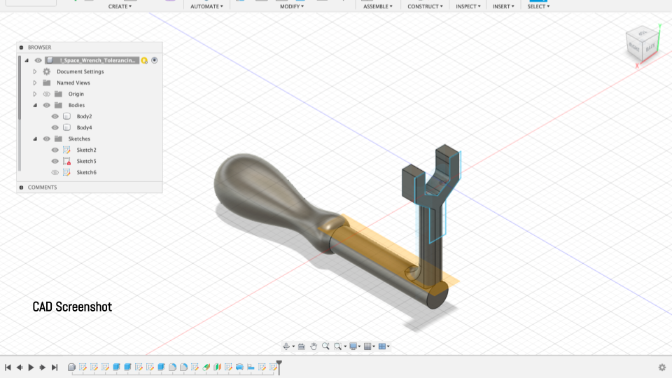
This project was for my Design for Additive Manufacturing Class in the Winter of 2023. This project allowed me to strengthen my CAD, Finite-Element Analysis, and Shape Optimization Modeling skills, all in AutoCAD Fusion 360.
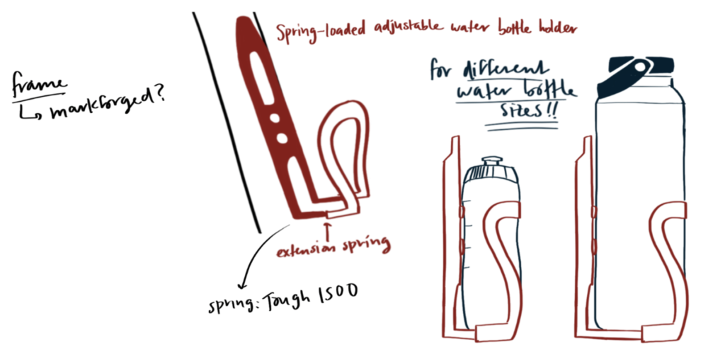
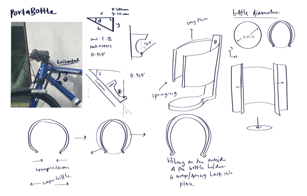
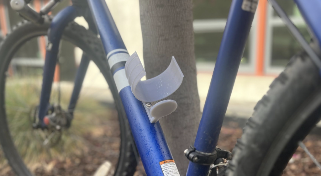
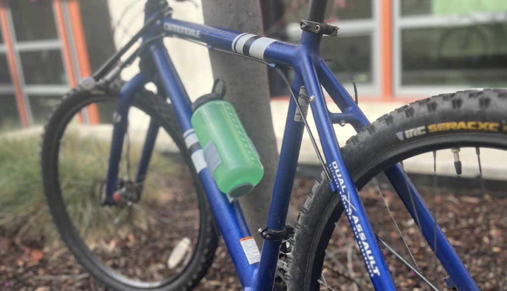
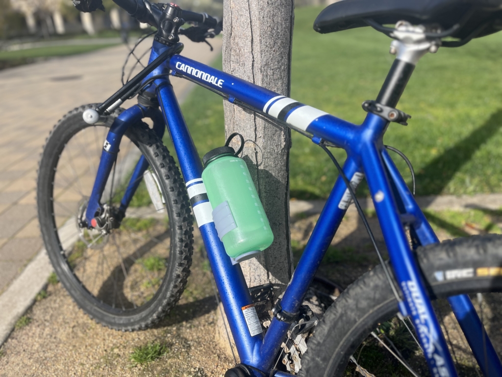
The prompt is fairly open-ended, and I initially opted for the route of redesigning a part by leveraging AM capabilities. I wanted to utilize shape optimization simulations to redesign bike-mounted water bottle holders. Simultaneously, my biggest qualm with bike-mounted water bottle holders is that those on the market (and currently mounted on my bicycle) are typically fixed for a specific size. I wanted to design a water bottle holder that is adjustable or accommodates a wide range of sizes.
Mechanical Function
The core function of my design is pretty simple–to allow people who bike to carry their water bottles with them as they go. Specifically, my design would be catered to bikers who opt for larger water bottles than the “standard size” single-use disposable bottles.
I’mma Buy You a Drank.
Then I’mma take you home with me
T-Pain
Ideation
Initial Sketches
My initial idea was a hybrid between an adjustable water bottle holder and something designed with algorithmic modeling.
I realized that ultimately, it would be difficult to design something that is both adjustable and algorithmically modeled within the scope of the project. I understood that I could separate the design into parts and tackle each part differently, but in the interest of time, I opted to solve each problem separately and choose a model to pursue before I printed.
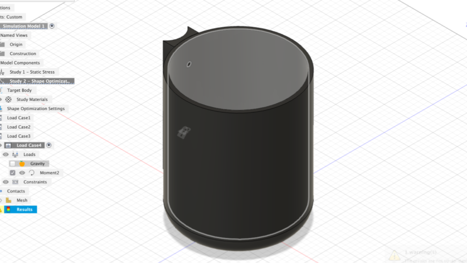
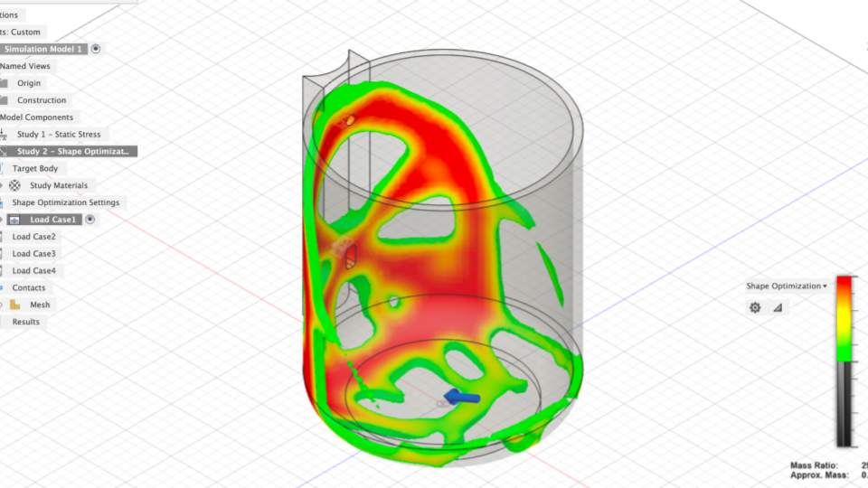
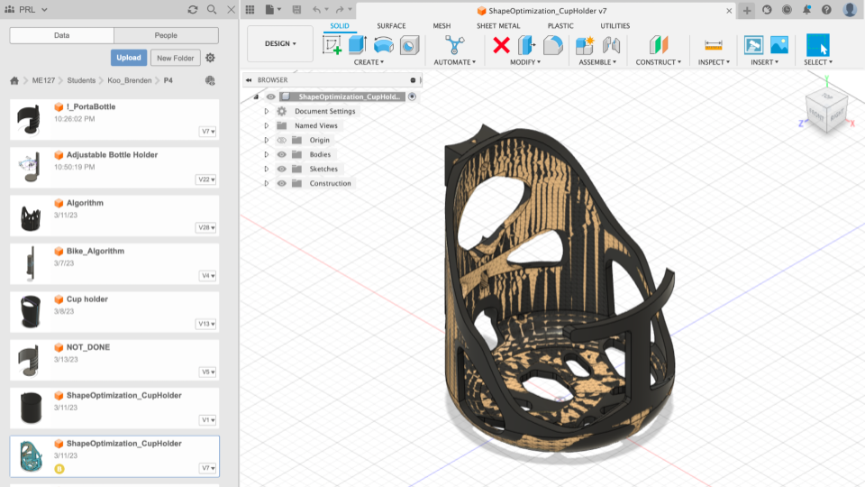
Solution 1: Shape Optimization
Shape Optimized CAD
Shape Optimized CAD
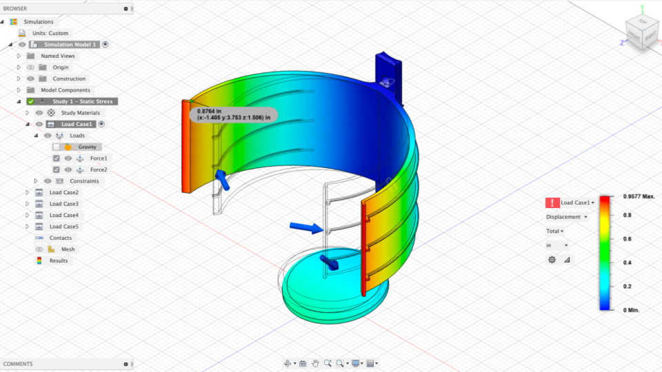
I created a model of a cylindrical shell with the same diameter as my water bottle. I constrained each of the load cases with fixed connections at the holes and applied the following load cases:
33.362 N load acting on the base face at a 37-degree angle
33.362 N load acting on the base face at a 37-degree angle and 5 N load acting normal to the cylindrical walls
Misuse Case: 33.362 N load acting on the base face at a 37-degree angle and 5 N load acting down on the cylindrical rim
5 Nm moment acting on the upper cylindrical hole
Solution 1 Result
The shape optimization simulation yielded the following result, which I promoted to the design workspace
I cut-extruded the model to resemble the general model created by the simulation
Solution 2: Adjustable Design
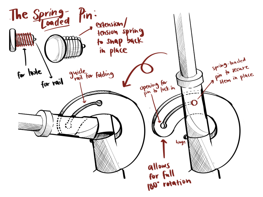
I opt to pursue a design that accommodates larger water bottles, using a spring-loaded mechanism.
At this point, I knew that I wanted to pursue a design that accommodates varying water bottle sizes, including the 32oz water bottles I typically drink from.
Re-thinking the prompt, I am still trying to take advantage of the additive manufacturing capabilities, gaining more hands-on experience with AM, and exploring material properties as they relate to flexibility and springiness.
Iteration
Materials Selection – Tough 1500
In choosing a material with flexibility and durability, I was torn between Durable and Tough 1500. Durable, as the name suggests, has a higher pliability rating than Tough 1500. However, Tough 1500 has a faster spring back, which would be necessary for the “snap” feature that I would want in my design. Ultimately, I deduced that Tough 1500 and Durable were similar enough in pliability (the design need not be so flexible, just enough to deform slightly)
Using Tough 1500, I knew that I needed to be able to have a design that would flex and bend repeatedly, all while being durable enough to hold my water bottle in place
In order to use Tough 1500 in my CAD (as the material is unavailable as a pre-set) I selected and edited Tough 2000 (in the same material family) and edited certain material properties with Tough 1500 specifications.
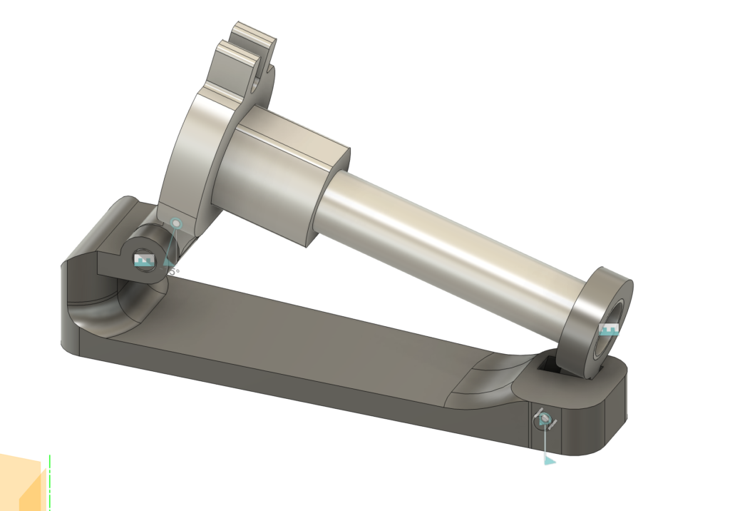
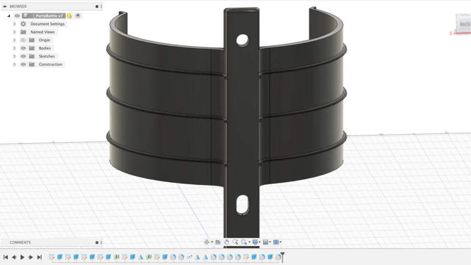
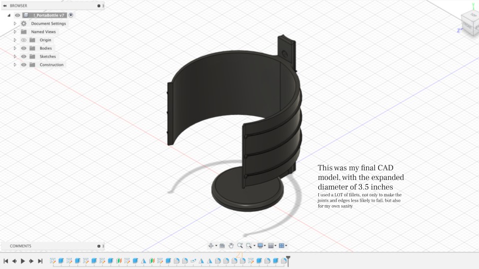
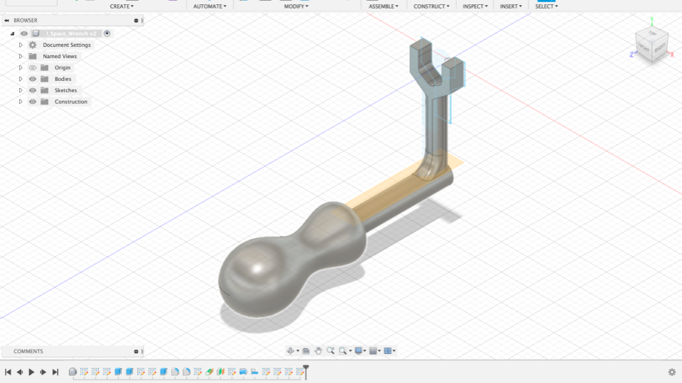
CAD Models
Portabottle CAD
Portabottle CAD
Simulations
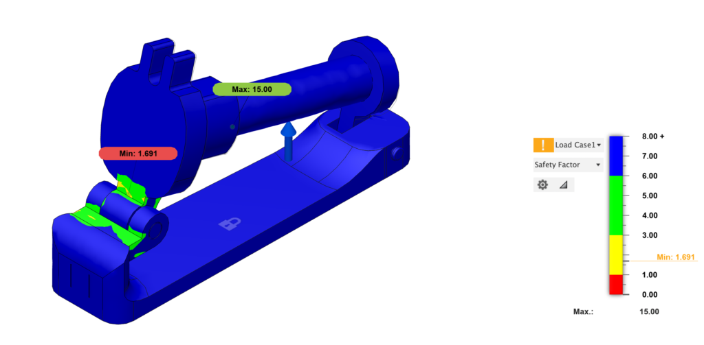
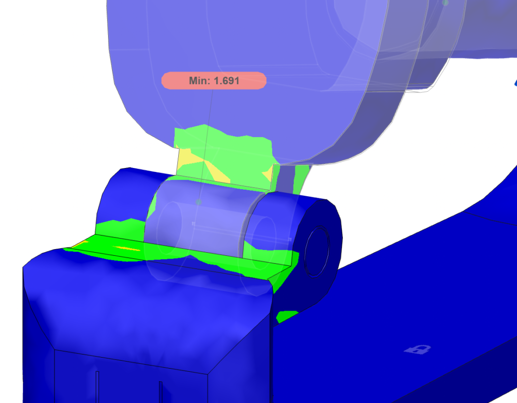
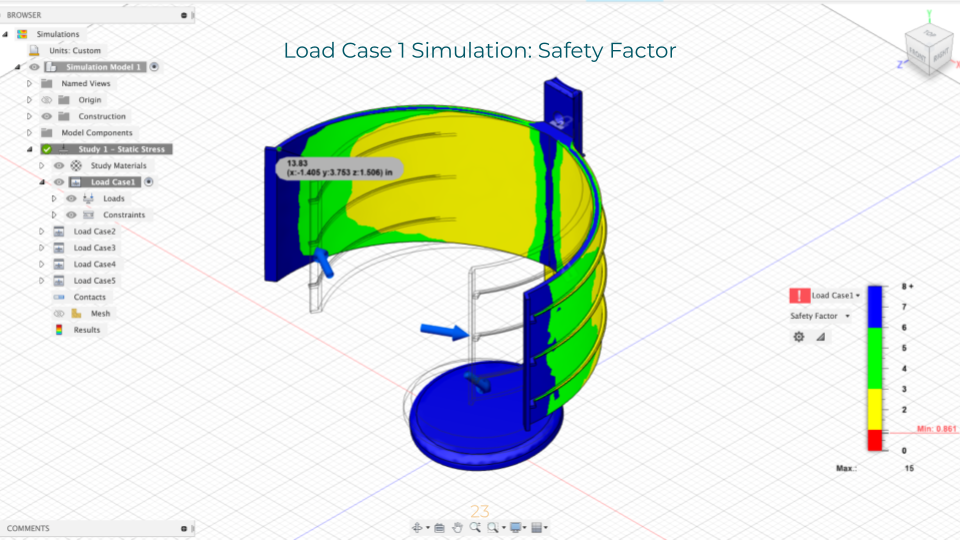
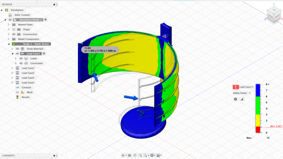
A large part of this project was focused on CAD simulations, and ensuring that the design I create is able to withstand the necessary forces of interfacing with a water bottle, as well as unexpected forces associated with riding a bicycle.
The CAD simulations implemented the following load cases (in addition to being constrained at the holes):
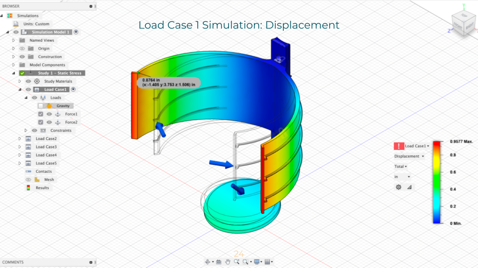
Load Case 1: 15 lb-force loads acting on the outer lips and a 3.5 lb-force load acting on the top face of base
Load 1 Simulation: Safety Factor
Load 1 Simulation: Displacement
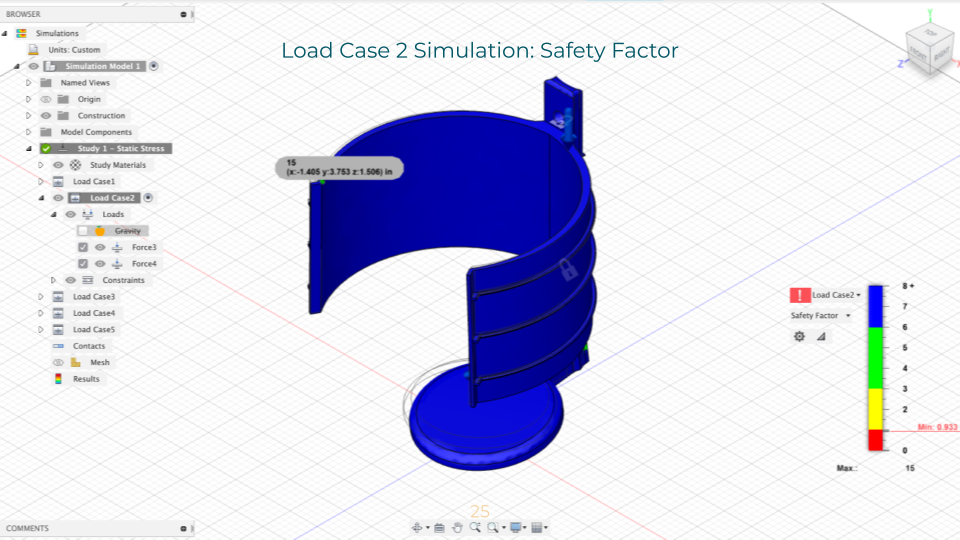
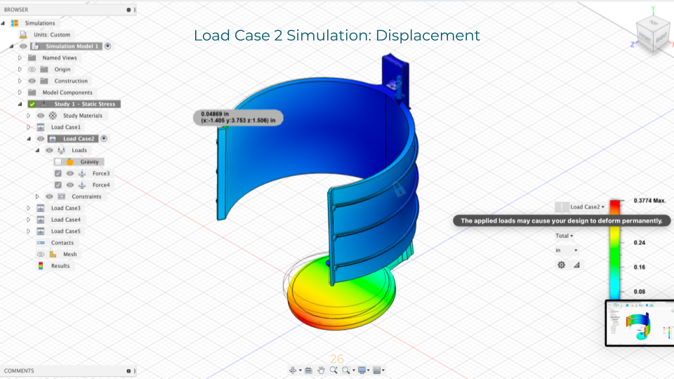
Load Case 2: Misuse case: 15 lb-force load acting on the upper rim and a 3.5 lb-force load acting on the base
Load 2 Simulation: Safety Factor
Load 2 Simulation: Displacement
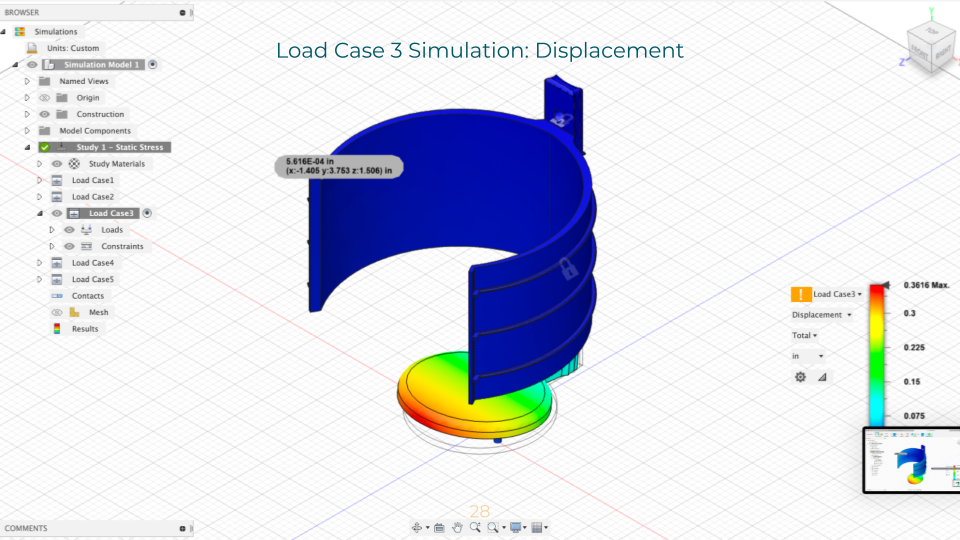
Load Case 3: Misuse case: 3 lb-force load acting on the bottom face of the base
Load 3 Simulation: Safety Factor
Load 3 Simulation: Displacement
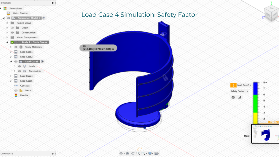
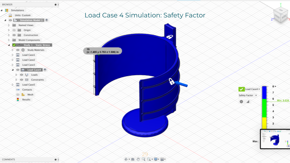
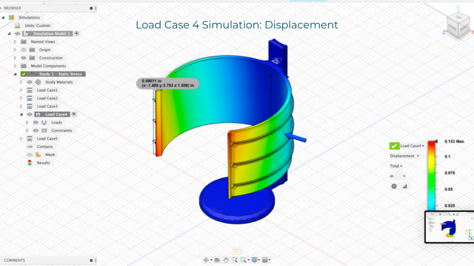
Load Case 4: Misuse case: 5 lb-force loads acting normal to the external faces of the holder
Load 4 Simulation: Safety Factor
Load 4 Simulation: Displacement
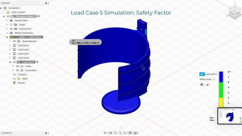
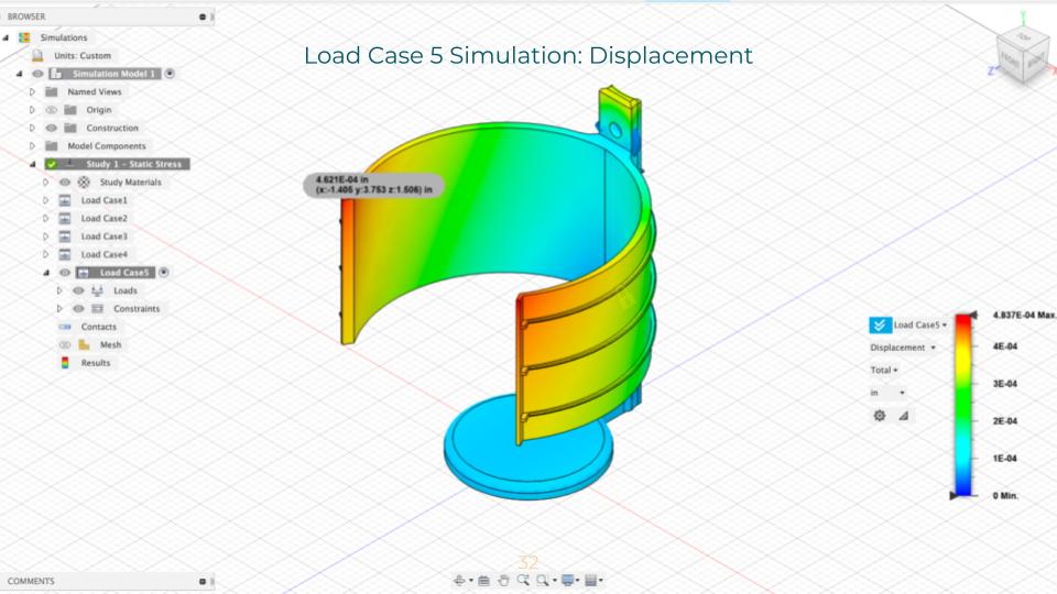
Load Case 5: 10 Nm moment acting on the cylindrical hole
Load 5 Simulation: Safety Factor
Load 5 Simulation: Displacement
Simulation Analysis
Essentially, the simulation demonstrated that the design was strong enough to perform as necessary! The first two load cases, however, failed with a safety factor of 0.86 and 0.93, respectively. Following a discussion with numerous CAs, I decided that the failure points (at the external ribs and internal faces of the lower hole) were small enough to be neglected.
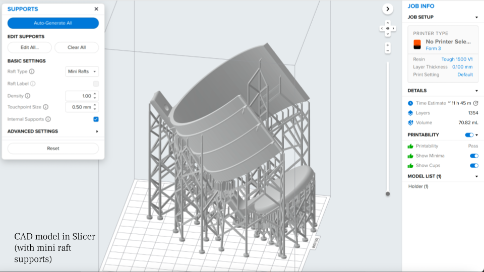
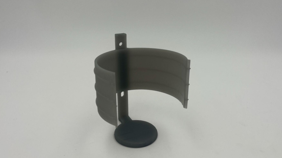
Final Prototype
FormLabs Model Print
PortaBottle
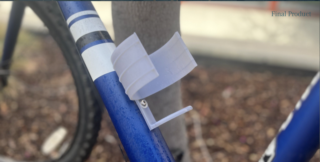
Design in Action!
Video
Final Reflection
Analysis
My design was successful! The bottle holder mounts to my bicycle frame with no problem, and it seems more than capable of carrying my 32oz water bottle. The bottle slips in and out of the holder with ease and satisfaction–the holder is flexible enough to widen to the diameter of the bottle, but snaps back into place to the point where the bottle is nicely constrained, even with a significant amount of movement or inertia. When biking around, the bottle is nicely secured. If I had more time, I would consider how I could either make the design more adjustable to be capable of holding smaller bottles (but who drinks out of those?) or more mass efficient using algorithmic modeling–or who knows, maybe even both. However, as I am faithful to my 32oz water bottles, I am more than satisfied with my current design.
Reflection
I am more than pleased with the outcome of my final project, as I was able to imbue my academic learnings with a real-world purpose. Although my final outcome deviated from my initial ideation, I was able to explore the iterative process and determine a solution that was much more suitable for my intended outcome. I appreciate the help of the CAs and Dan who have–once again–provided me with valuable advice on how to elevate my design, approach the prompt from different perspectives, and continue pushing forward in the face of challenges. Admittedly, even though I had thought my initial idea was well-scoped, I found that it was, yet again, out of scope for the time frame of the assignment. Moving forward, I will attempt to have a better understanding of project timelines to scope my project properly from the start. Furthermore, in the future, I will take care to wash and cure my 3D-printed part BEFORE I remove the supports, as that evidently makes a big difference.
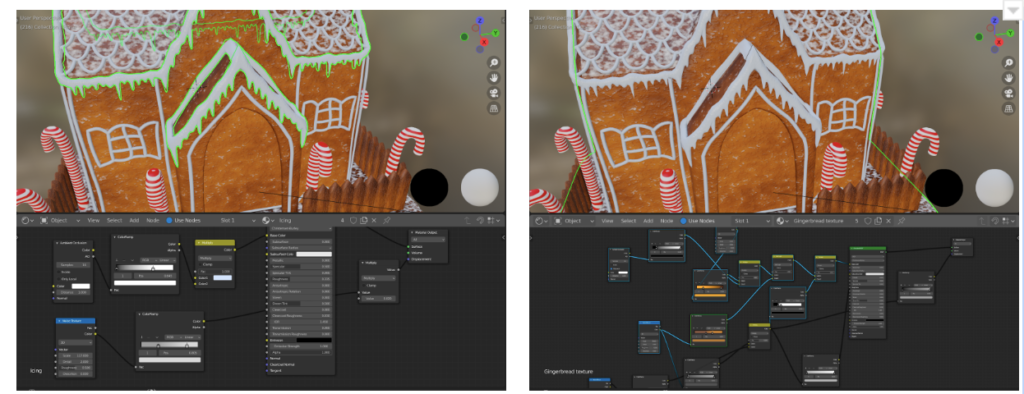
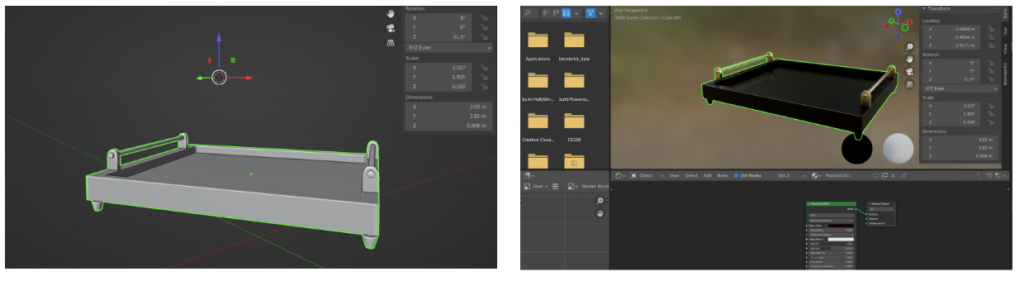
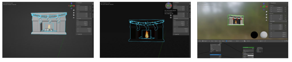
As a Product Design Engineering/ Mechanical Engineering student, Computer-Aided Design (CAD) is at the forefront of my design arsenal. I have experience with both SolidWorks and AutoCAD Fusion 360, as well as Blender (for computer graphics rendering). I have provided below an assortment of images depicting my CAD journey–don’t hesitate to reach out to learn more about any of my projects!
Here, you can also see a couple of projects that I have done for my Design for Additive Manufacturing class!
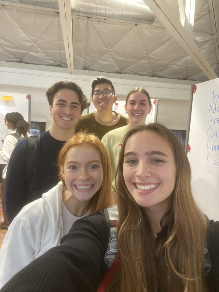
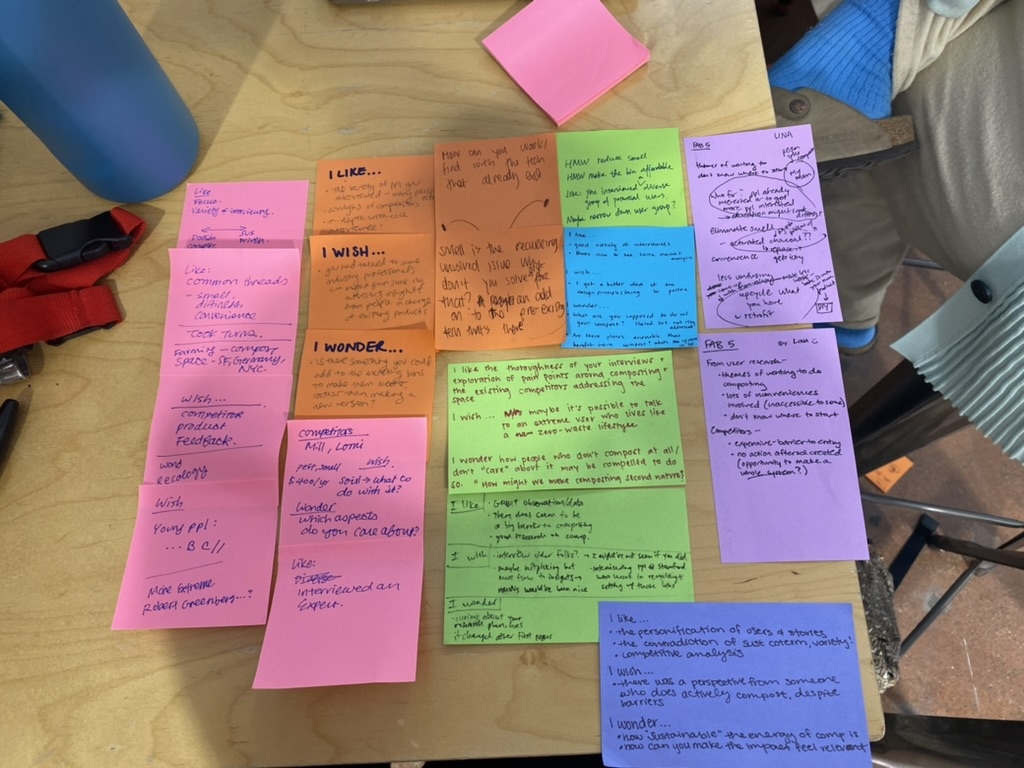
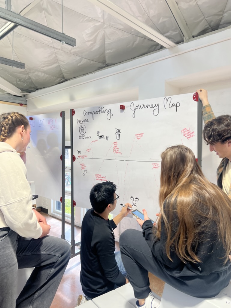
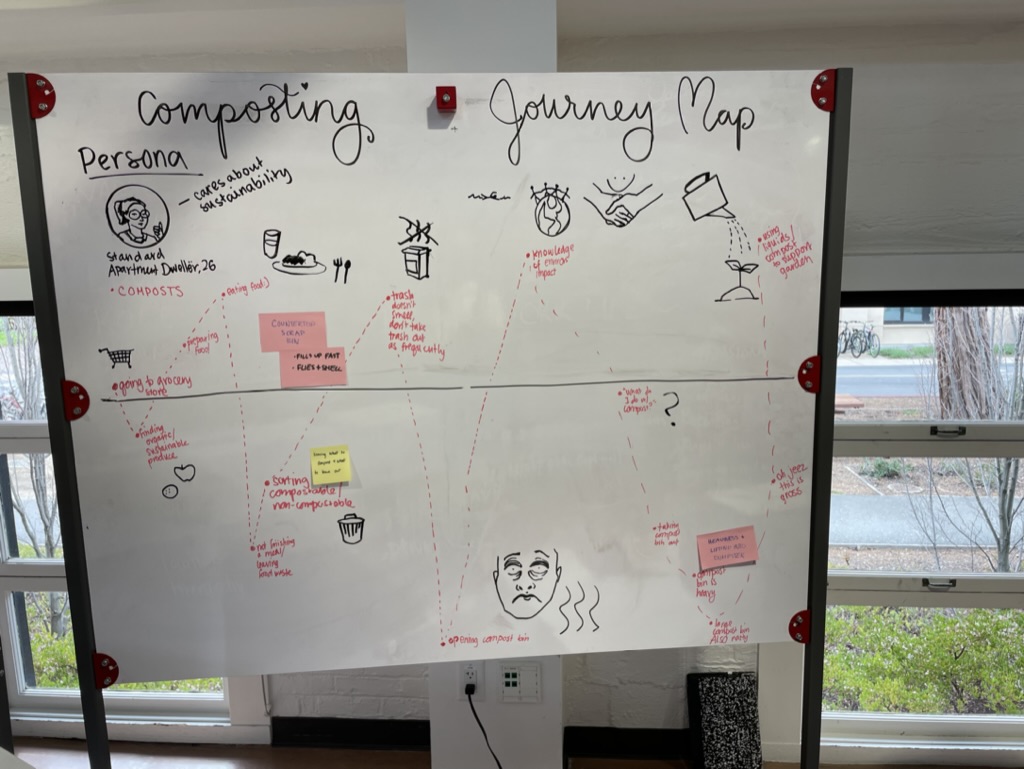
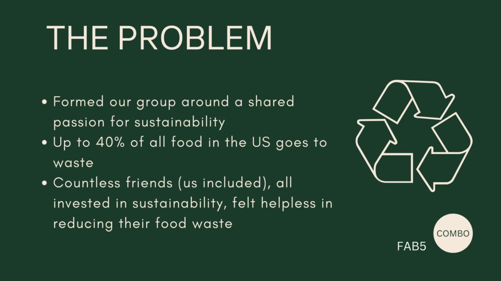
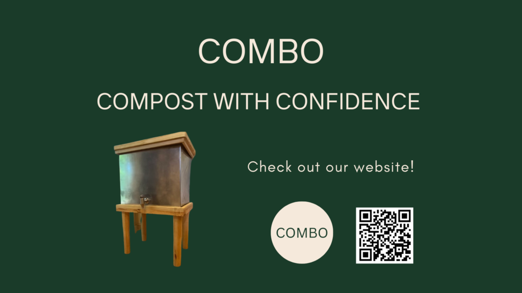
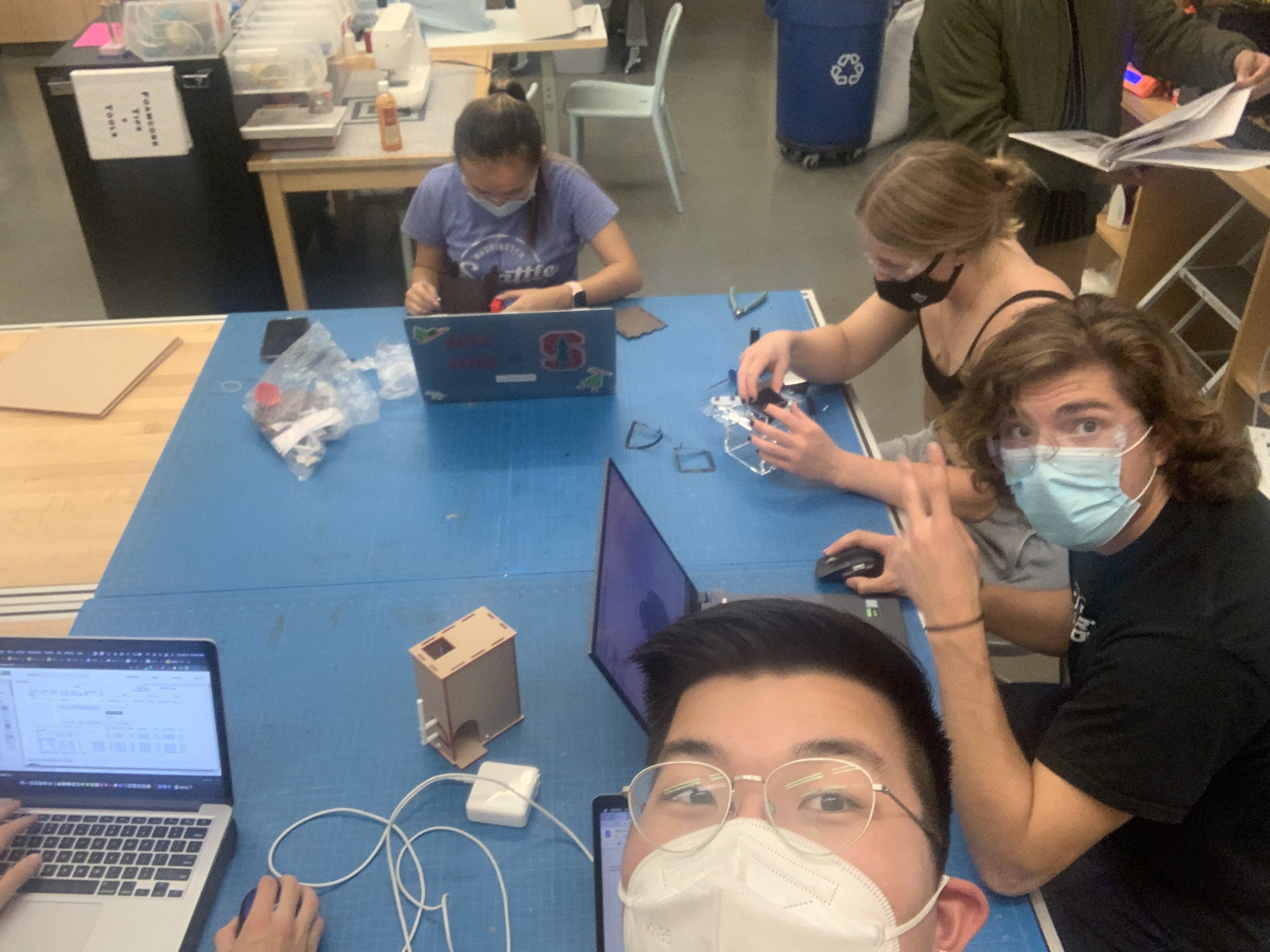
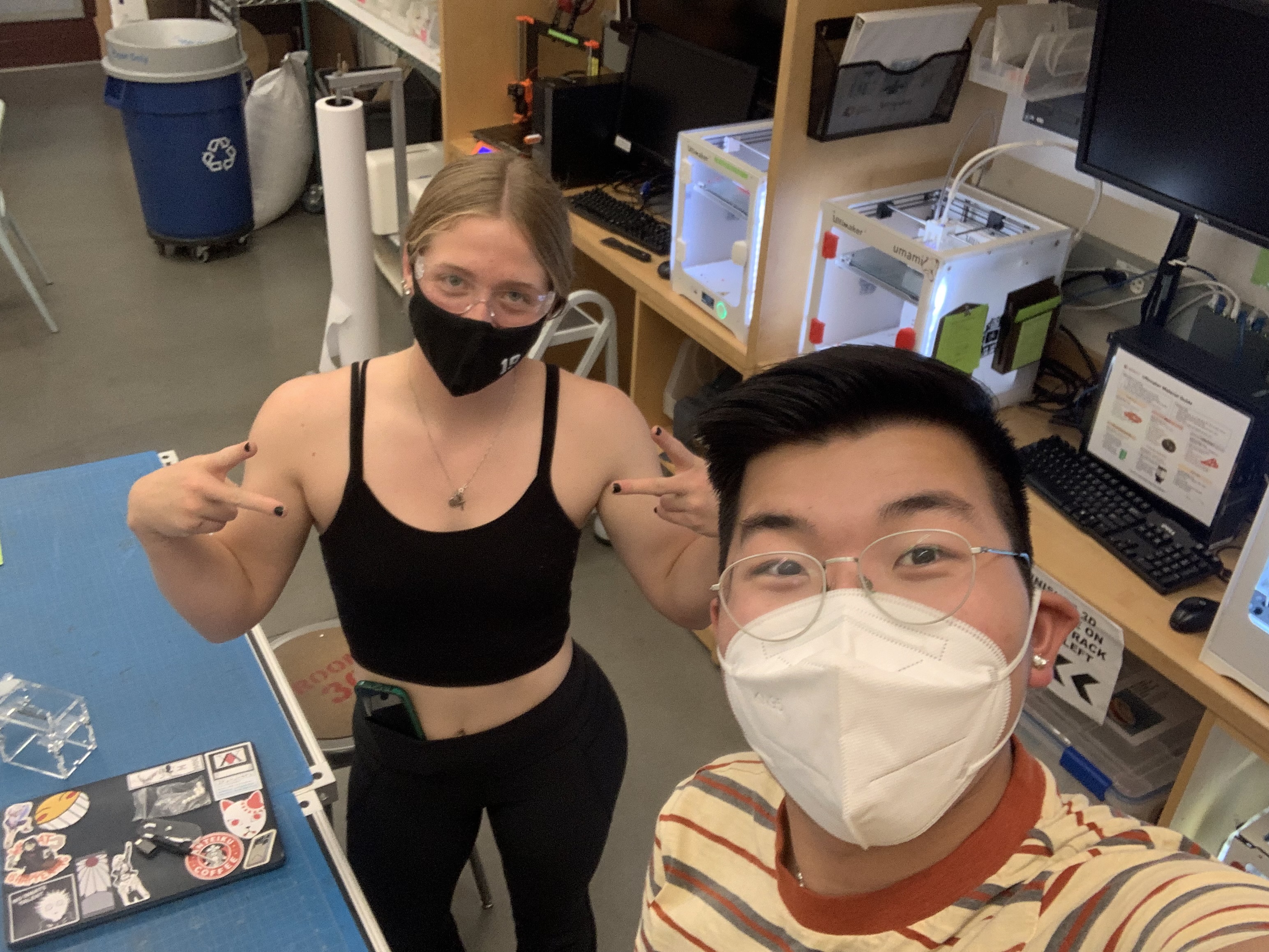
This project was designed with my teammates Addie Stonecipher (Stanford ’23), Chloe Widner (Stanford ’23), Emma Wheal (Stanford ’23), and Sasha Lascar (Stanford ’23) for our ME216: Advanced Product Design Capstone class. We named ourselves the Fab Five.
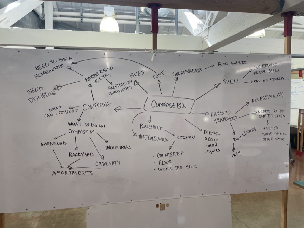
All of the members in our group were really focused on sustainability in our product design. We were all motivated by a desire to create a better future, and one way that we wanted to work toward this goal was by decreasing food waste. If you want, check out our final presentation (also featured at the end).
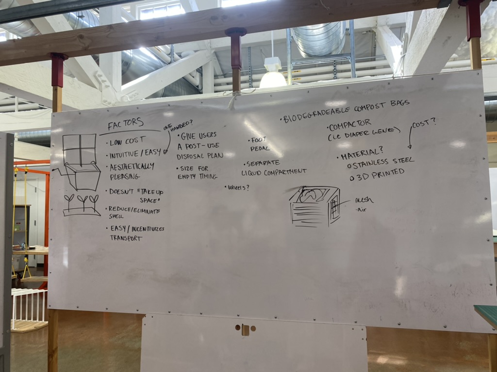
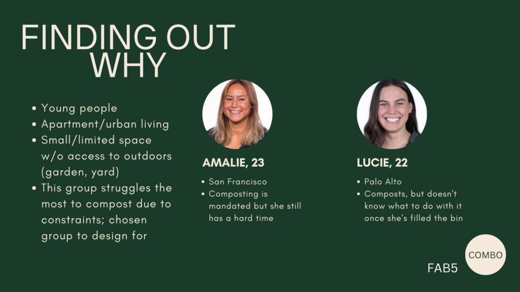
We were all familiar with composting, in the sense of the yellow food waste buckets provided by local governments and the green compost bins that people often fail to distinguish from their blue or gray counterparts. People seem to be deterred by composting but are just as excited by gardening. Upon conducting some need-finding research, here’s what we found out about the composting experience:
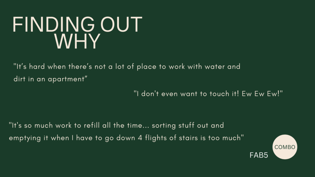
I don’t really compost, I tried to do it at home but…[didn’t work out because of] space
Megan Rogers, age 22
[When asked if the bin is big enough] Oh no, not at all. I have to [walk down a flight of stairs to] empty it several times each week
Patricia Crisera, age 81
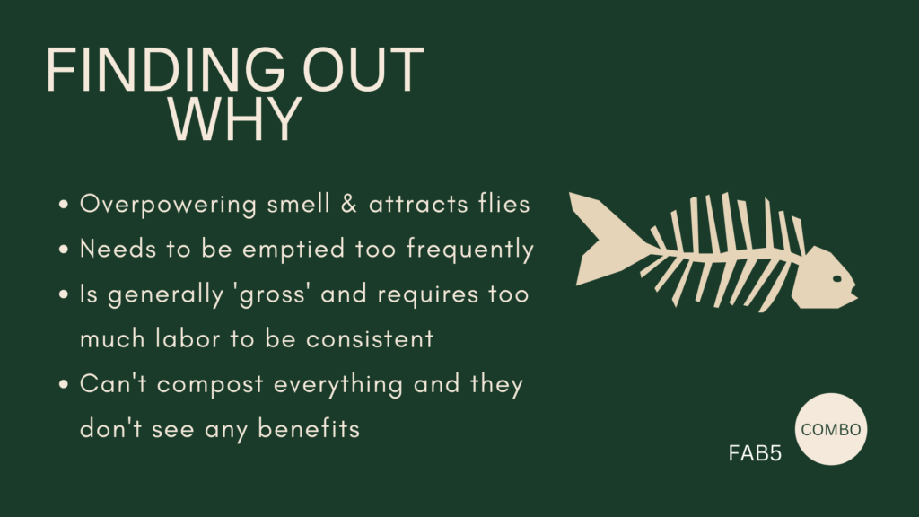
Here are some of our insights about composting. Young people do not compost despite caring about the environment because:
Carrying extra bags to the trash bins is a major barrier to composting
The barrier to entry is too high for people to feel comfortable to start composting
Existing tech is either expensive, complicated to assemble, or confusing for people who don’t know how to get started
Other major deterrents like smell, accessibility, difficulty, size, frequency of emptying process, lack of long-term benefits
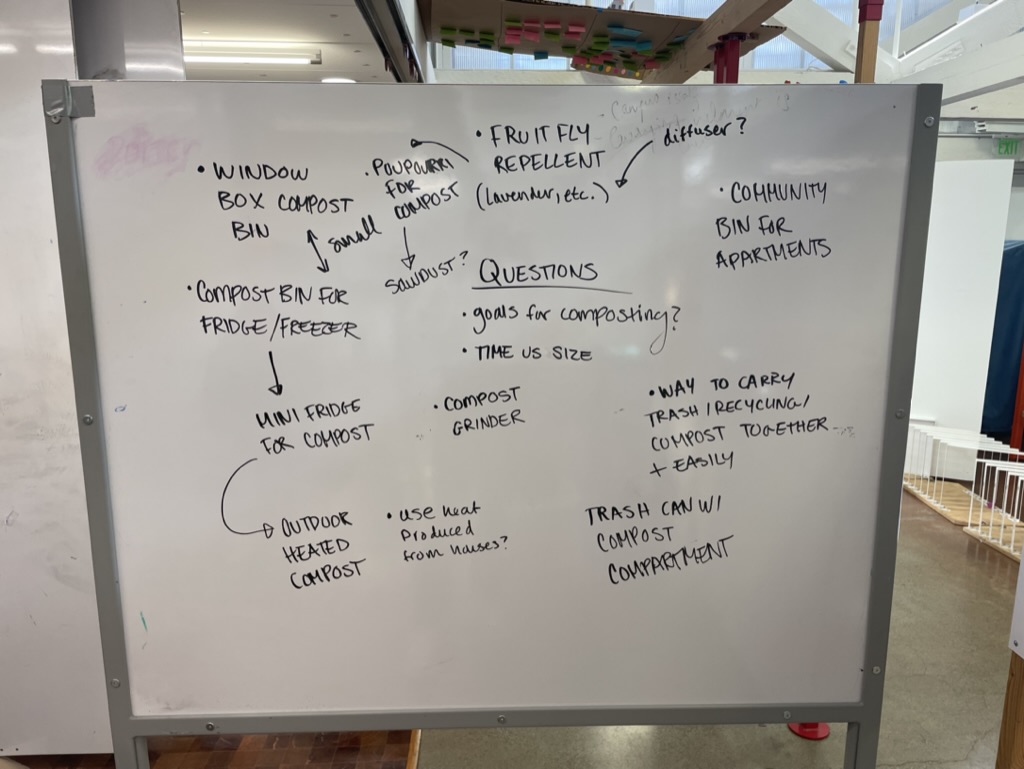
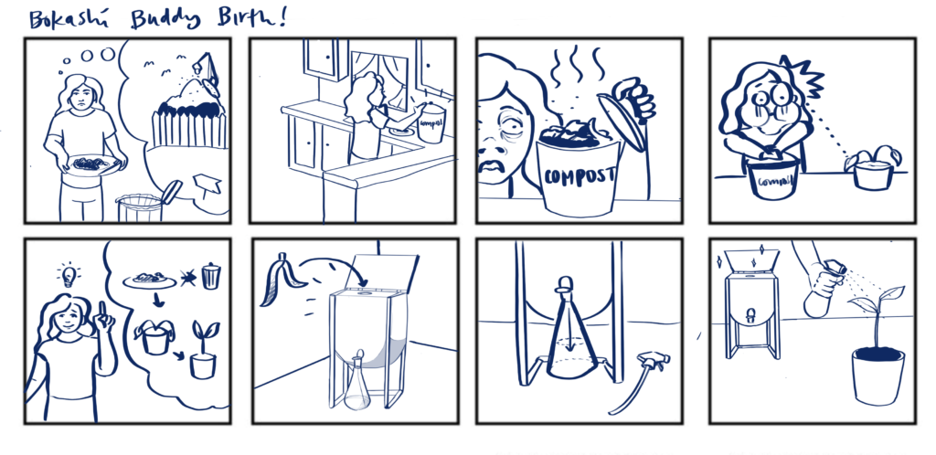
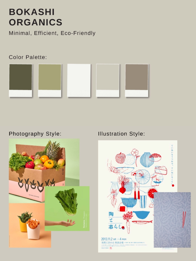
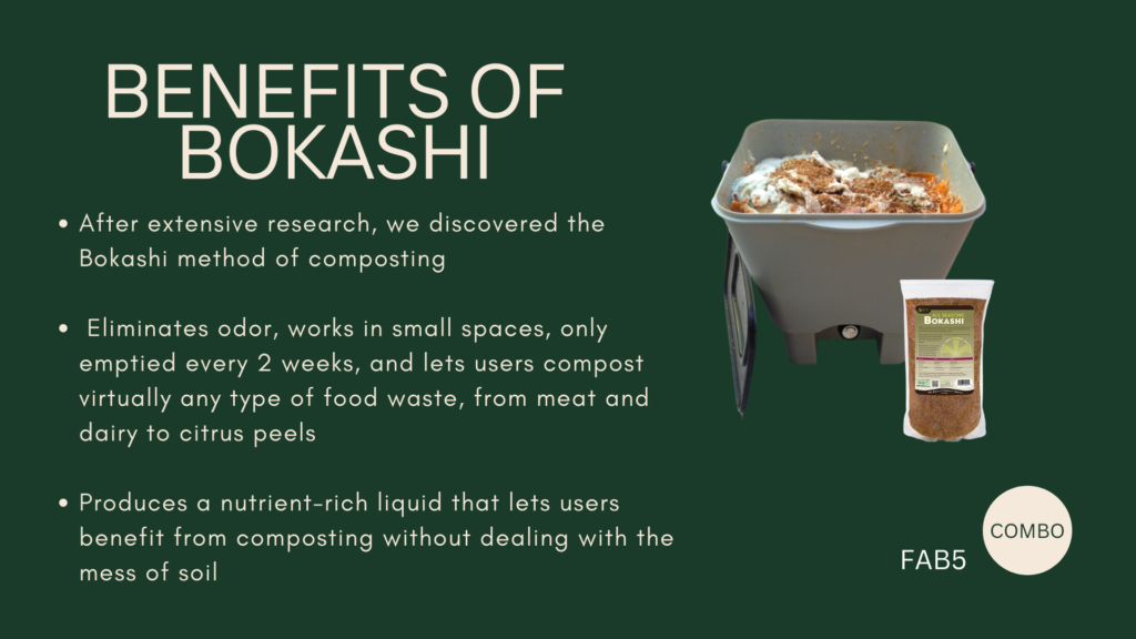
Familiarizing Ourselves with Bokashi
Keeping that some of the major barriers to composting that we identified were smell, frequency of disposal, and lack of long-term benefits, we did some more research on how to make composting more accessible, especially for younger people. Young adult non-homeowners (living in dorms or apartments) make up a significant percentage of people in the world and are often the least proactive about decreasing food waste.
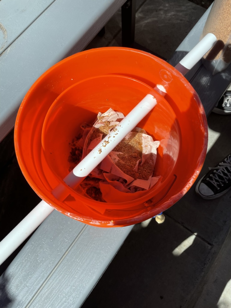
We came across the Bokashi composting method: Bokashi means “fermented organic matter” in Japanese and it is a method of composting that involves layering kitchen scrapswith bran. The scraps ferment and create a liquid that can be used as a natural plant fertilizer.
Bokashi Benefits
Eliminates odor
Works in small spaces
Only emptied every 2 weeks
Lets users compost virtually any type of food waste, from meat and dairy to citrus peels
Produces a nutrient-rich liquid that lets users benefit from composting without dealing with the mess of soil
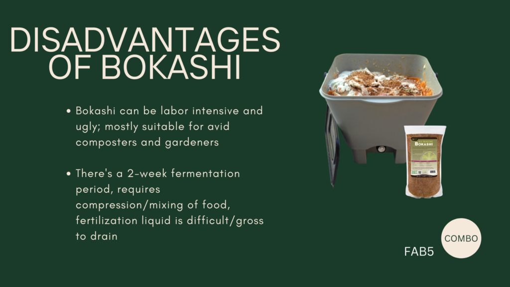
Bokashi Disadvantages
Bokashi composting is not perfect. Some major disadvantages are:
Bokashi can be labor-intensive and ugly; mostly suitable for avid composters and gardeners
There’s a 2-week fermentation period, requires compression/mixing of food, fertilization liquid is difficult/gross to drain
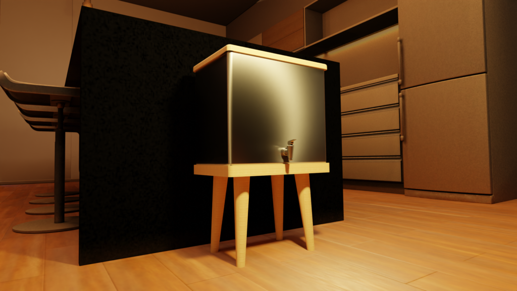
As a result, our team sought to design a product that leverages the advantages of Bokashi composting and mitigates the disadvantages.
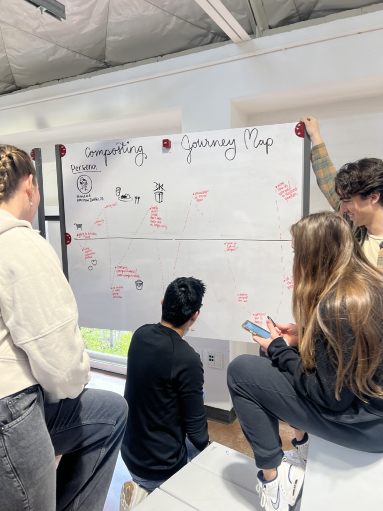
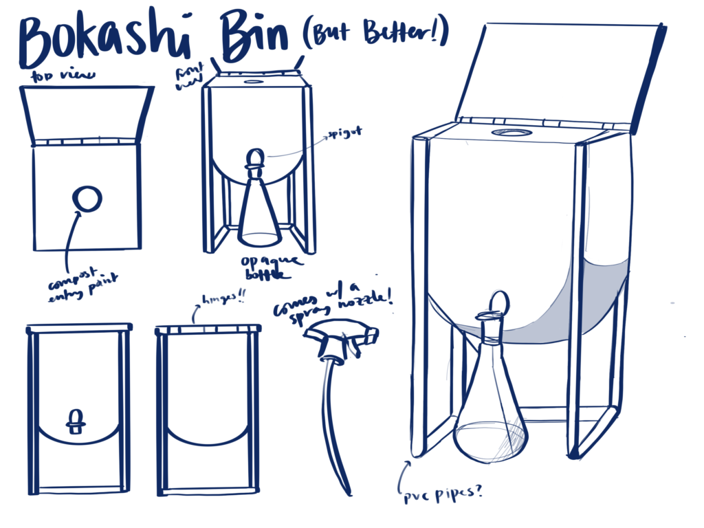
Initial Combo Designs
Prototyping
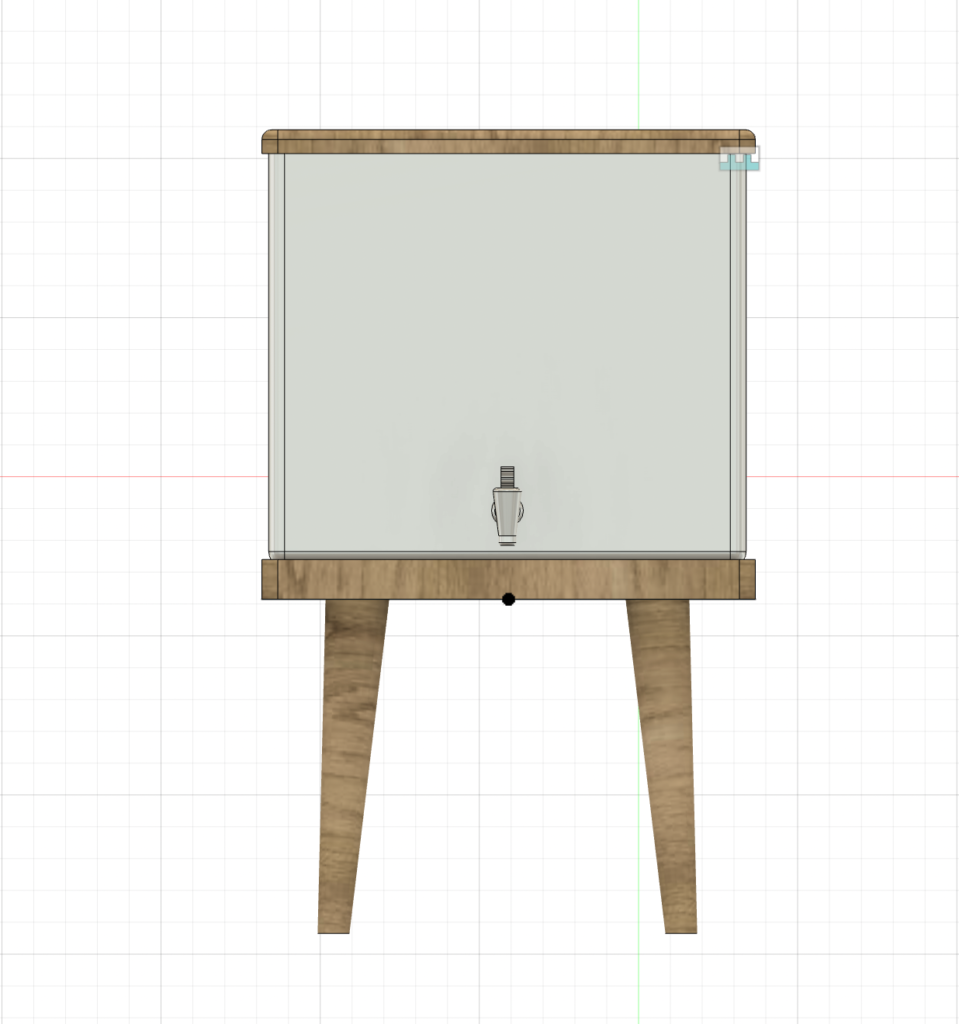
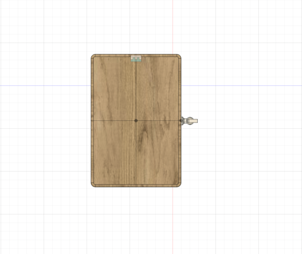
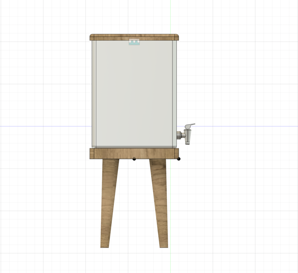
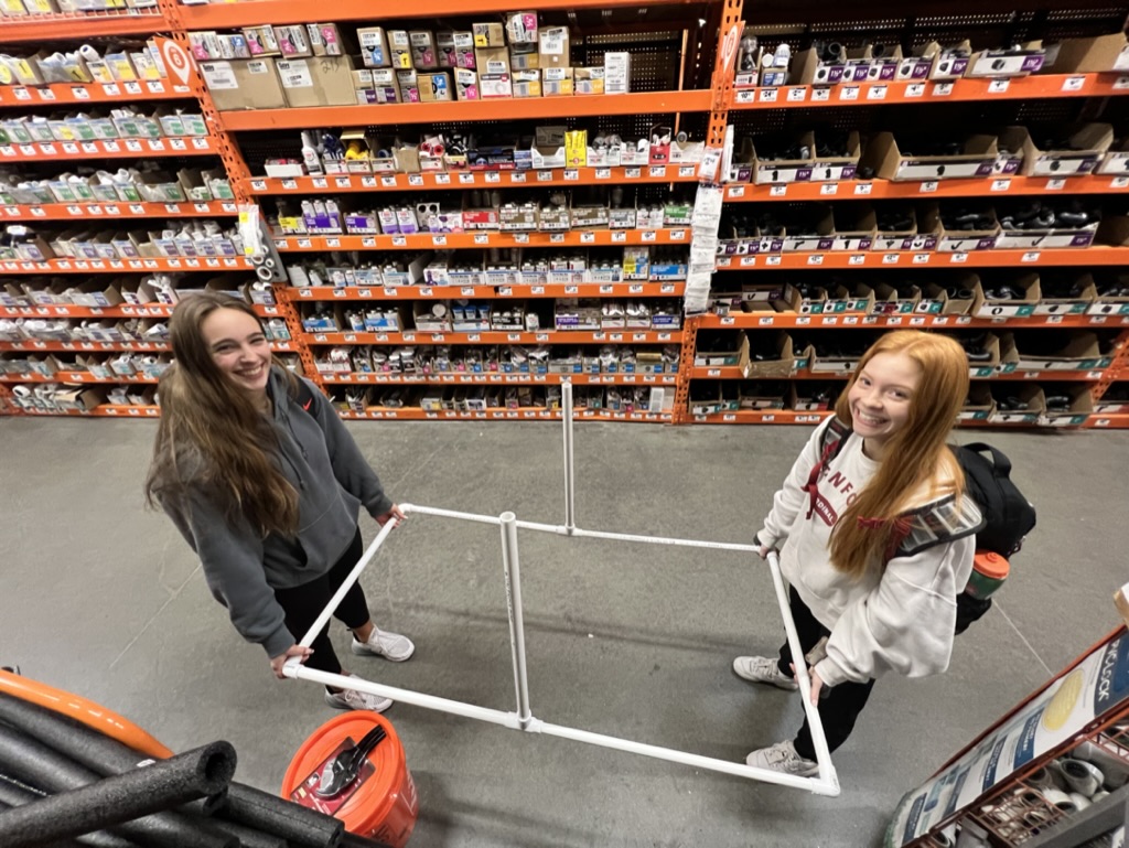
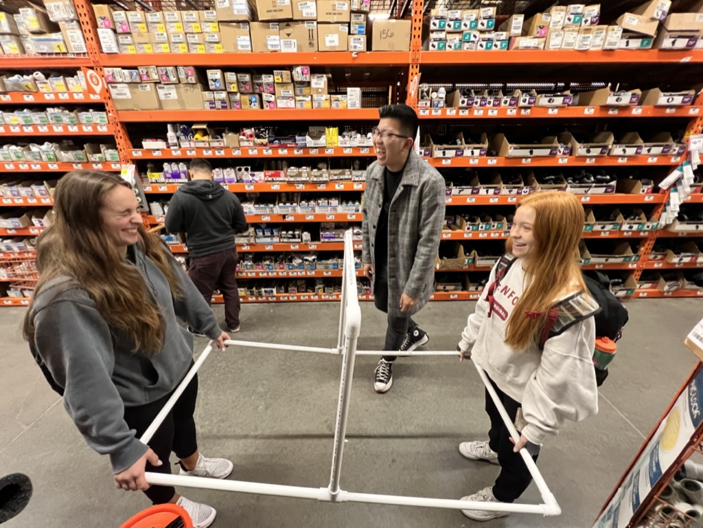
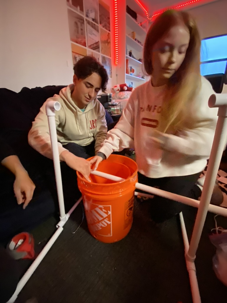
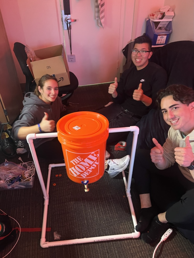
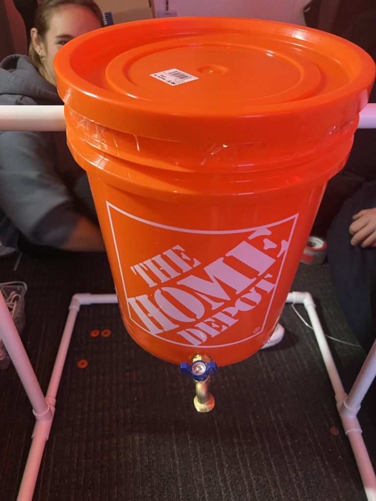
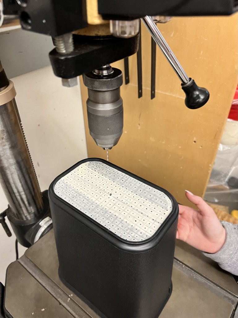
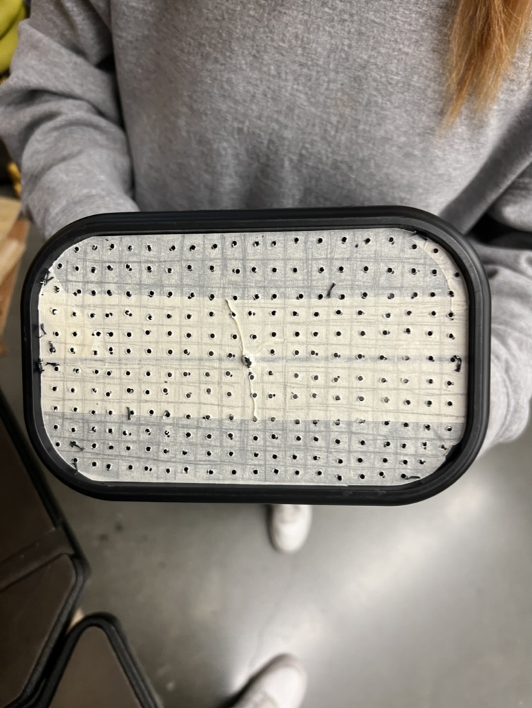
Following our initial concept sketches and journey maps, our team had a direction to move toward bringing composting to young adults everywhere. Our initial prototype featured a swiveling set of two concentric Home Depot, with the interior bin featuring a number of punctured holes to allow the food waste and fermented liquids to pass through. The design featured a spigot at the base of the design, and a rather simple–yet effective–lid to seal the food waste inside. We used materials from Home Depot (namely bins and PVC pipes) and tested the prototype by storing food waste in the bin for a period of time to test the efficiency of the Bokashi bran (purchased from Amazon).
CAD Sketches
Our initial CAD sketch, designed in AutoCAD Fusion360, resembled our physical prototype in functionality. It features a similar dual-bin system, a swiveling stand, and a spigot at the base of the bin.
As we 3D printed our initial CAD design, we realized some built-in flaws with the design. Without any form of stopper, the swiveling method resulted in the bin rotating uncontrollably, only exacerbated by the fact that the food waste would imbalance the bin.
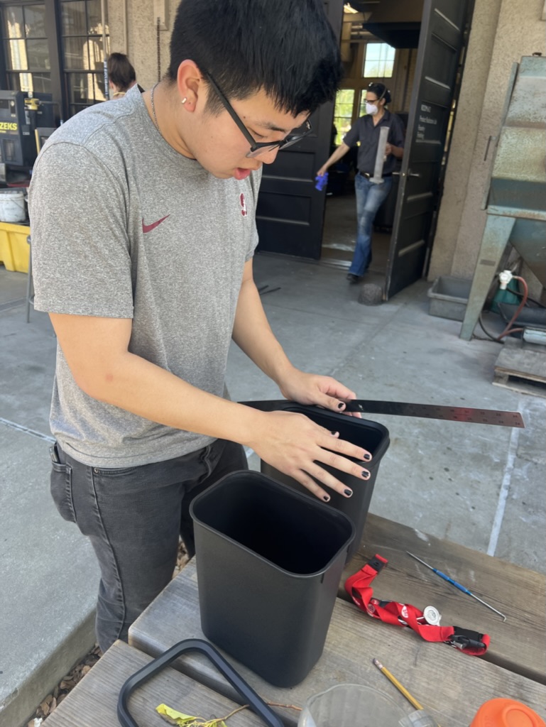
Revisions to the Design
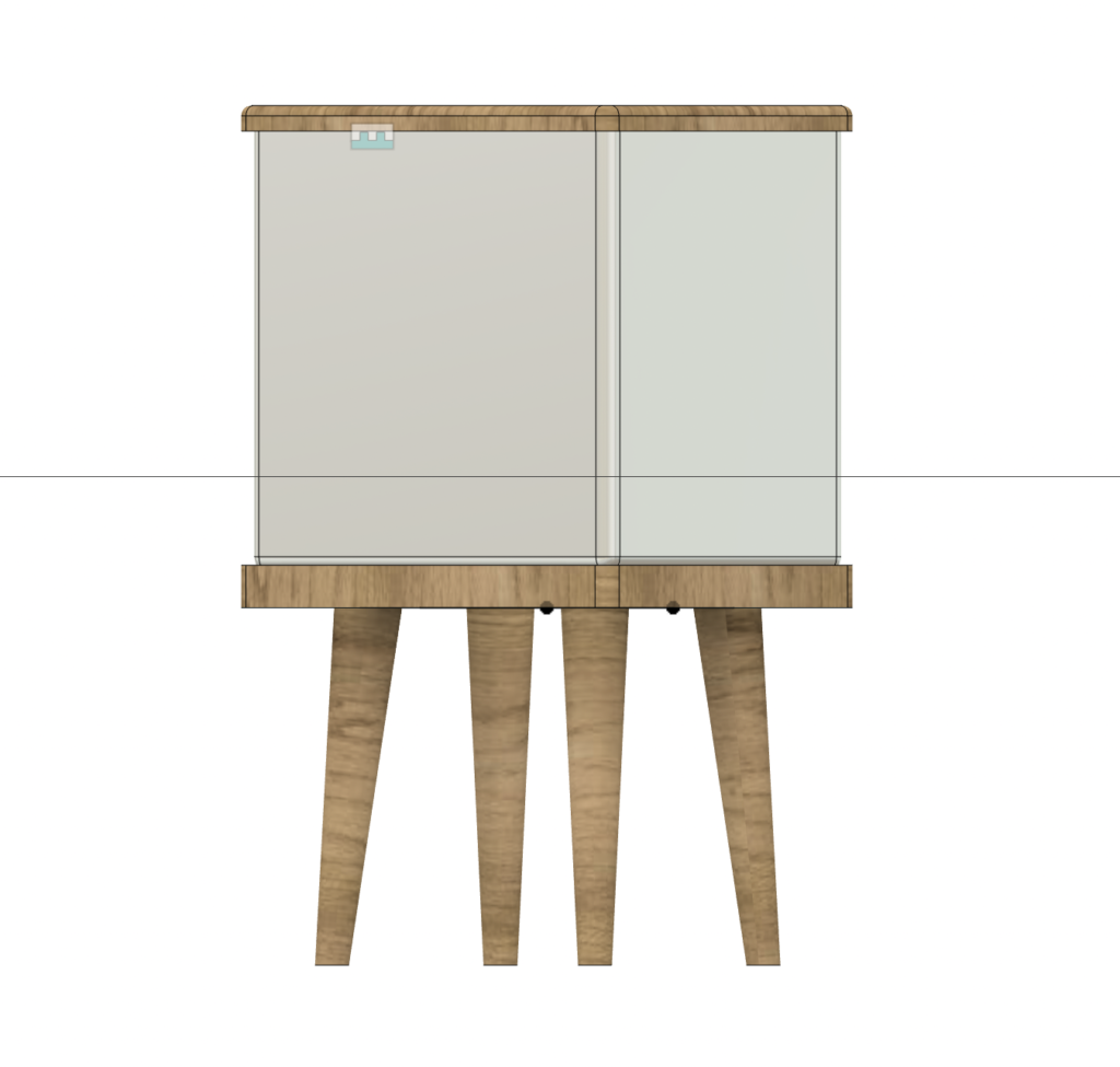
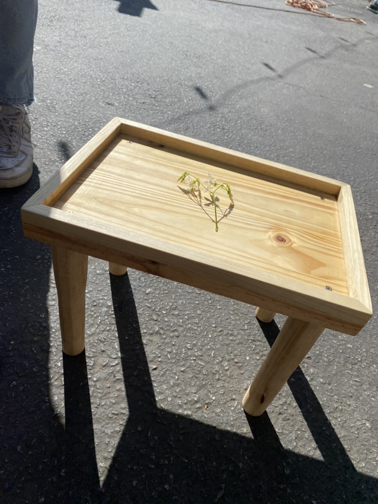
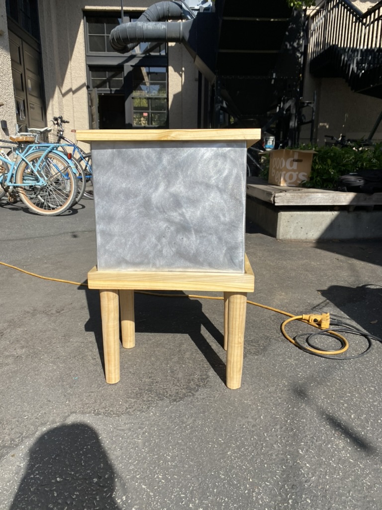
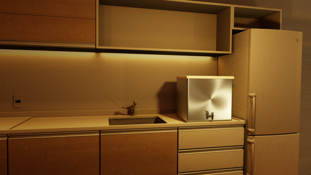
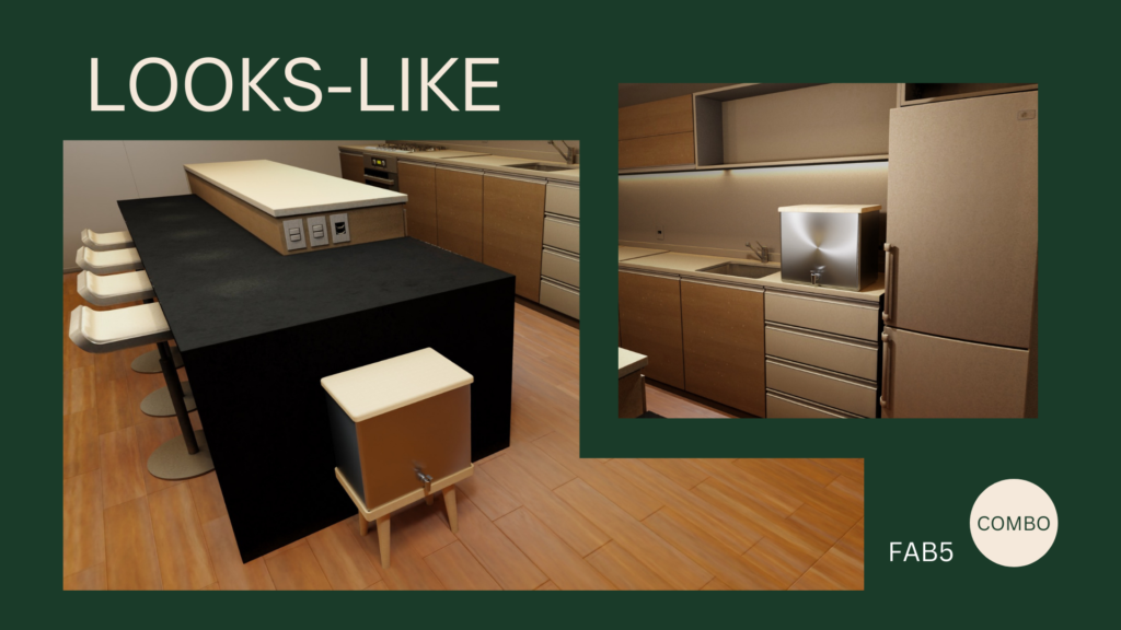
We then adjusted the design to no longer feature a swiveling design, but instead added a sloping base to the interior of the outer bin, so that all of the contents of the bin would be sloped down to the front (where the opening of the spigot is positioned). Instead, we created a stand with four legs for the bin to stand on. However, we also realized that–in designing this bin for young adult non-homeowners–we should create something that is fit for compact kitchen spaces. We decided to make the compost bin separable from the stand so that it could be comfortably placed on a kitchen counter or otherwise.
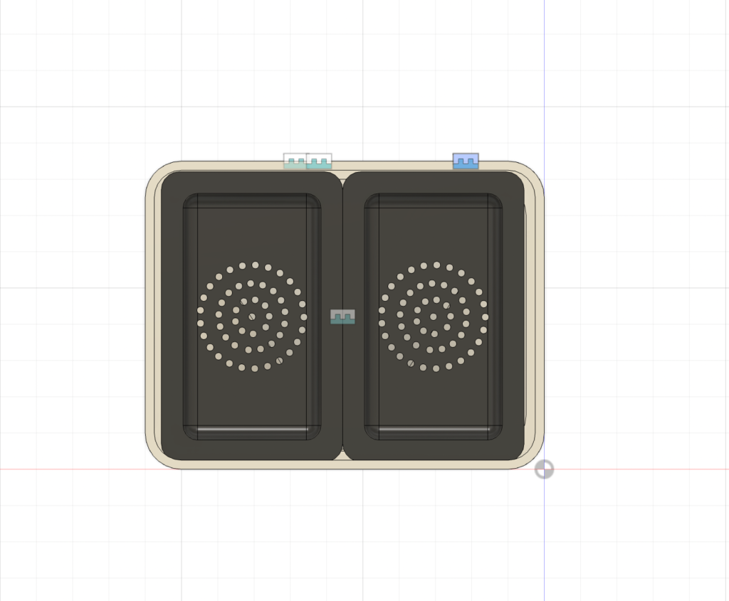
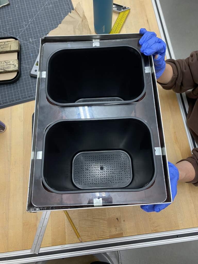
The swiveling feature was not the only change to our design. We also considered the fact that Bokashi bran takes two weeks to ferment, and thus the fermentation process would render the bin unusable for the two-week period. As a result, we decided to create a sealed dual-bin design, where there are two interior bins instead of one. Consequently, the user can fill one bin and seal it, but then continue using Bokashi bran with the other bin while the contents of the first bin ferment for the two-week process. Meanwhile, the bin continues to produce the Bokashi “tea”, which can be used as a liquid fertilizer for gardening.
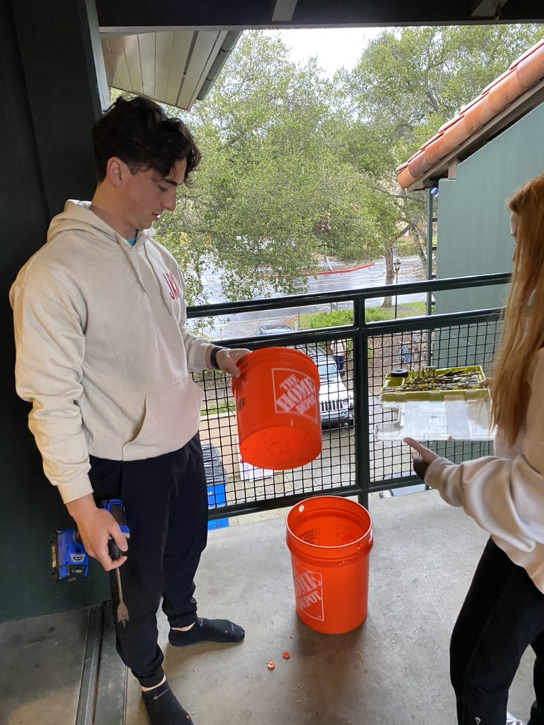
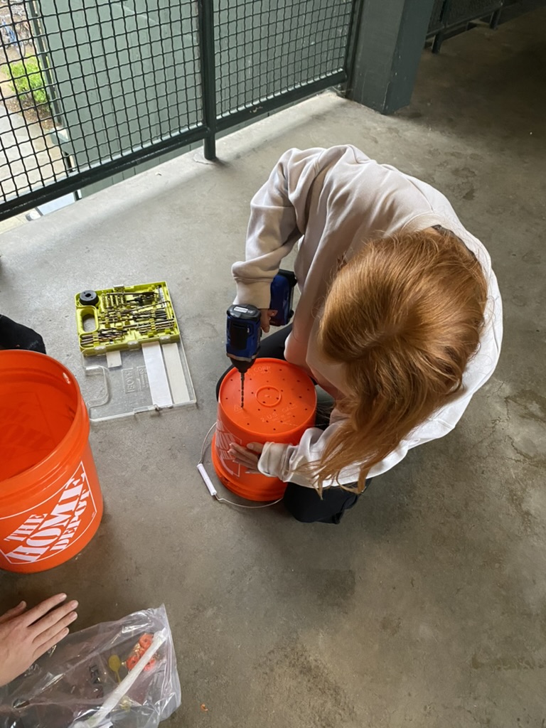
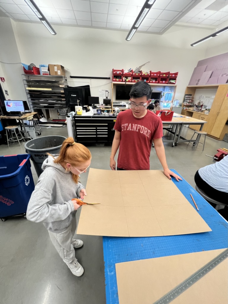
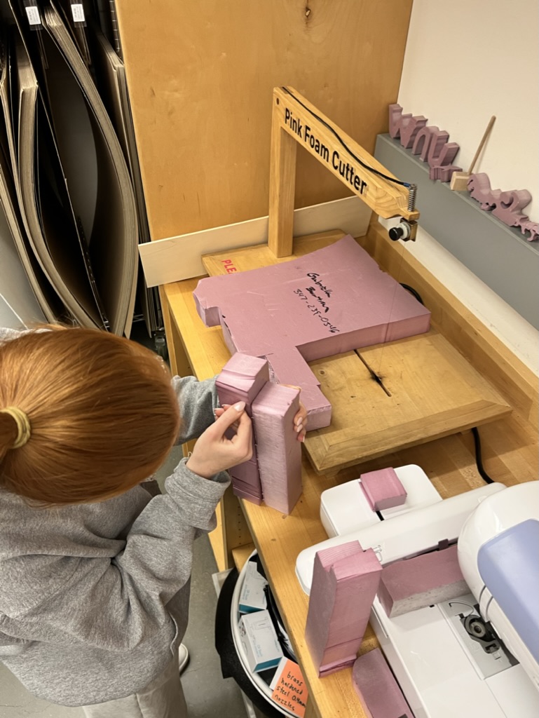
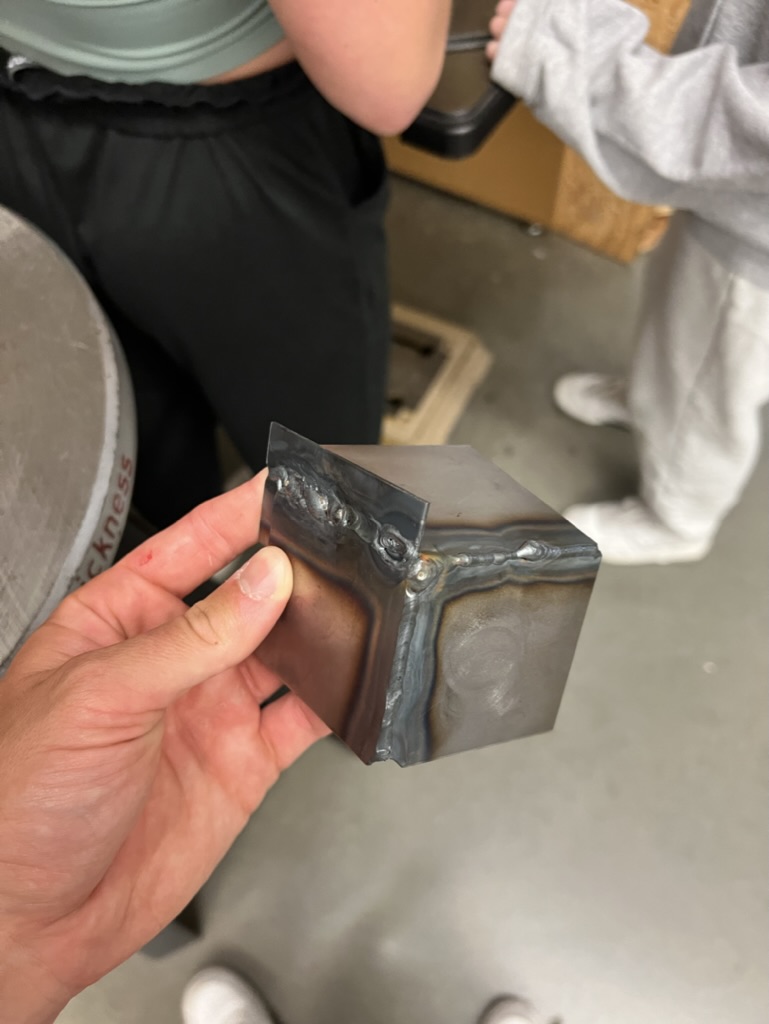
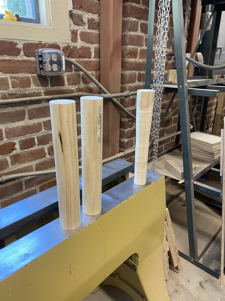
Combo Construction Process
We then spent a significant period of time assembling the Combo bin. We underwent a number of machining processes, including wood turning, sheet metal bending, and TIG welding. Check out a couple of our progress shots below!
One area of complication was the fitting of the lid onto the bin. We needed to prototype a number of designs in order to be successful in ensuring that the bin was secure and the lid was airtight.
Combo Media
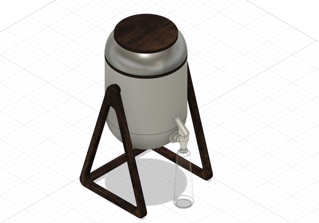
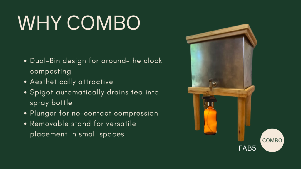
Why Combo?
Dual-Bin design for around-the-clock composting
Aesthetically attractive
Spigot automatically drains tea into a spray bottle
Plunger for no-contact compression
Removable stand for versatile placement in small spaces
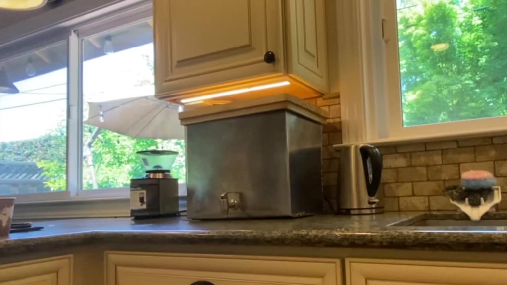
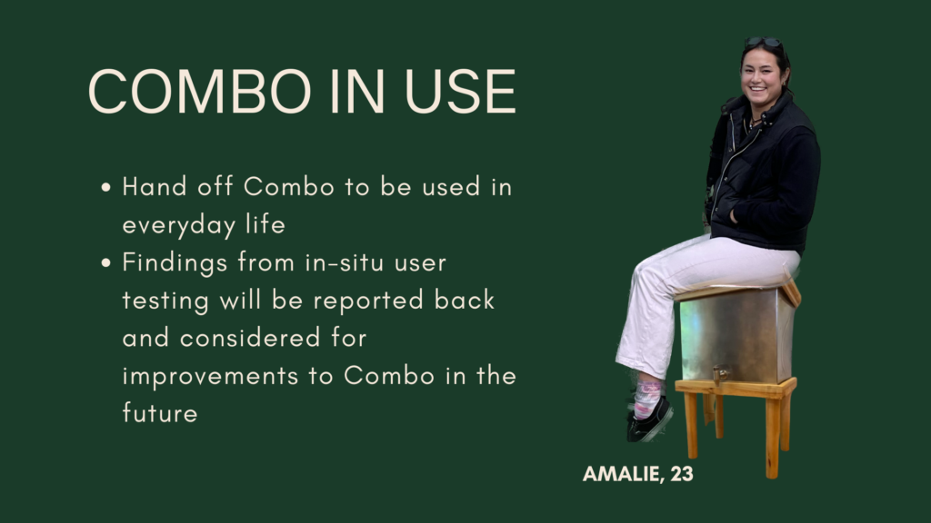
Combo in Use
Hand-off Combo to be used in everyday life
Findings from in-situ user testing will be reported back and considered for improvements to Combo in the future
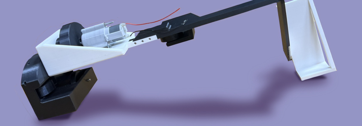
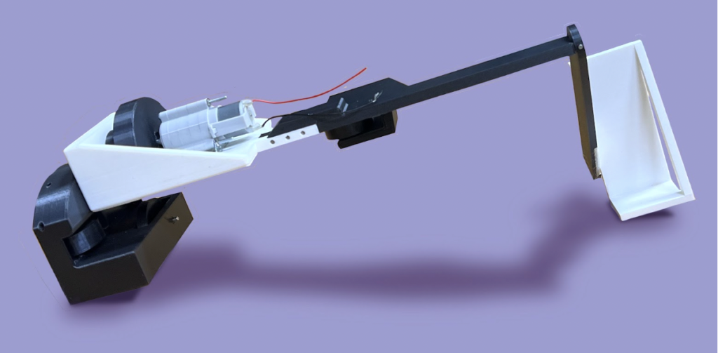
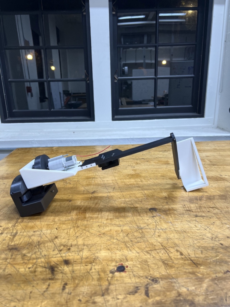
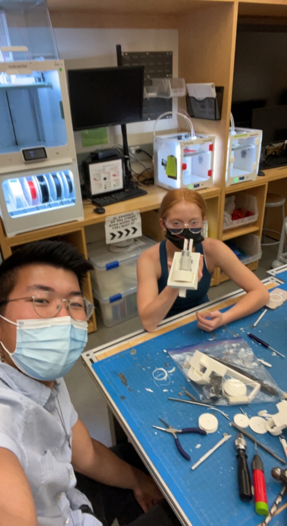
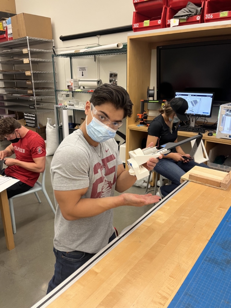
This project was completed in conjunction with my Mechanical Engineering teammates: Addie Stonecipher (Stanford ’23), Brandon Briones (Stanford ’23), and Ian Gunther (Stanford ’23). We completed this project for our ME104: Mechanical Systems Design course that we took in the Spring Quarter of 2022. We were named Tony’s Tigers, in loving tribute to our Teaching Aide, Tony Chen.
Summary
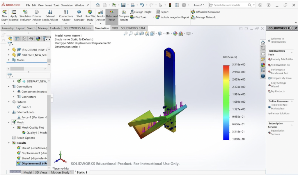
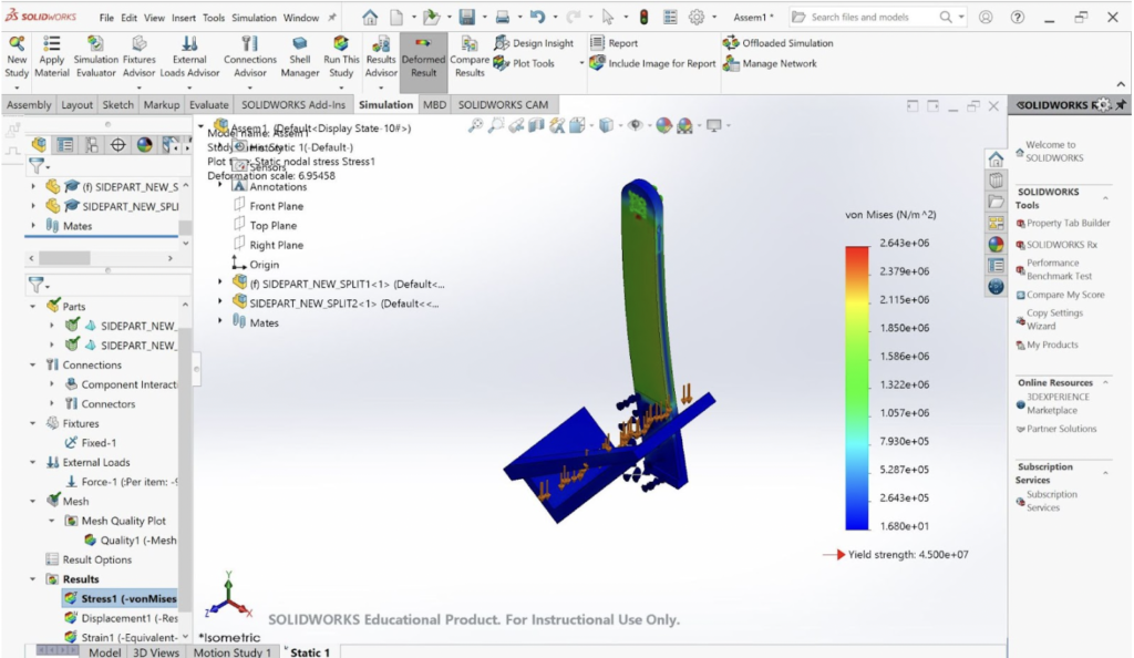
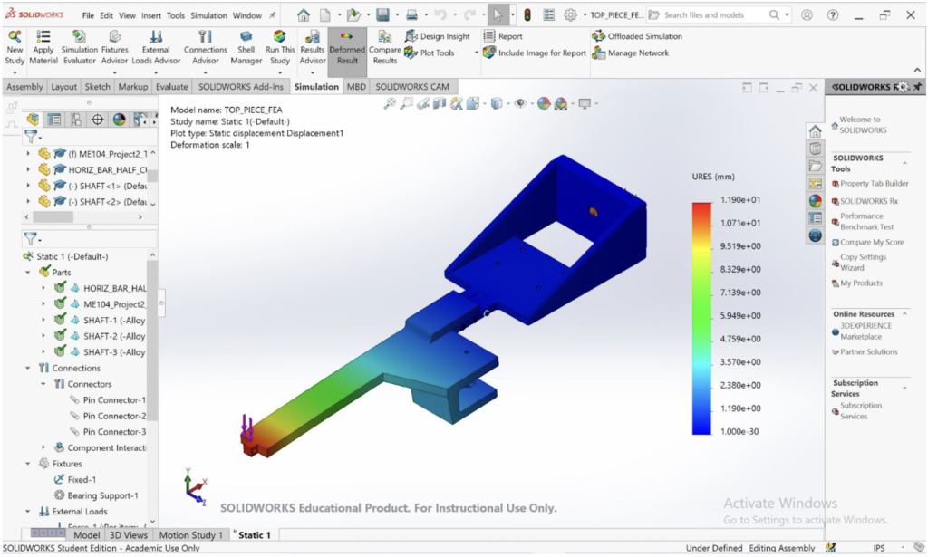
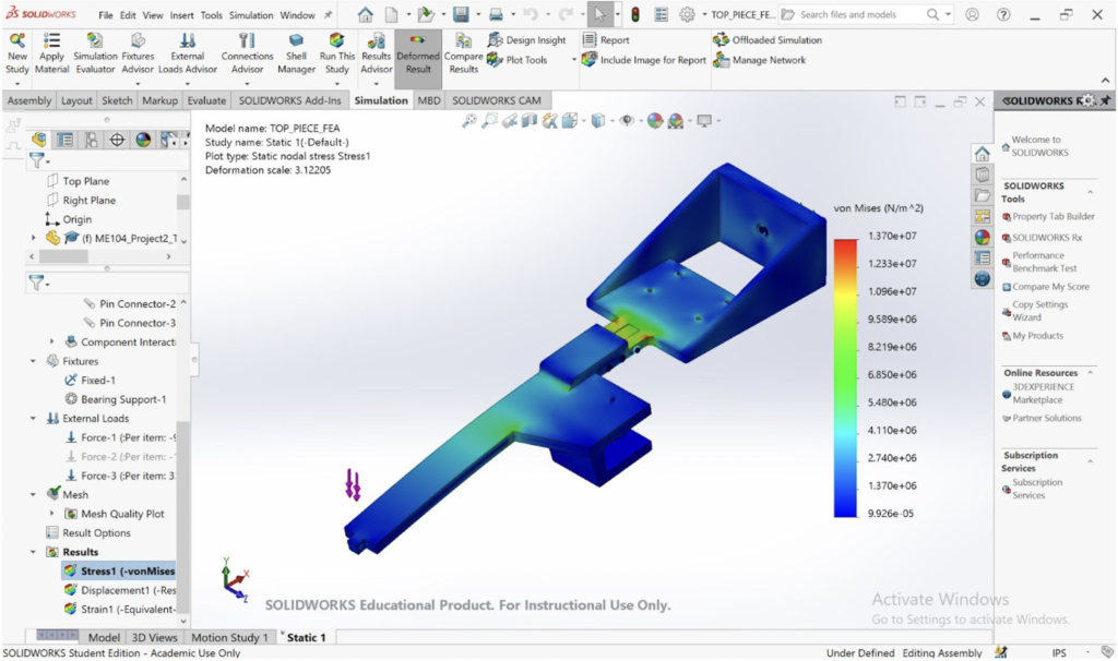
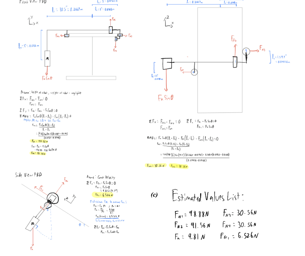
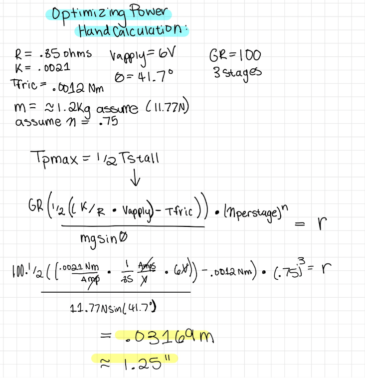
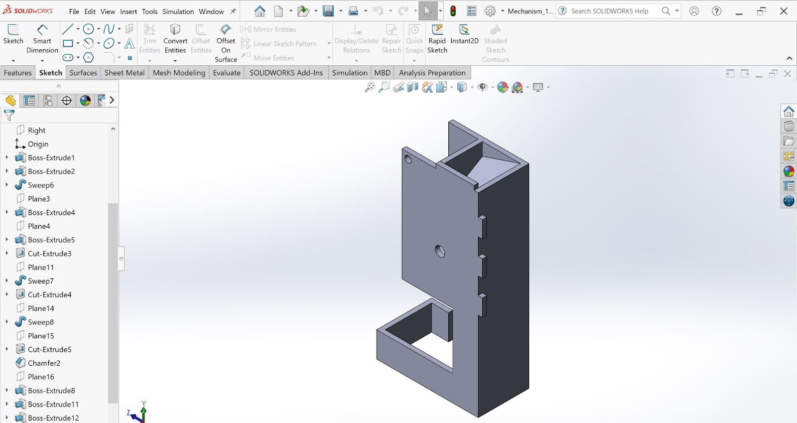
The robot was designed to carry a 1-kg payload one meter up the I-Beam at an angle of 41.7° as fast as possible while maintaining the payload 10.5 inches from the center of the I-Beam. The robot utilizes a simple design of a chassis, one driving wheel, and three driven wheels to constrain the robot around the beam, as well as a horizontal and vertical beam to hold the payload in the specified orientation. The normal force on the driving wheel was determined using FBDs. Given material constraints, the normal force required to sustain the coefficient of friction of 0.1 was reached by utilizing an increased lever arm from the payload to the driving wheel. Four wheels were used to counteract the moment on the driving wheel created by the payload in two planes and achieve static equilibrium. This was achieved by including the driving wheel on top of the I-Beam, the bottom wheel under the lip, and two side wheels offset from the horizontal axis of the robot to act as constraints. Stress analysis and FEA were used to determine the dimensions of the top beam and side beam to prevent breaking, reduce deflection, and increase mass efficiency. To reduce the deflection and stress of the top beam depicted by FEA, the thickness of the top beam was increased above and around the connection between the top beam and the chassis. The side beam was designed to hang vertically to the ground to reduce torsion on the connection point between the top and side beam, with a “cradle” attachment to keep the payload in the specified orientation. The cradle was positioned outside of the vertical beam to reduce the length, and therefore deflection, of the top beam by reducing the maximum applied moment. Fixed connections between the side beam, top beam, chassis, and side housing were created using square pegs and pin connections in order to constrain all degrees of freedom. In order to increase power, and therefore reduce climbing time, transmission analysis was performed to determine the torque at max power. This value for torque was used to design the final radius of the driving wheel at 1.25 inches.
Free-Body Diagrams:
For each FBD, acceleration was assumed to be constant, and the height and weight of the robot were assumed to be negligible. For the moment balance in the front view FBD, moments from wheels 3 and 4 were neglected because FN3 = FN4 and they are at equal vertical distances from wheel 2.
Transmission Analysis:
Set-Point Approach
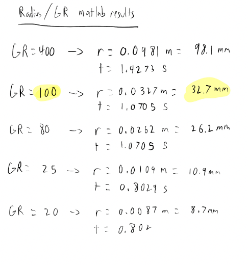
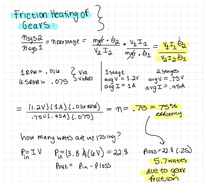
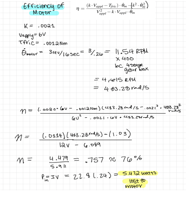
Time is inversely proportional to power, so in order to decrease the time it takes for the robot to climb the beam, the torque at max power was calculated. To calculate this torque, an equation was derived that is equal to ½ the torque when the motor is stalled. This equation was calculated by hand and incorporated into a matlab script to estimate various combinations of the radius of the wheel and gear ratio that would allow the robot to climb the beam at maximum power. The voltage was capped at 6 Volts for this project, and since P = IV, the maximum value of 6 Volts was applied in order to maximize power. The mass of the entire robot including the payload was assumed to be 1.2kg for this analysis. After the hand calculation was done, a radius of .03169m was found using a gear ratio of 100:1. The Matlab script was run to derive different radii and fastest times given various gear ratios. The radius and gear ratio that were found with the hand calculations were confirmed, as having a 3 stage gearbox was calculated to be faster than having a 4 stage gearbox while still providing sufficient torque, and the calculated radius was a reasonable size compared to the physical size of the motor.
Set-Point Diagram
Power Flow
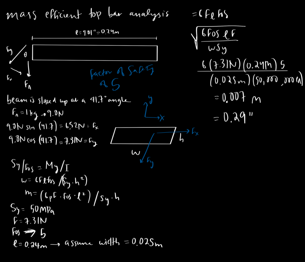
Component Analysis 1: Top Bar
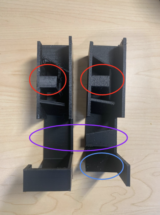
The top bar of the robot is fixed on one end and supports the payload on the other, increasing the susceptibility to bending. The top bar has a length of 0.24m and is assumed to have a width of 0.025m. The bending analysis demonstrated that the expected height of the top bar was to be 0.007m, with a safety factor of 5. The right end of the top bar has three pin connections, fixing it rigidly to the motor housing. The FEA illustrates that this end of the bar is the most stressed area of the component. In order to prevent deflection here, this part of the bar has a height twice the size of the rest of the component.
The left end of the bar has a square peg and shaft that goes through the sidebar of the robot. The square peg and shaft restrict all degrees of freedom, prohibiting the payload from swinging or falling.
BOTEA of the Top Bar
FEA Analysis of the Top Bar
In the analysis of the top bar, the FEA considers the reactions of the chassis and the horizontal bar together, to account for the forces acting on the part via the driving wheel. The load acting on the shaft and bearing connecting the driving wheel to the chassis is half of the normal force acting on the driving wheel or 49.44N, and each of the four holes that constrain the motor to the chassis bears an ⅛ of the normal force or 12.36N. There is a 9.81N load acting on the end of the top bar, simulating the weight of the payload. The horizontal bar and the chassis are connected via 3-pin connections, and the square peg of the chassis–away from the horizontal bar–is constrained via fixtures to simulate the connection to the side housing. Where the shaft and the bearing connect the driving wheel to the chassis, the FEA model implements a bearing fixture.
The stress analysis demonstrates that the highest points of stress are at the pin connections between the chassis and the horizontal bar. The top bar is doubled in thickness at this point of concern, so as to accommodate this stress region. This increased thickness also increases rigidity and ultimately decreases deflection.
Furthermore, the displacement analysis of the top bar and the chassis demonstrates deflection at the end of the shaft close to the pin connection between the top and sidebars. The height of 0.007m is set to accommodate the potential deflection of the top bar. With this design parameter, the top bar is expected to only deflect 0.0119m at the greatest point of displacement.
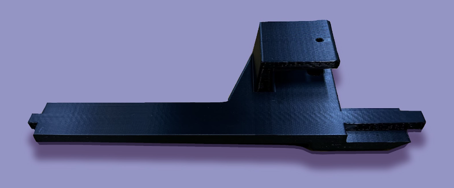
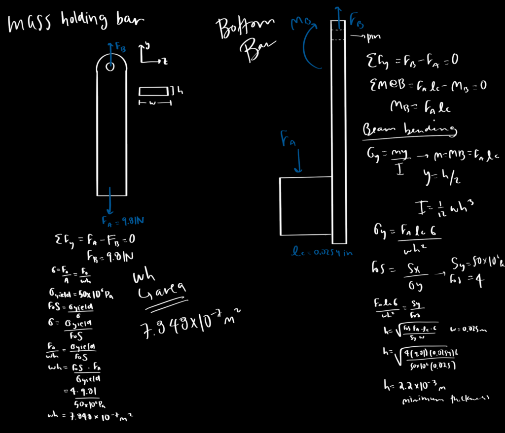
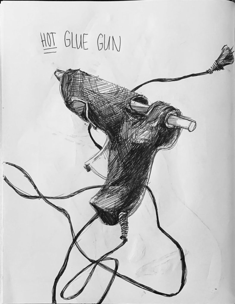
Component Analysis 2: The Side Bar
The sidebar was designed as two pieces, fixed together using hot glue: the vertical bar that implements a square slot to conjoin with the top bar, and the angled cradle to hold the payload. The slot for the top bar accounts for a square peg and a pin connection so that the sidebar could be positioned vertically, to reduce torsion on the connection point and to reduce swinging. Increased torsion would increase the stress and deflection of the sidebar, too much of which would result in interference between the top bar and the I-beam, which would reduce the normal force on the driving wheel. Swinging would decrease the stability of the robot, while greatly impacting the normal force on the driving wheel. To account for the assignment requirements to position the payload properly with the centroid of the I-beam, a “cradle” attachment physically constrains the payload at the proper angle. The “cradle” is positioned on the outward-facing side of the sidebar, in order to reduce the length of–and ultimately possible deflection of–the top bar. The maximum possible moment created by the horizontally-displaced payload is therefore decreased, as a result of the shortened top bar. To follow the existing geometry of the top bar, the width of the sidebar is selected to be 0.025m and the thickness of the bar is then calculated to be 2.2 * 10-3m with a factor of safety of 4.
BOTEA of the Sidebar
FEA of the Sidebar
An FEA was conducted on the part by fixing the square peg as it is restricted in all degrees of freedom. A force of 9.81 Newtons was vertically applied on the surface of the cradle. Our FEA results show that our part is unlikely to break during the applied load, and will slightly deform towards the I-beam. The FEA results show the highest stress concentrations are around 90° angle of the cradle. However, even the highest stresses of the part are well under the yield stress of PLA. This is by design, as a high safety factor of four was chosen to ensure that the part does not break if the mass is bouncing or is experiencing other complications.
The part was designed to have a vertical sidebar with the cradle angled at 41.7°, the angle required to hold the payload. This was in order to reduce the moment the sidebar applies to the top bar when it is angled. By allowing the bar to remain vertical, it reduces the deflection and stress, resulting in a more efficient part. The FEA supports this idea by showing the minimal stress experienced by the sidebar. However, the sharp angle in the cradle is experiencing a higher stress, so a crossbar was added and the thickness of the cradle was increased such that the stress does not exceed 12.5 MPa.
Due to our high factor of safety for this part, it is expected to not cause any issues for the system. Empirically this was true and the part functioned as expected.
Process Photos
Performance
As the above video demonstrates, our robot successfully climbed the designated 41.7° I-Beam with a 1kg load of aluminum 10.5 inches away from the center of the beam. With an applied voltage of 6V, there was an overall gear ratio of 3125.0 radians/minute and a measured motor current of 3.8A. Given that we were optimizing the robot for speed, our pull time of 3.93 seconds made our robot one of the fastest and most high-performing in the group!
When I was enrolled in CS147: Introduction to Human-Computer Interaction, I devoted the ten-week class to developing EduCare, an app designed to educate young adults about their healthcare. For a project designed for groups of three or four, unprecedented circumstances led to my group being reduced to a team of myself and Nate Fleischli. Together, we used an arsenal of tools ranging from rapid paper prototypes to Figma to React Native and Expo to develop a fully-fleshed mobile application.
Although I wish to share my designs in their entirety, confidentiality agreements require me to block out all of the specific text and images, but I have done my best to maintain the design of the system I have worked on. If you have any further questions, please feel free to reach out.
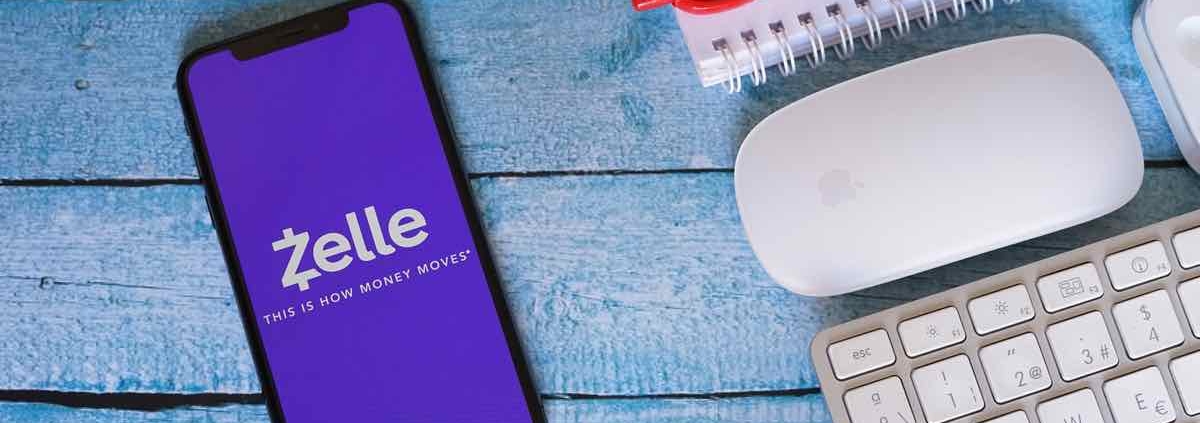
During the summer of 2022–from May to August, I worked as a Product Design intern for Zelle through Early Warning Services (EWS). I worked alongside a stellar team, comprised of EWS employees–Emily Tseng, Jonathan Carver, Megan Manley, Daphne Huang, and Sean Loosli–and Awasu, a design team of Craig Peters, Cara Adelmann, Varun Mehra, Eric Townsend, and Coco Ramgopal.
For one of our projects, we studied the user interfaces of other apps to develop a competitor matrix. After exploring other money transfer apps like Venmo, CashApp, and Paypal, we were able to create diagrams to pinpoint Zelle’s strengths and areas of improvement and identify a future trajectory for directions the system should move in.
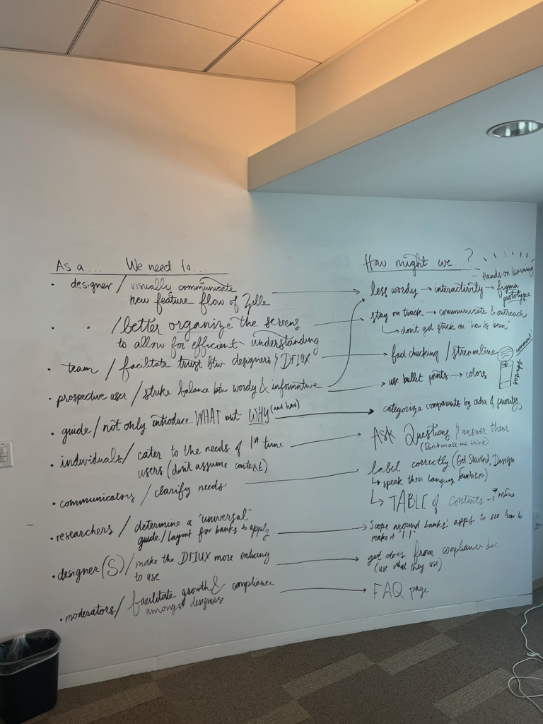
Although the experience was remote due to COVID-19, I was nevertheless able to develop skills as a designer–I had the privilege of attending meetings with Early Warning Services executives and all-team Product meetings. I was even able to commute to work at the San Francisco meetings, participating in a design conference where the team flew in from different areas of the country to collaborate on our main project. Since Zelle is owned by the seven largest banks in America, we wanted to streamline the communication between Zelle and the banks that implemented the money transfer system within their respective mobile apps. The existing platform, also known as the dFIUX–or digital Financial Institution User Experience Guide–was experiencing numerous bugs and existed on a static content platform, meaning that any changes to the screens would require a complete re-upload of the screens into the system. Due to a number of discrepancies in the communications between designers and engineers, we were tasked to create a novel way to communicate the requirements of the dFIUX to the designers.
We started by conducting user research interviews with employees at Morgan Stanley and JP Morgan, and compiled these interviews into POVs and How Might We Statements.
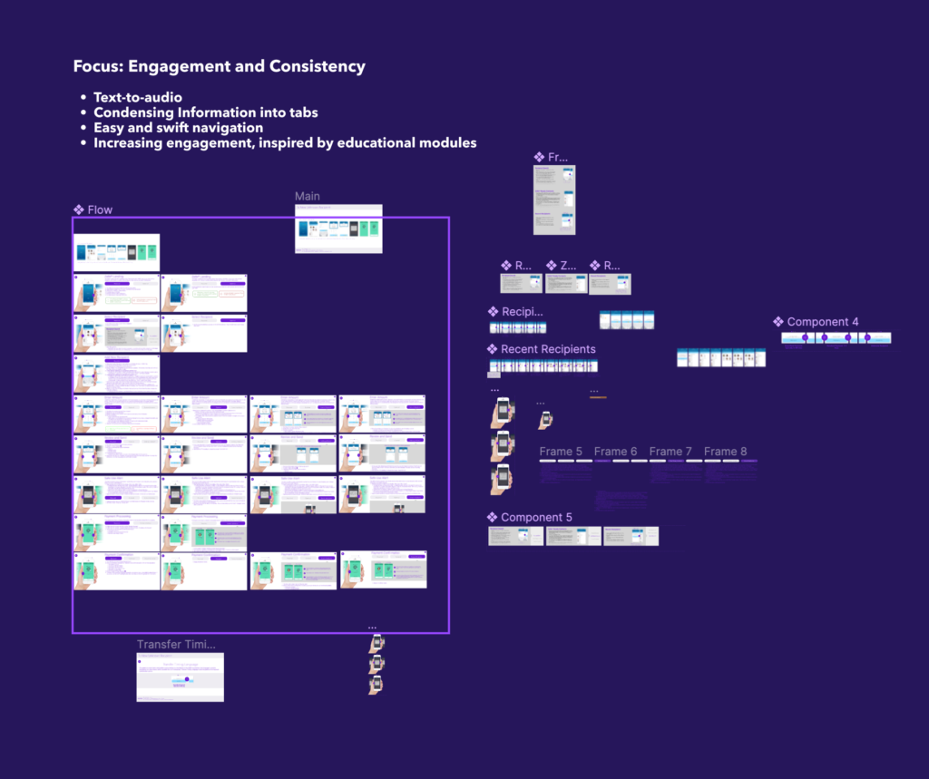
From the needfinding interviews, I determined that some notable pain points with the dFIUX were that the content was sometimes overwhelming due to wordiness and lack of engagement. There was also a desire for a clarification of requirements and needs and improved organization. Following the brainstorming sessions in the San Francisco office, we were then tasked with using Figma to develop a wireframe prototype for what this content management system would look like. Looking over my notes, I knew that I wanted to prioritize engagement and consistency as my design values when redesigning the dFIUX. I wanted to implement a text-to-audio feature within the system to allow people to engage with the content through their other senses, to reduce visual exhaustion and overwhelming amounts of visual text. I also wanted to condense the information into tabs to provide the designers with the content on a need-to-know basis, so that the user can have a better understanding of how to clearly navigate the guide. Most importantly, I wanted to see if I could gamify the dFIUX, not only to increase engagement but to also provide the content to the designers in an easily digestible manner.
Although the text and images are blurred out in my interactive Figma prototype, you can still understand how to navigate between screens and pages within the dFIUX prototype. Here is a video of the prototype in action:
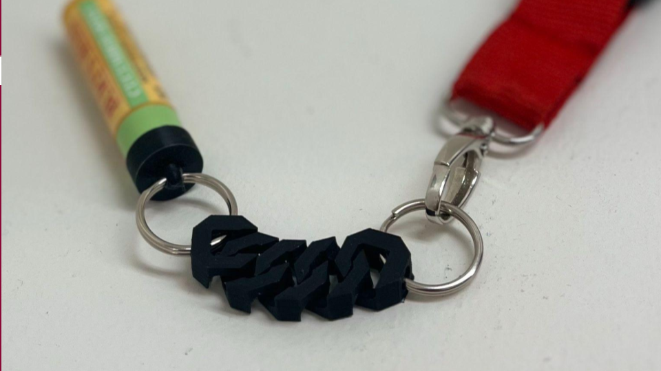
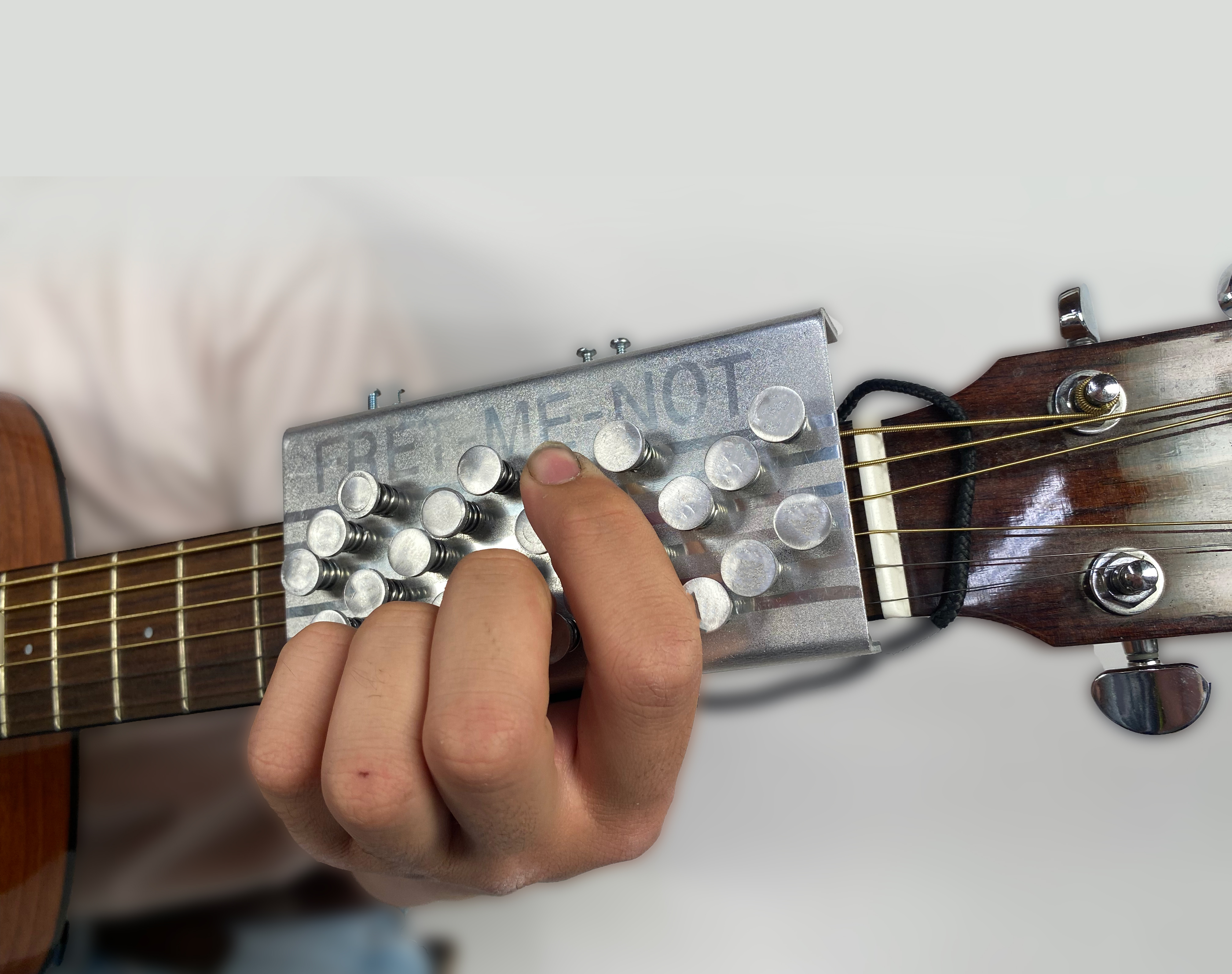
As a disclaimer, the Fret-Me-Not is affiliated with any similar products on the market. When I was designing the Fret-Me-Not, I had believed it to be an original creation, with no knowledge of any existing models.
If you want to check out a succinct version of my product story, please feel free to check out my photo essay here!
As a designer, one of my greatest passions is to determine an accessible way for people who may be unlike me, whether in physical or cognitive capabilities, to engage with the world as I do. As I am an avid lover of art and music, these are two of the primary ways through which I want to tackle this challenge. When tasked with designing and manufacturing a project for my ME 103 course, I wanted to take the first step towards my goal for accessible and inclusive art and music.
When the stay-at-home order was enacted in 2020, I started trying to learn how to play the guitar. I fumbled around with a couple of strings and chords, but whenever I would make any headway, my fingers would develop callouses. I would become discouraged from continuing with my guitar-learning process, and my guitar would continue to collect dust in the corner of my room. When my callouses heal, I would redevelop interest and continue this cycle over again. Reflecting on my experiences, I was concerned for those who might be like me–looking to learn how to play the guitar but barred from doing so because of personal physical circumstances or a lack of desire to deal with pesky callouses.
Final Hero Shots of the Refined Product
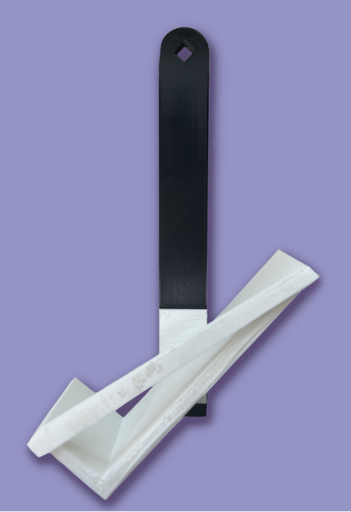
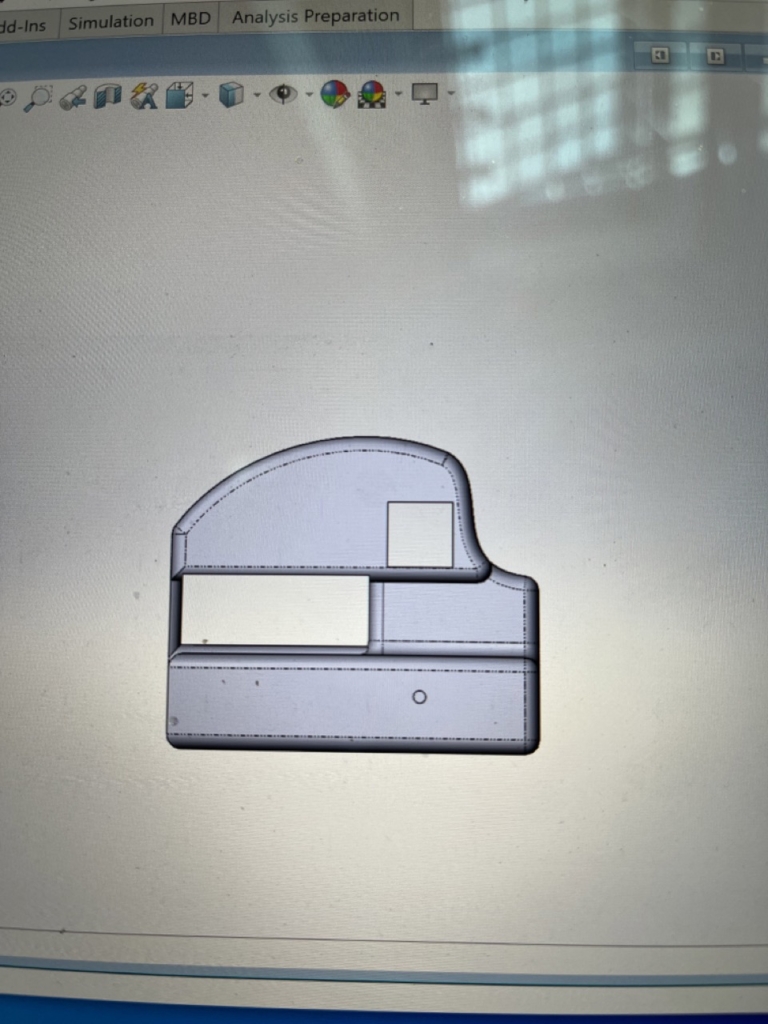
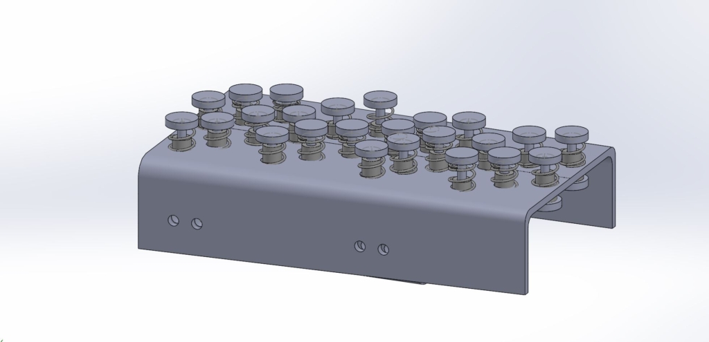
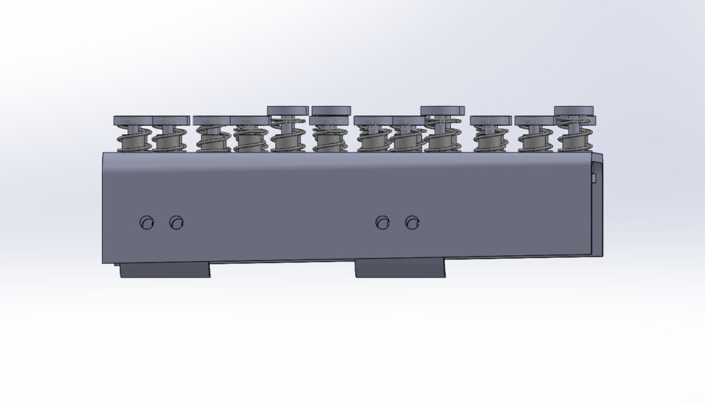
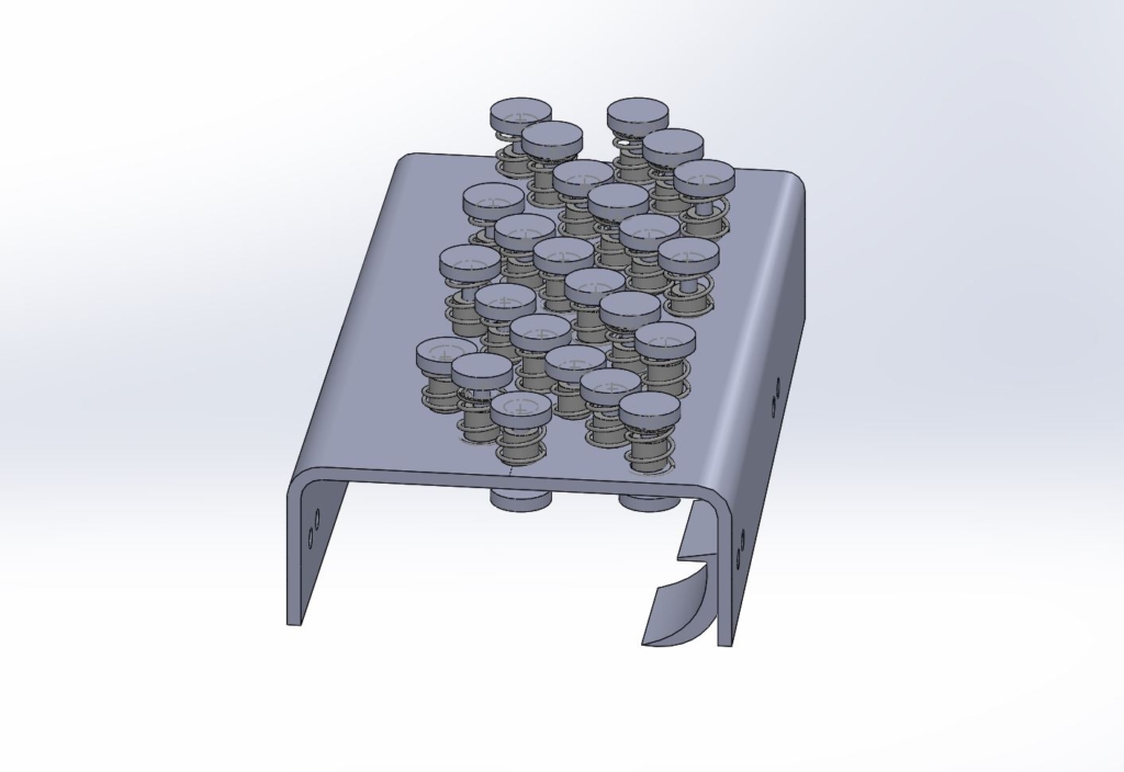
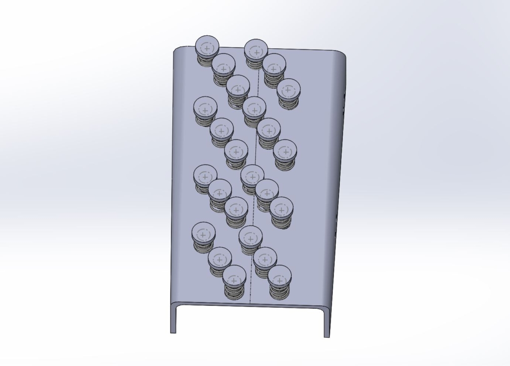
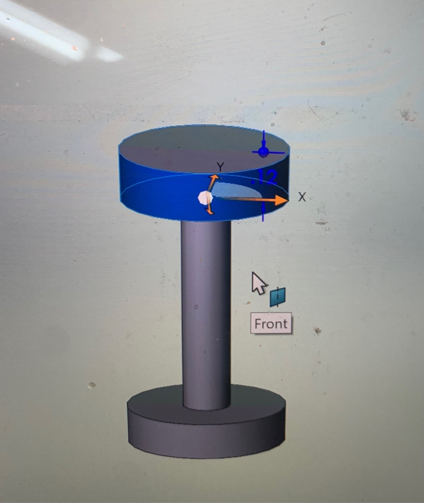
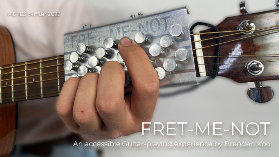
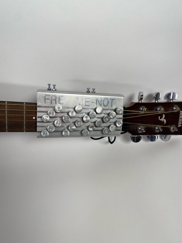
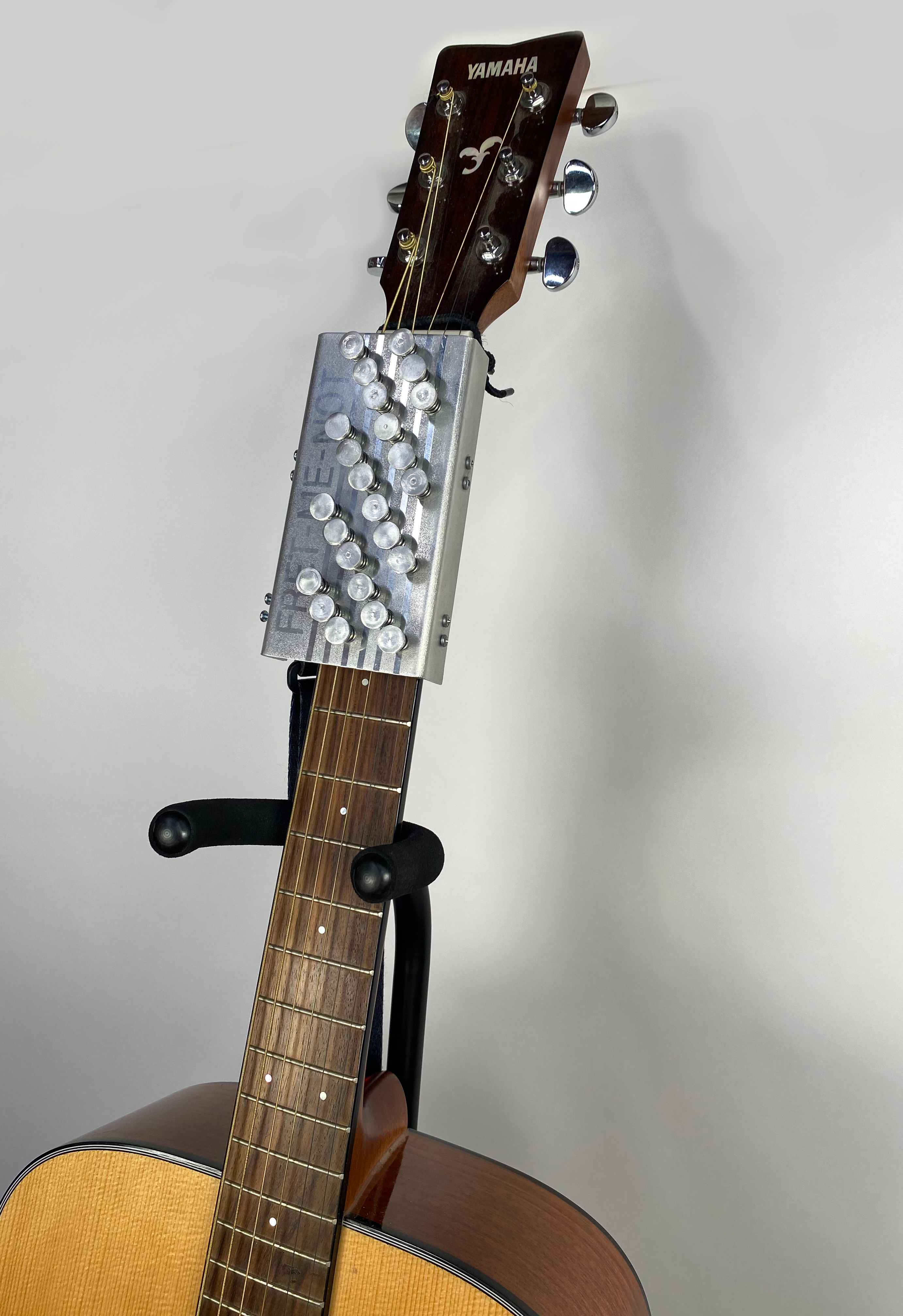
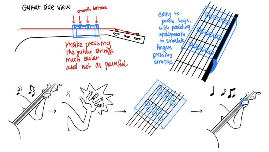
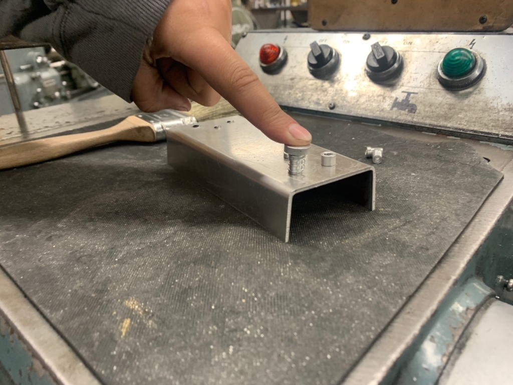
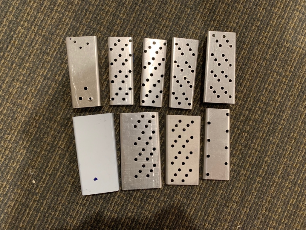
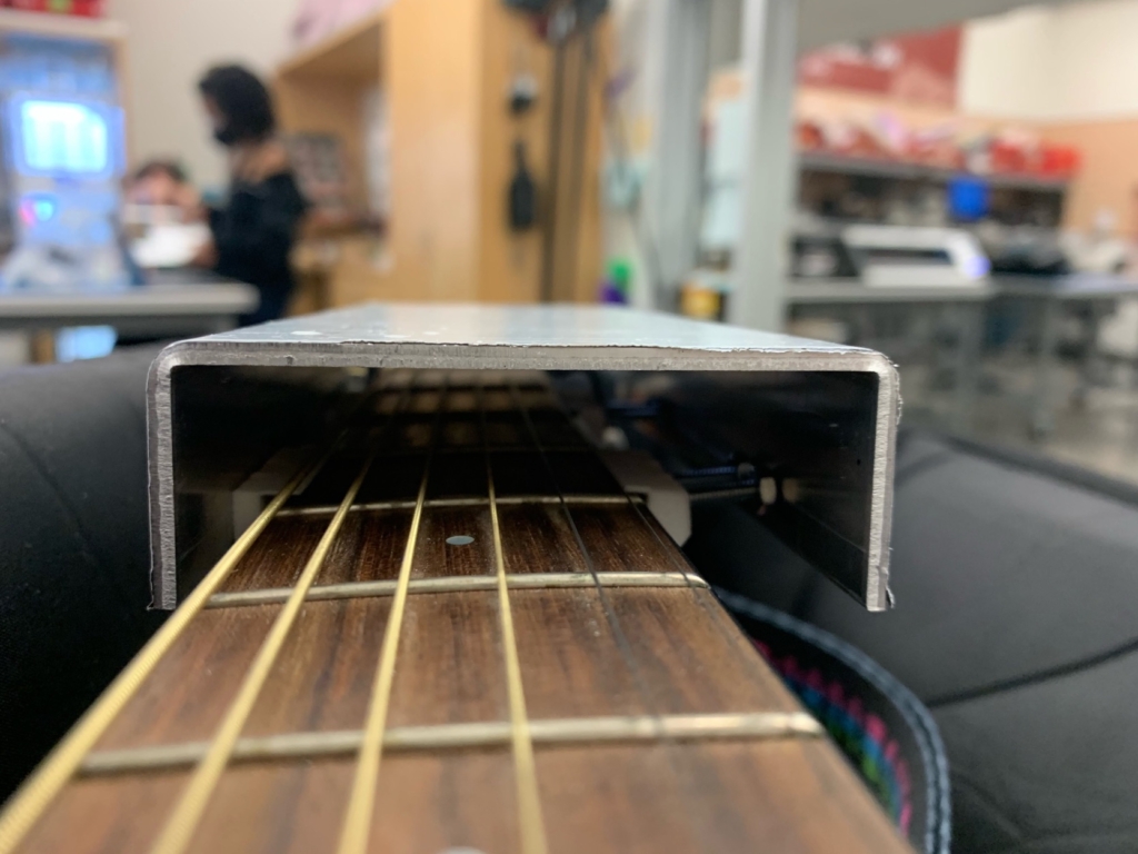
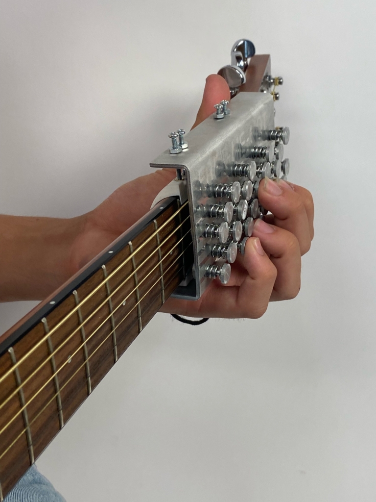
As a result, I designed the Fret-Me-Not, which is a guitar attachment that allows anyone of any physical capability to play the guitar. What I really appreciated about this project was the opportunity to have full autonomy over the product from the obtaining of raw materials to designing the assembly of the product to the actual machining processes. The Fret-Me-Not functions by screwing onto the neck of the guitar with a set of four 3D printed clamps. There are 24 hand-turned buttons spring-loaded into bearings that are press-fit into a sheet of aluminum. Each of the buttons are positioned in four groups of six, so that there could be one button on each of the six strings for the first four frets. The idea behind the product is that the user is able to press the smooth buttons of the product to activate the strings, avoiding the callouses caused by the harsh textures of the guitar strings.
Designing the Product
From the start of the project, my brainstorming process involved the usage of spring-loaded buttons for the Fret-Me-Not. Since the Fret-Me-Not is a tool designed for beginning guitarists, I made the executive decision to position the product in the first four frets of the guitar, where most of the common guitar chords are located. It is for the same reason that I designed the Fret-Me-Not to be in a fixed position connected to the neck of the guitar. Although it is not a permanent fixture, it is not something that will be flimsy or fall off while playing the guitar.
The questions that I was posing to myself at this stage of the process were whether the product should be secured to the neck of the guitar via a string-loaded mechanism (not unlike a capo) and which material should I use?
CAD Models
CAD Models of my Fret-Me-Not Assembly
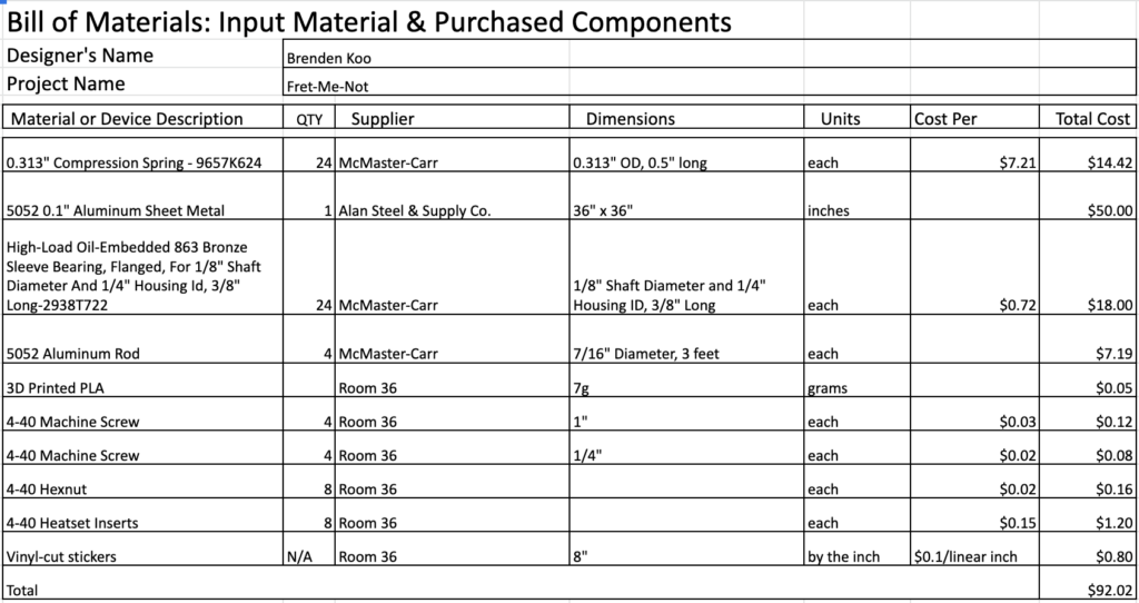
Bill of Materials
Bill of Materials
Prototyping and Machining
The different prototypes of my product
I wanted to push myself through this experience by using the following machining processes: Turning with Lathe, Sheet Metal Bending, Press-Fitting, 3D Printing, Bead Blasting, Sanding, Polishing. The materials I used in the product are Aluminum, Bronze, and Zinc-Plated Steel.
I faced a number of difficult challenges during this project. I had a lot of issues with the specific dimensions: I didn’t know how high above the guitar strings the buttons should be situated. I didn’t know how far apart the buttons should be from one another so that they could each interact with a different string on a different fret without pushing down or muting other strings. I didn’t know how wide the bent piece of aluminum should be, since I wanted it to be attached to the neck of the guitar but didn’t want it to be physically constrained to, and potentially damage, the wood. I ultimately iterated 9 different “less-successful” versions of my prototype before finally arriving at my final design.
I also had an issue with how the product would secure to the neck of the guitar. With the help of the ME 102 Professor, Dan, and my ME 103 coach, Jack, I designed 3D-printed clamps that would screw into the side of the guitar without the screws breaking through to the wood. In order to do so, I had to model the neck of my guitar in SolidWorks in order to find the perfect angle for my clamps be able to constrain the product properly.
Working in Room 36 on the 3D-printed clamps
Another challenge had to do with tedium. Since I was designing a product with 24 identical buttons, I was doing a lot of scaled manufacturing. I had to spend hours upon hours hunched over the lathe in the Stanford Product Realization Lab doing the same repetitive actions turning and threading the tiniest stock of aluminum. I had to machine identical buttons to be the same exact dimensions, and make sure to be delicate so as to not deflect or damage the material. I had to make sure to give a hundred percent of my attention to the lathe, so that I wouldn’t accidentally mess up my dimensions or prematurely part the material. I was able to streamline the entire process to ensure that, even though I was turning and threading each of my buttons individually, I could effectively and efficiently machine them as a whole in a relatively quicker period of time.
Final Iteration and Finishing Touches
After figuring out all of the dimensions of my product, I then assembled everything together. I cut out vinyl stickers to resemble the strings of the guitar and to read out the words “FRET-ME-NOT”. I then stuck these vinyl stickers onto the base of my product, and then I bead-blasted the part to have a nice finish on my product. Following this, I carefully (careful so as not to ruin the finish or the piece itself) press-fitted my bearings into my bent piece of sheet metal and placed the springs on each of the bearings. I sanded the tops of the buttons to create a uniform finish across the top, and then screwed these buttons into the little discs that would interact with the strings of the guitar. I then screwed in my clamps and secured the product to the neck of the guitar, as intended.
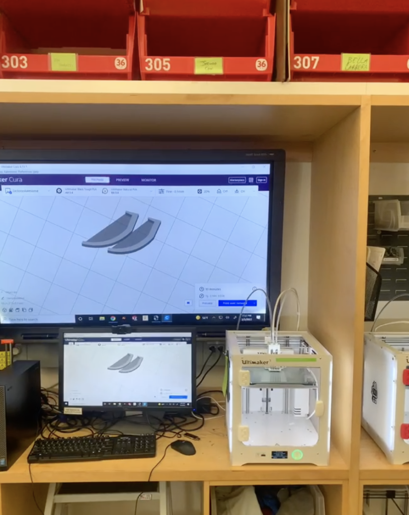
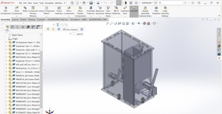
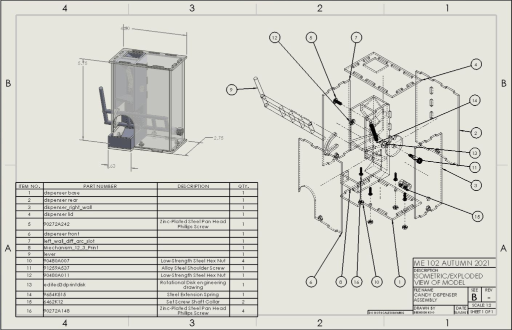
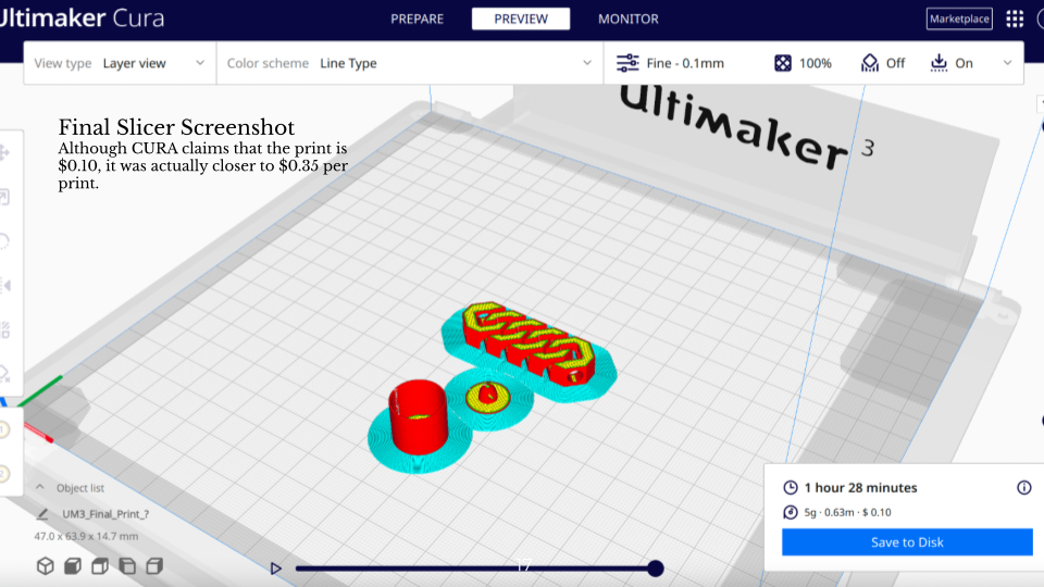
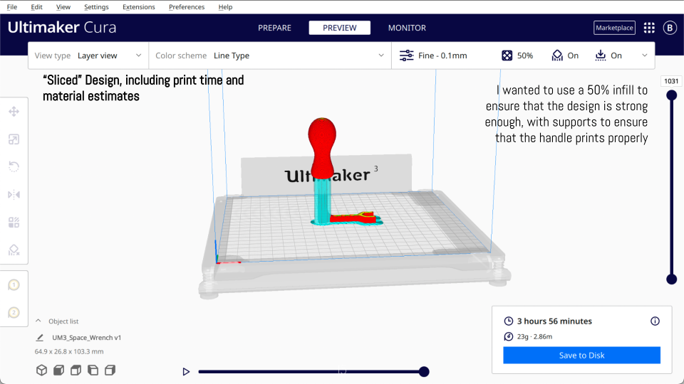
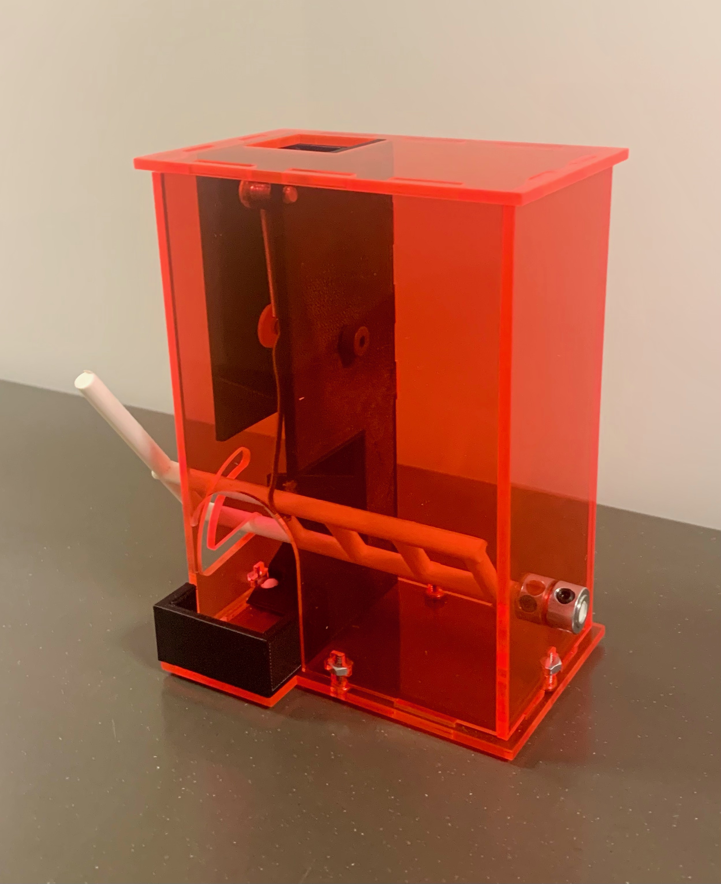
To access the PDF of my Candy Dispenser Photo Essay, please follow this link here.
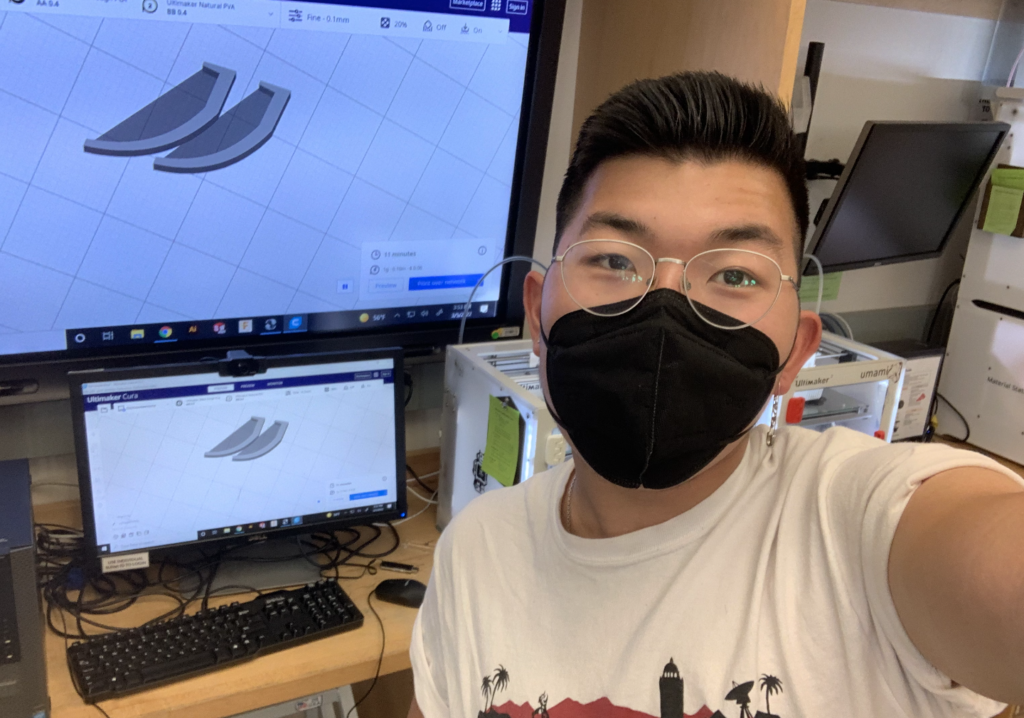
In my Stanford ME102: Foundations of Product Realization class, we focused a lot on taking our product design abilities to the next level, beyond rapid prototyping. We would design 3D models using Computer-Aided Design (CAD), and use laser-cutters or 3D printers to bring our designs to life. The class is a very thorough introduction to product realization, as the designs were not finished once they were 3D printed or laser-cut. We would continue to assemble our models using hardware provided for us in the Product Realization Lab, and we would even keep a bill of materials.
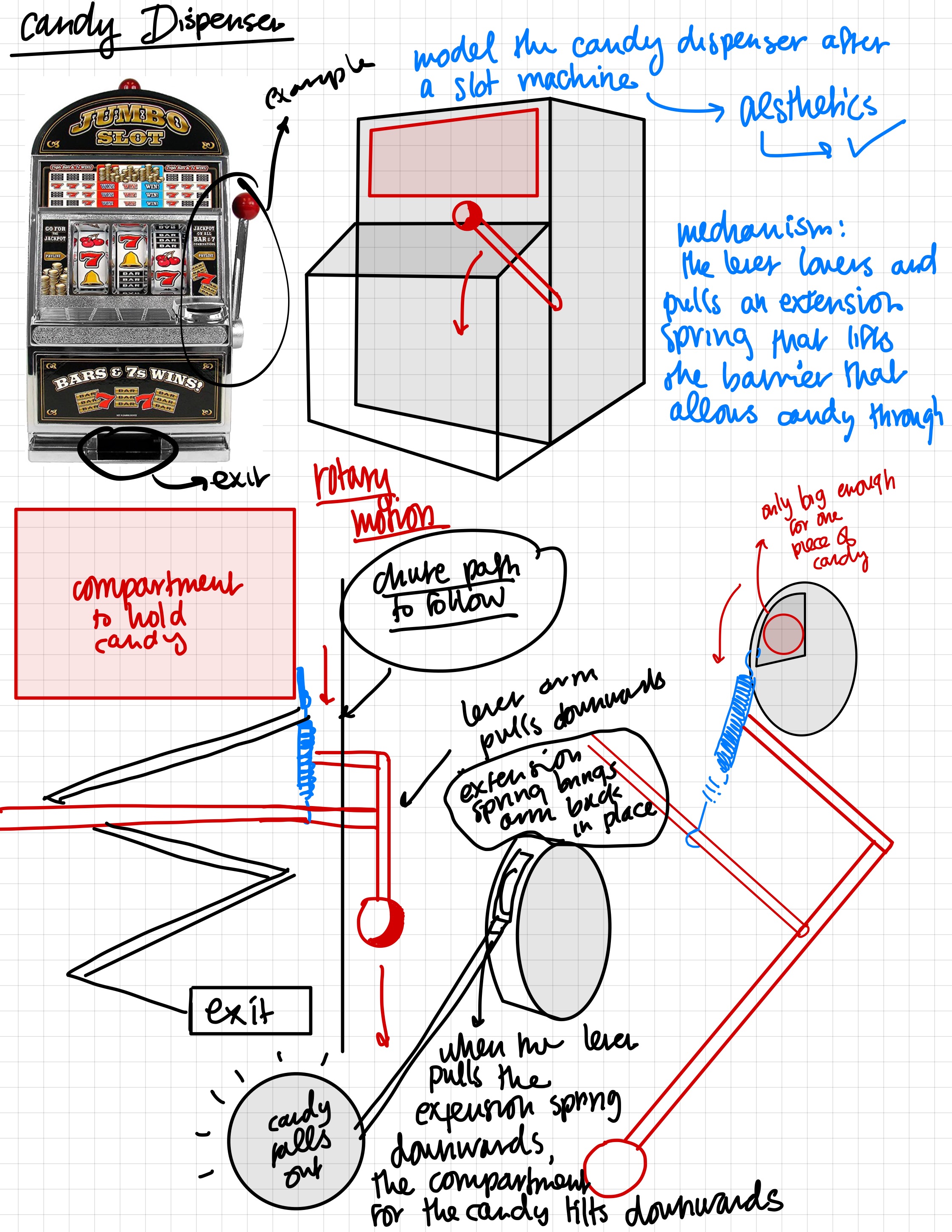
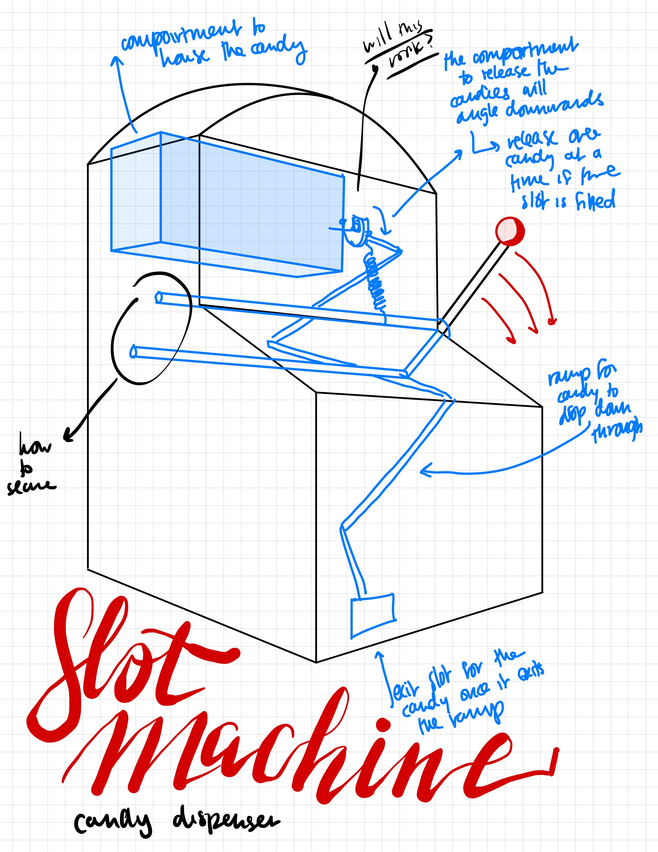
For my final project, I was tasked with the challenge of sketching, designing, prototyping, and digitally fabricating a candy dispenser, and I was only given the following criteria:
The candy dispenser must:
store at least 20 artificial candies, which will be provided to you. Candies will be loaded without preference to position relative to one another.
dispense only 1 candy per user actuation/input and reset for the next dispensing
the dispensing action can be “passive” (such as a gumball machine where the gumball falls due to gravity)
the dispenser can be “active” with some kind of launching action
the dispenser can be “silly” and dispense back into itself (search “useless machine”)
include a controlled, specific location for the dispensed “candy”; the “candy” cannot just drop onto the table below the dispenser.
use rotary motion to actuate; this could be turning a knob or moving a lever through an arced path
hardware for rotary motion (bushings, bearings, shafts, etc.)
a spring (compression or extension) subject to a preload, hard stops, and a purely linear load between its endpoints.
be operable with one hand
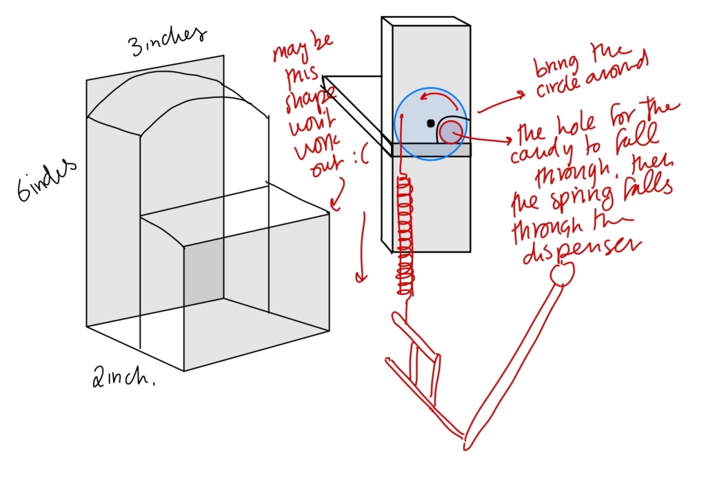
fit within an approximately 6” X 6” X 6” volume
Skills/Programs Utilized:
SolidWorks (Computer-Aided Design)
Ultimaker CURA
Laser-Cutter
Ultimaker 3D Printer
Adobe Illustrator
Design Sketching
Rapid Prototyping
Getting Started
In my initial brainstorming stages, I wanted to focus on these assignment requirements:
Use rotary motion to actuate
I took inspiration from slot machines, as the levers are pulled in arced paths, and the bar that extends from the lever handle can interact with the mechanism and ultimately dispense the candies.
Dispense only 1 candy per user actuation/input and reset for the next dispensing
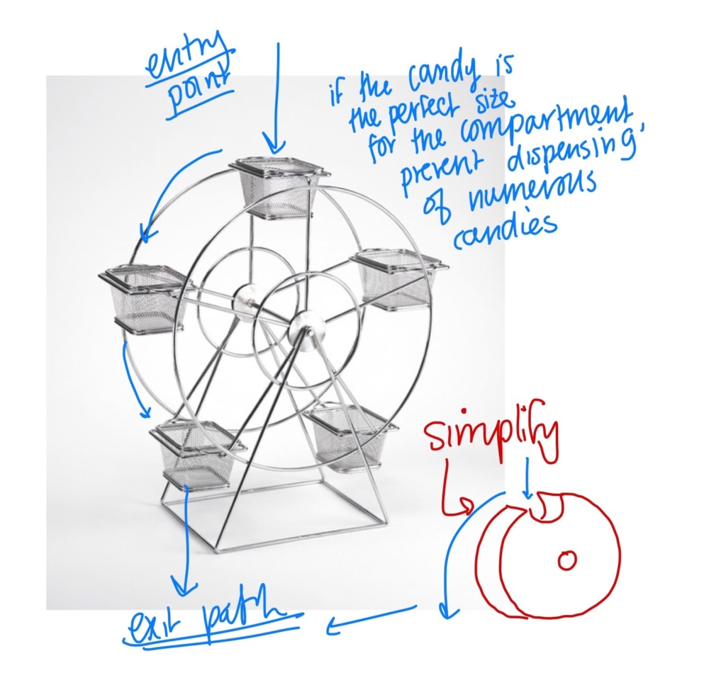
For the second condition, I took inspiration from ferris wheels, as a wheel of the right size can let me carry one piece of candy at a time and, with every rotation, it can dispense the candy individually.
Refining the Design
The essential components
Top compartment to store the candies
Disk that is connected to the lever via a spring so that when the lever is actuated, the disk will rotate and dispense the candy that is currently stored in the groove
The disk is next to the compartment, and the candies will travel through an opening in the compartment into a groove in the disk
Path for the candy to travel down until arriving at the compartment at the bottom of the dispenser
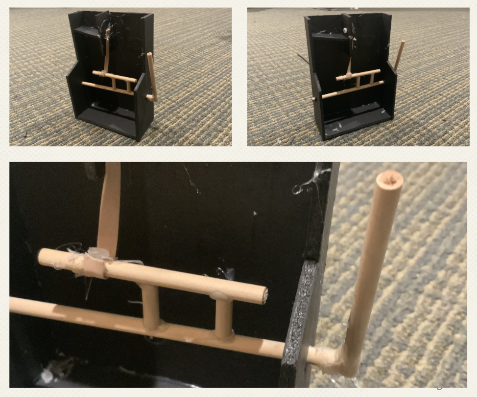
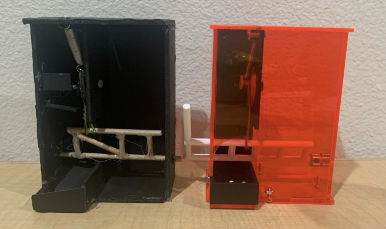
Rapid Prototyping
Issues: The disk next to the compartment made it difficult to dispense one candy at a time, as it didn’t have the desired funneling effect The elastic connection between the disk and the lever made it so that pulling the lever had no real effect
Back to the Drawing Board
Following the less-than-stellar results of my rapid prototype, I decided to revisit the idea of how the interior mechanism of the candy dispenser would function:
I wanted to create an opposition of forces with the spring and the static wire that connects the disk to the lever
The wire would rotate the disk down to dispense the candy to the path, and the spring would automatically reset the disk to collect the next piece of candy ready
With this new design, only one candy would dispense at a time, as the next candy would rest atop the disk and cannot fall until the groove opens up
Functional Prototype
I started the prototype from scratch, applying the changes from my rapid prototype. I fixed the disk underneath the container to hold the candies, used the spring to reset the disk and a static connection to join the disk and the lever.
Strengths
Placing the disk underneath the “funnel” definitely let the candies more efficiently and accurately fall into the groove of the disk
The prototype is fully functional and even resembles a general idea of the final product
Dispenser not only functions but fulfills the requirements of the assignment
Weaknesses
The input lever would be too weak to actuate from outside of the dispenser, needs to be activated from inside
The Spring was the wrong expansion spring and I had mounted the spring weirdly (it had led to some bending in the spring)
I was determined to improve my prototype in the following ways:
In order to strengthen my lever, I could create an arced slot for the lever to extend the lever base across the width of the dispenser (and initiate a hard-stop for the preload)
I could fix my spring mounting issue by mounting the spring on a dowel pin on the model (instead of “threading” it through the walls of the dispenser
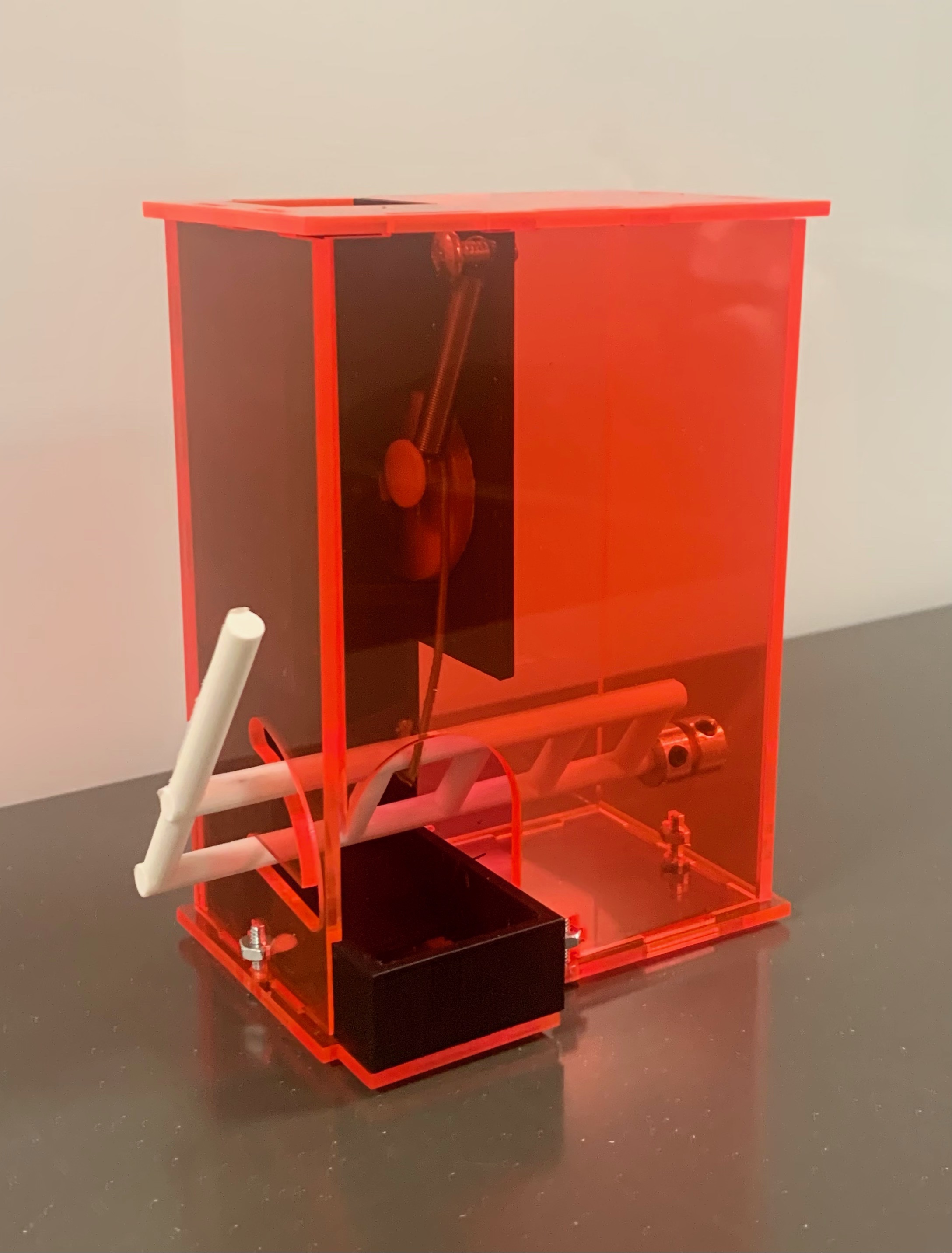
Digital and Physical Modeling
3D Print
I wanted to 3D print my interior mechanisms and my lever, as those would be elements of my dispenser that would require 3-dimensional extrusion and cuts
Laser-Cut
I wanted to laser-cut the walls of my box, as this would be more time-efficient and the box faces could just be cut and assembled. I laser-cut into ⅛” thick acrylic plastic
Hardware
I used the following hardware:
Spring
Shoulder Screw
Machine Screws
Hex Nuts
Steel Collar
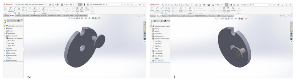
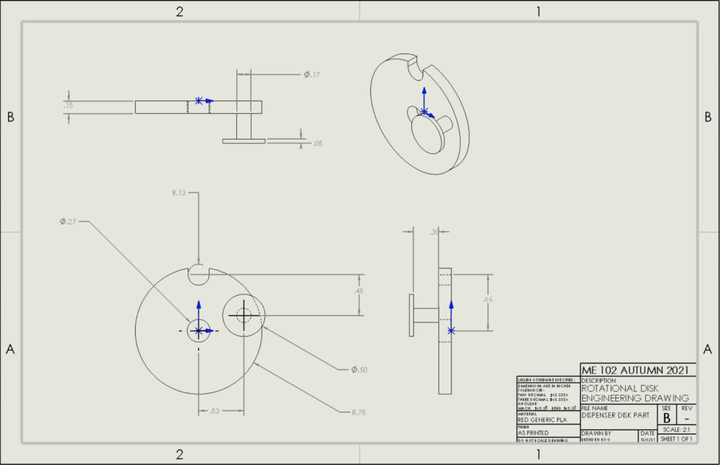
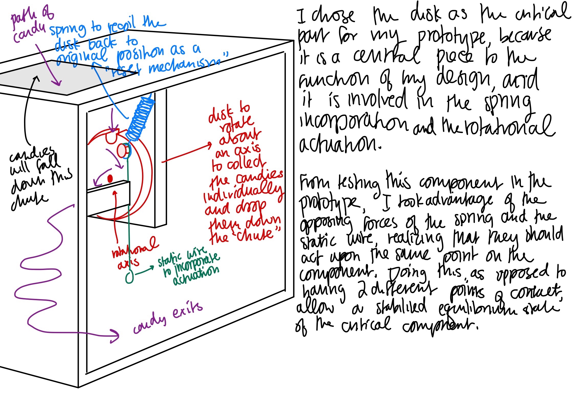
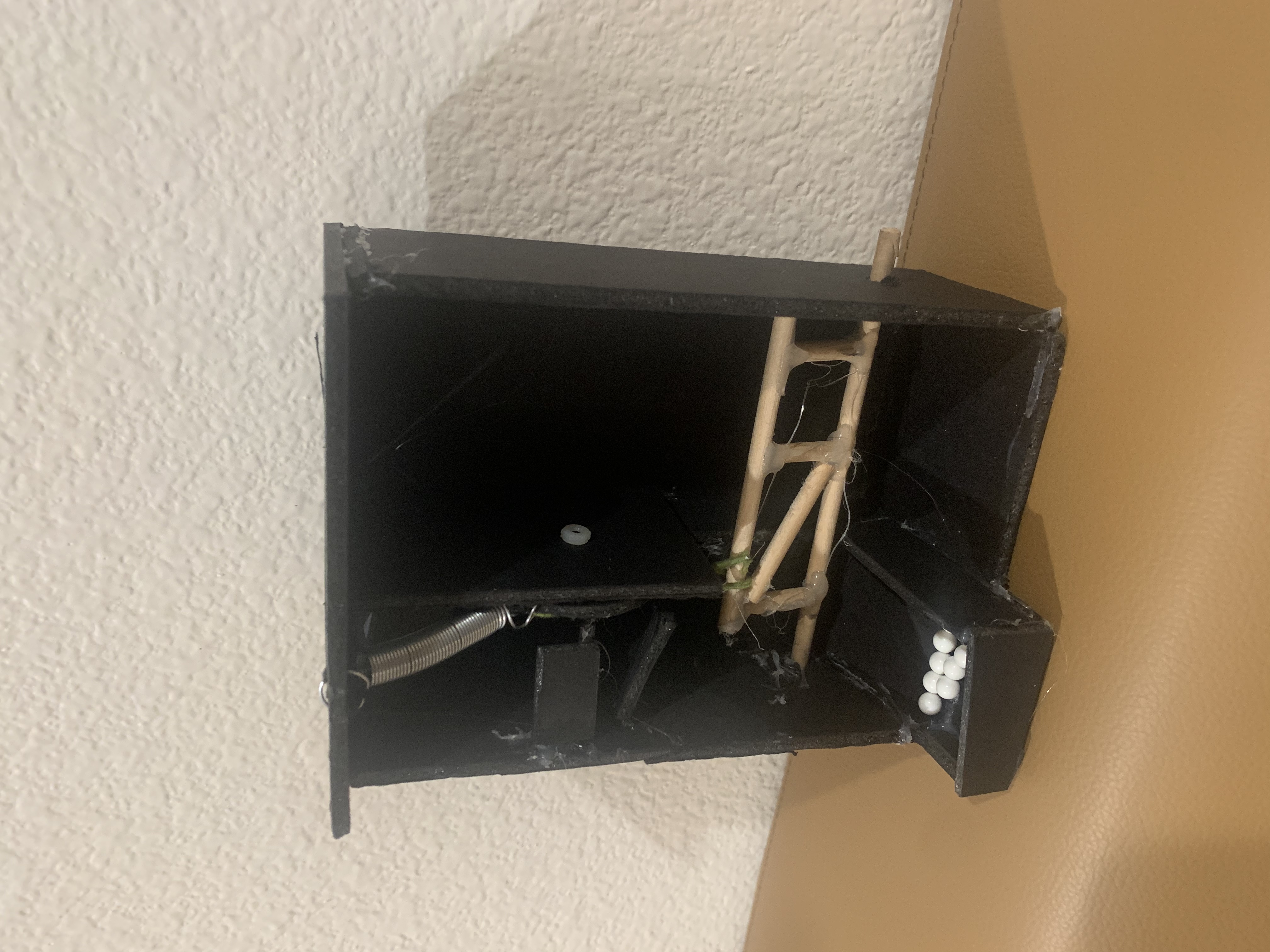
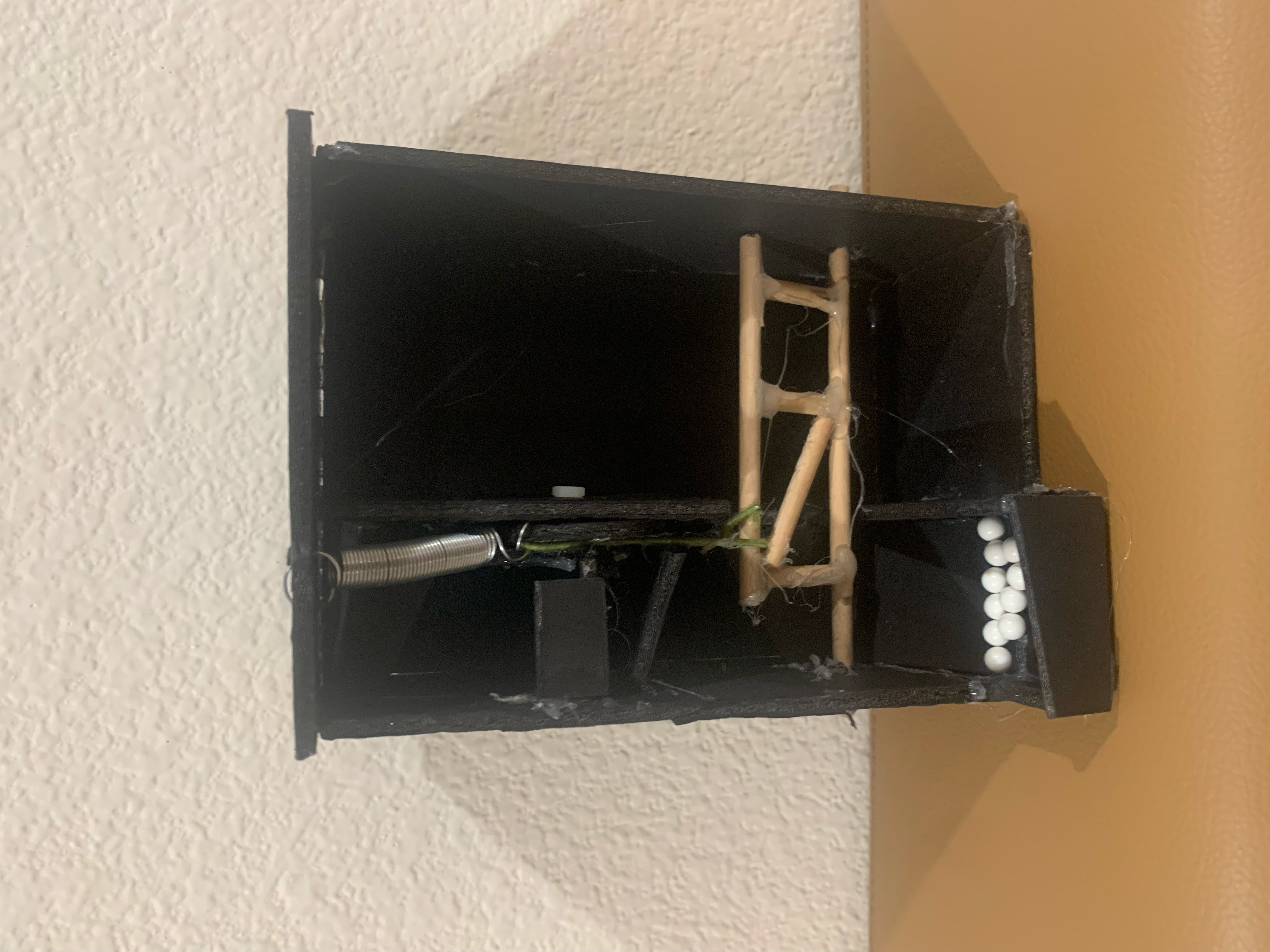
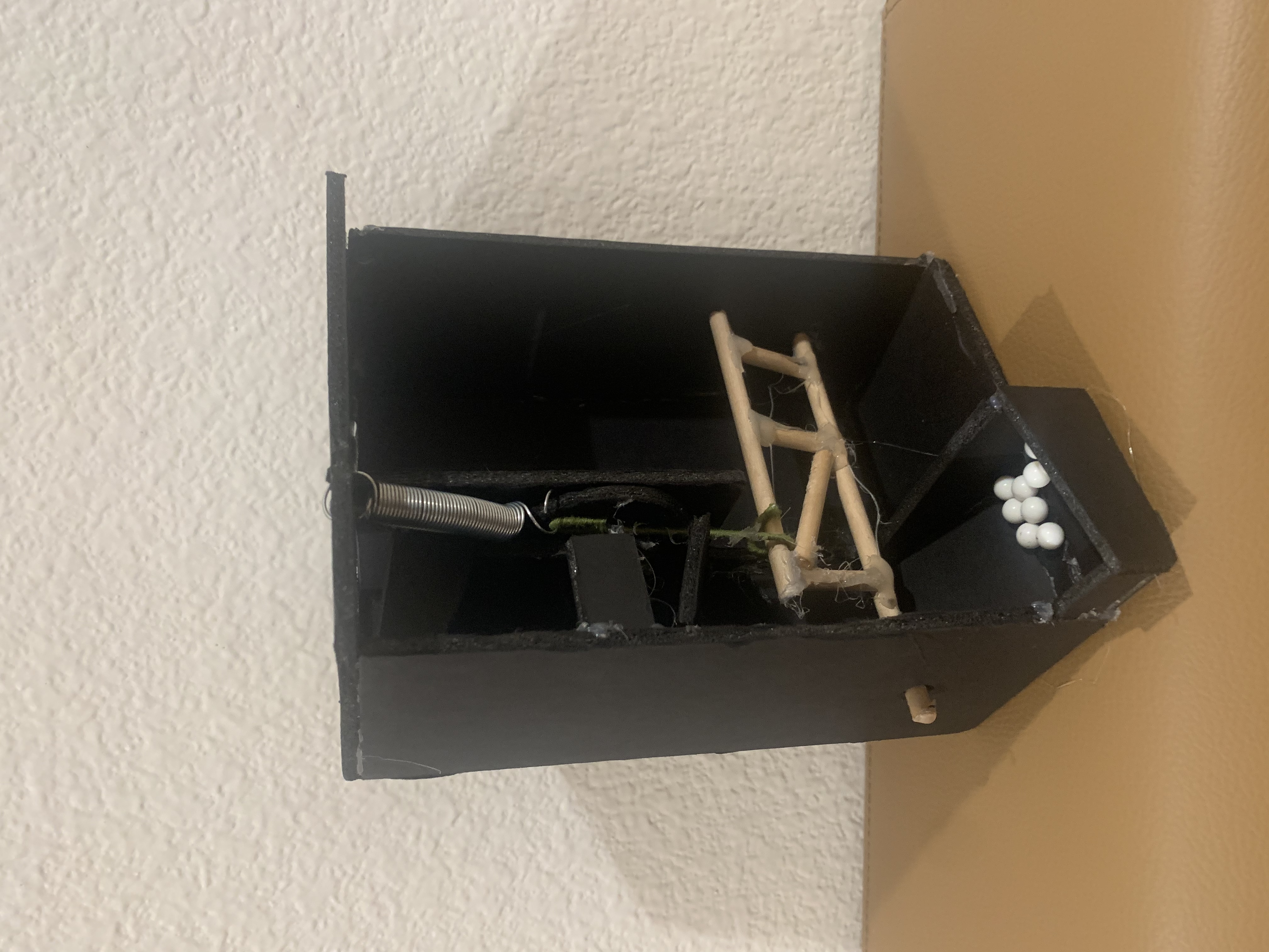
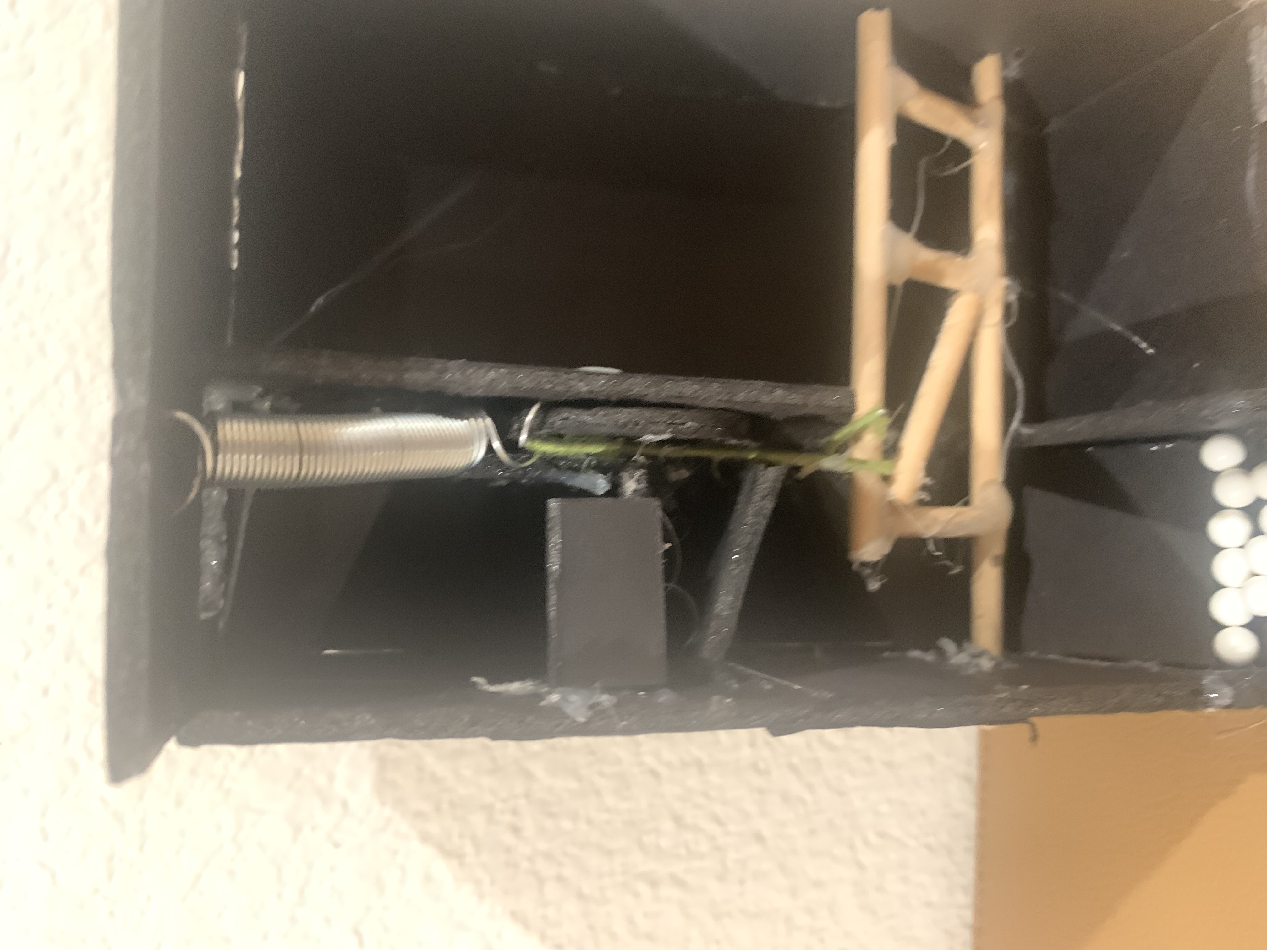
Critical Part – Rotating Disk
I initially intended to laser-cut this piece, with a hole to press-fit a 10-32 machine screw (instead of the extruded knob as pictured) but decided to change the design to be 3D printed upon realizing that using a machine screw would require a hex nut to secure in place, and the back of disk needed to be flush to the interior mechanism surface.
3D Printed Lever
I took inspiration from a ladder in designing my lever, as I wanted the bar that would be connected to the disk to extend all the way to the lever arm, to increase the moment. The dispenser wall has an arced slot to guide the motion of the lever arm, and it is secured using 2 collars to prevent wiggling.
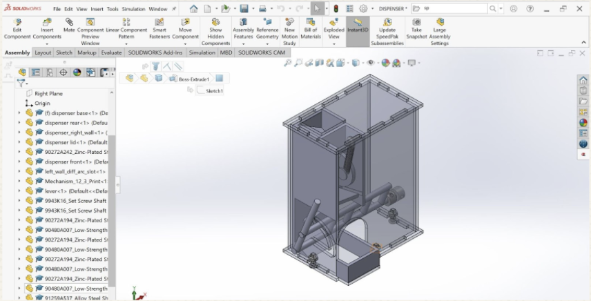
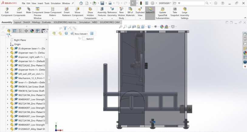
Interior Mechanism
I wanted to create one unified piece for my interior mechanism, because of my inability to use adhesives, I wanted everything to be secured in one piece. I constrained the piece within the box with tabs on top and behind it. I also wanted to create a channel for the disk to rest within.
Tweaking the Interior Mechanism
In all honesty, the interior mechanism required a couple different iterations with my personal 3D printer in order to function properly. I faced a couple issues due to 3D printing shrinkage and miscalculation, and I needed to tweak my model each time:
The hole in the compartment to store the candies was too small
The channel to hold the disk was too narrow
The candies would bounce too much if there was no ramp/path for the candies to follow (circled in purple)
The shelf that the candies were initially supposed to land on (circled in red) was too obstructive in assembly
If the ramp (circled in blue) was too long, it would interfere with the hex nut that was fastening the box together
After much tweaking, the final CAD model was ready.
The CAD Assembly
Bill of Materials
QTY
Part Number
Description
Cost / unit
Cost
1
90272A242
10-24 x ½” Zinc-Plated Steel Pan Head Phillips Screw
$0.05 ea
$0.05
2
6432K12
Set Screw Shaft Collar, ¼”
$1.25 ea
$2.50
4
90272A148
6-32 x ½” Zinc-Plated Steel Pan Head Phillips Screw
$0.03 ea
$0.12
4
90480A007
6-32 Low-Strength Steel Hex Nut
$0.02 ea
$0.08
1
91259A537
¼” Alloy Steel Shoulder Screw, ½” length
$1.25 ea
$1.25
1
90480A011
10-24 Low-Strength Steel Hex Nut
$0.02 ea
$0.02
1
9654K515
Steel Extension Spring
$1.05 ea
$1.05
2
12 x 12 in Acrylic Plastic, Fluorescent Red
$3.50 ea
$7.00
2
3D Print
Disk, Red Generic PLA (5g)
$0.39
$0.78
1
3D Print
Lever, White Tough PLA (13g)
$0.93
$0.93
1
3D Print
Interior Mechanism, Black Tough PLA (72g)
$5.23
$5.23
Total
$19.01
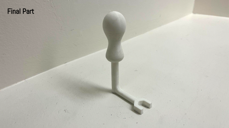
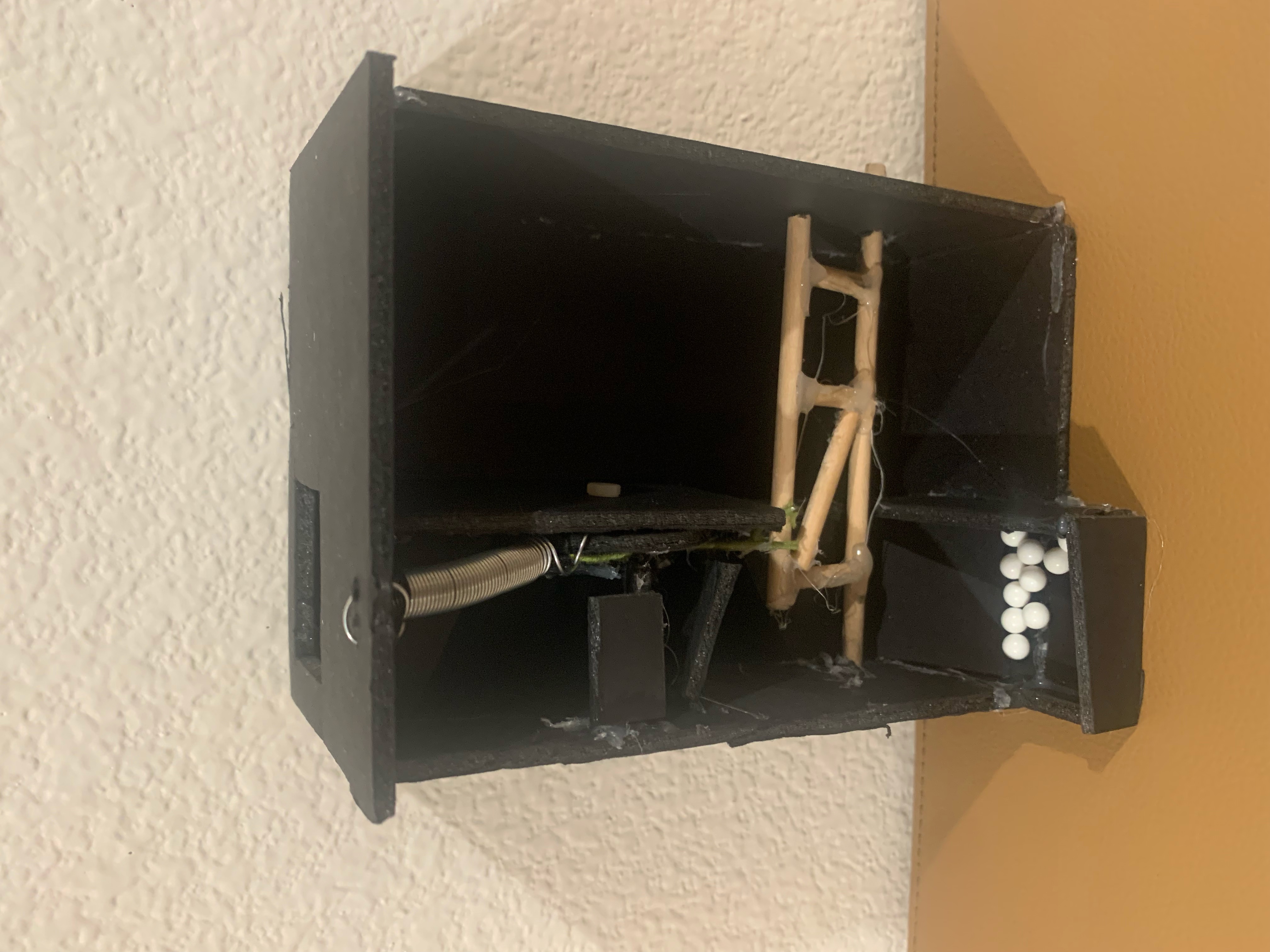
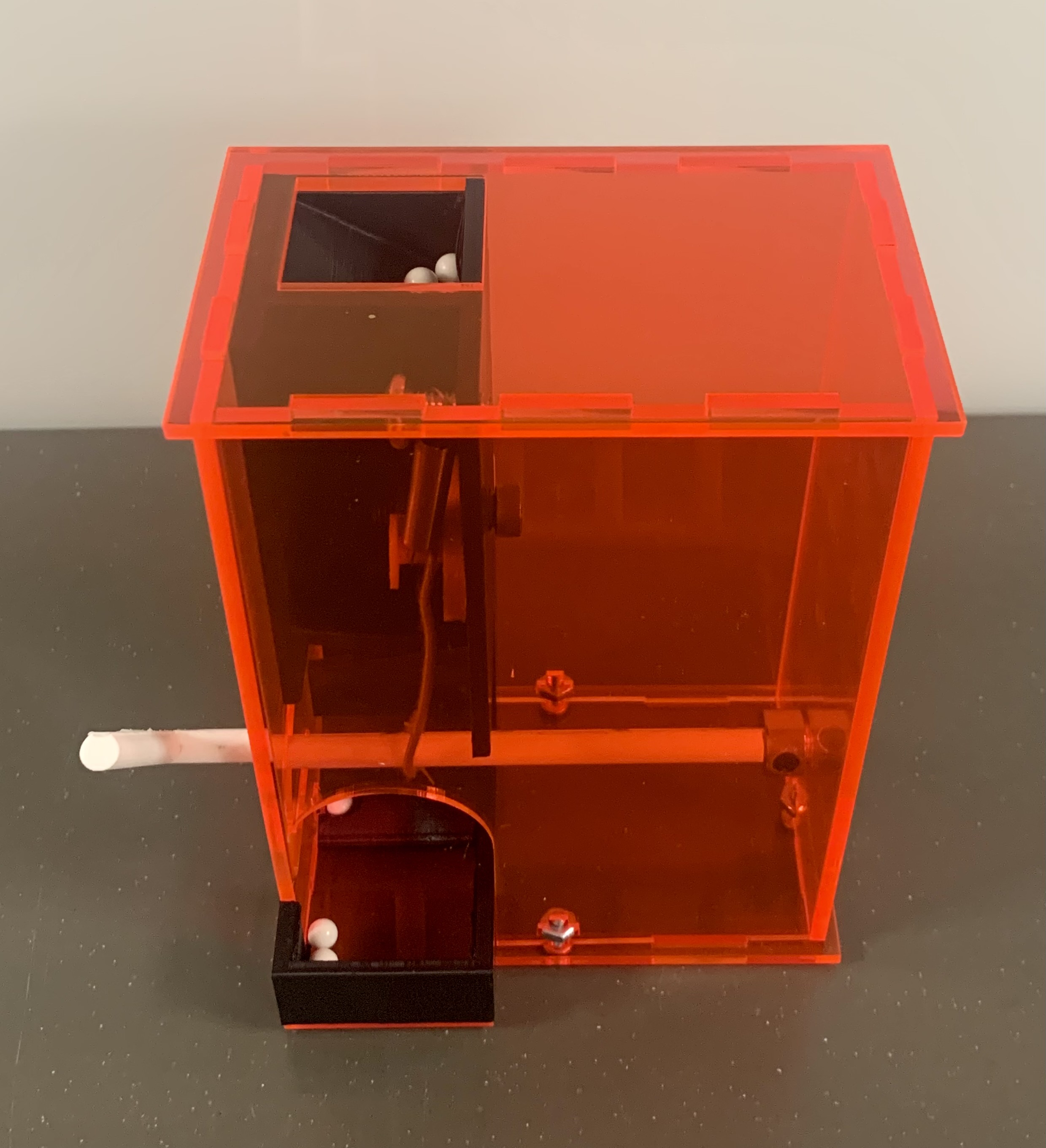
The Final Product
Analysis
Overall, my dispenser does function as intended, as it fulfills each of the requirements as outlined in the assignment guidelines. As there were a lot of tweaks and improvements made in each prototyping stage, the final product has evolved greatly since the initial concept sketches:
My initial design had the rotational disk situated next to the storage compartment and the actuation was intended to align the openings in the disk and the compartment wall, so that the candies would just pass through. However, I realized that this method made it difficult to dispense one candy at a time—if the lever was held down, numerous candies would tumble out. I thus edited my design so that the resting state of the dispenser would separate the to-be-dispensed candy from the compartment, so that the actuation would just release this already separated piece of candy. I specifically designed the disk to achieve this by creating a groove that would perfectly fit one piece of candy, and situating the disk directly beneath the opening of the compartment so that the next candy would be ready to enter the groove of the disk, but only after the dispenser is reset. I also changed the reset mechanism by connecting the disk to the top of the box via an expansion spring, as opposed to using it to connect the disk to the lever (for which I now use a static wire).
I found that this method of approach was extremely effective, as my functional prototype was a just that—functional. However, I was not fully satisfied with my prototype, as there were issues with input (the lever needed to be actuated from inside the dispenser) and spring mounting (the way that I had attached it to the dispenser had slightly bent it). I solved my input problem by creating an arced slot in the wall to which the lever arm was adjacent, and solved my spring mounting problem by using extrusions and screws to secure the ends of the spring. With a few minor adjustments to my CAD models to allow for 3D printing shrinkages and tolerances, my model was ready to assemble.
In terms of next steps, I found one concern with my reset mechanism. Although the reset functions perfectly, I wish that the lever arm would be brought straight up to a vertical orientation when the dispenser resets. Even though this is a purely aesthetic concern—and does not impact the functionality—I believe that editing the point at which the disk connects to the static wire would solve this issue, as the wire just needs to be more taut. As the dispenser functions perfectly, however, I do not have any unanswered questions.
Reflection
Throughout the process of creating my candy dispenser, I have learned so much about my design process. I realized that, as pictured below, I am a person who likes to have his functional prototype very closely resemble the final product, because I find solace in knowing that every aspect of my design is fully functional before I even start 3D modeling it. Although it was a useful tactic in this context, I wonder if I might fare better if I spend less time on my functional prototype—only creating the mechanism and not worrying so much about the aesthetics in the prototyping process. I also realized that since I am a bit of an indecisive designer, I took a lot of decisive design action. For example, once I had an idea that I believed will work, I chose to play it safer with a simpler design rather than designing something complicated and worrying if it would even function. However, this might have led to me not even considering more creative alternatives. In the future, I hope to take more risks with my designs—i.e. using a launch mechanism instead of a passive dispensing action. Had I taken more risks and spent a little more time brainstorming my ideas and options, my mechanism might have been a little more advanced. Ultimately, although I do believe that I played it a little safer with my design, it made me more confident in 3D printing and laser-cutting my pieces, as I strongly believe that I would be hesitant to print anything if I even had a shred of doubt that it would function properly. However, this did not mean that I did not face any challenges in my process. A large obstacle I ran into was designing my CAD models with the proper tolerances to account for shrinkage from the 3D printer. Numerous times, since I had calculated every aspect of my mechanism perfectly, I ended up having to file down the through-holes in order to fit the proper hardware. Another challenge was definitely the assignment restriction against adhesives, as I had to place tabs and fasteners in creative places, use collars and arced slots, and also account for perfect/press-fits. Moving forward, I have a better sense of who I am as a designer—playing it safe never hurts, as the ultimate goal is to achieve functionality. However, I can sometimes cave into my inner overachiever and take some design risks now and again, even if it might make life a bit more interesting.
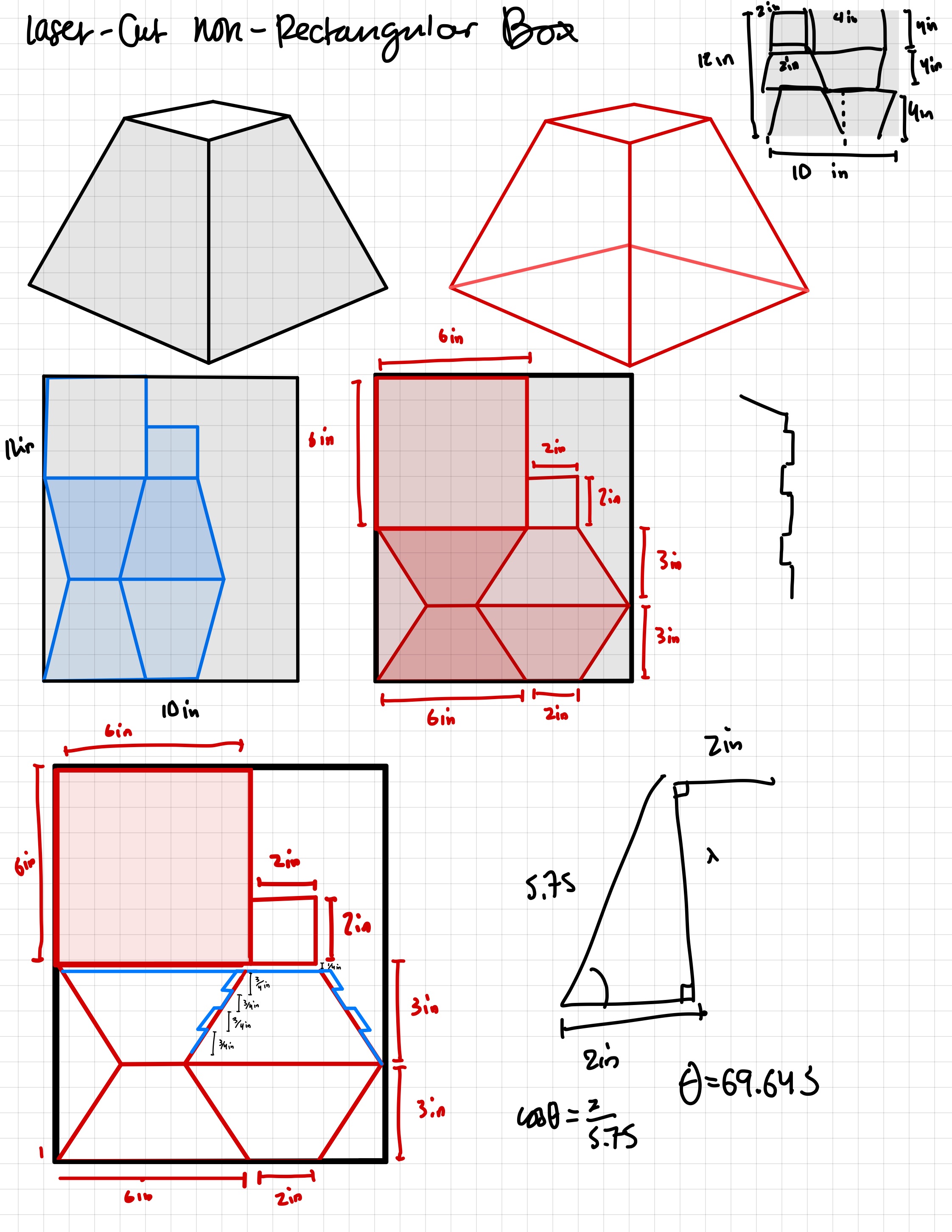
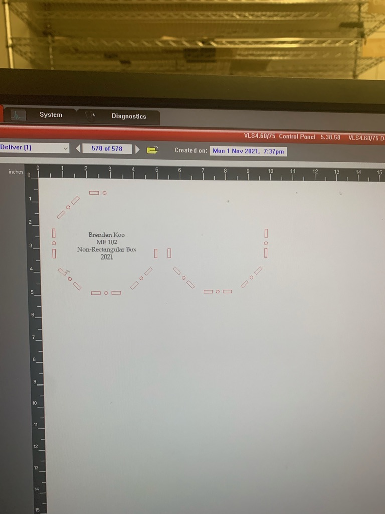
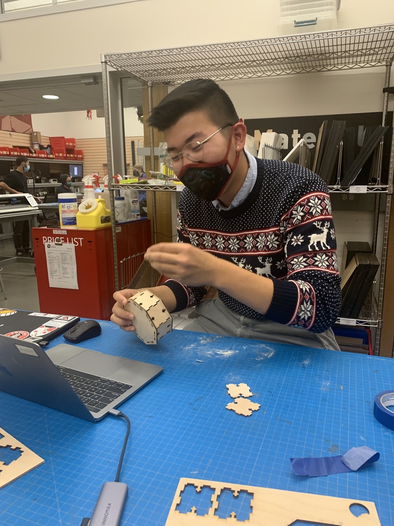
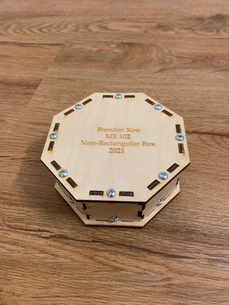
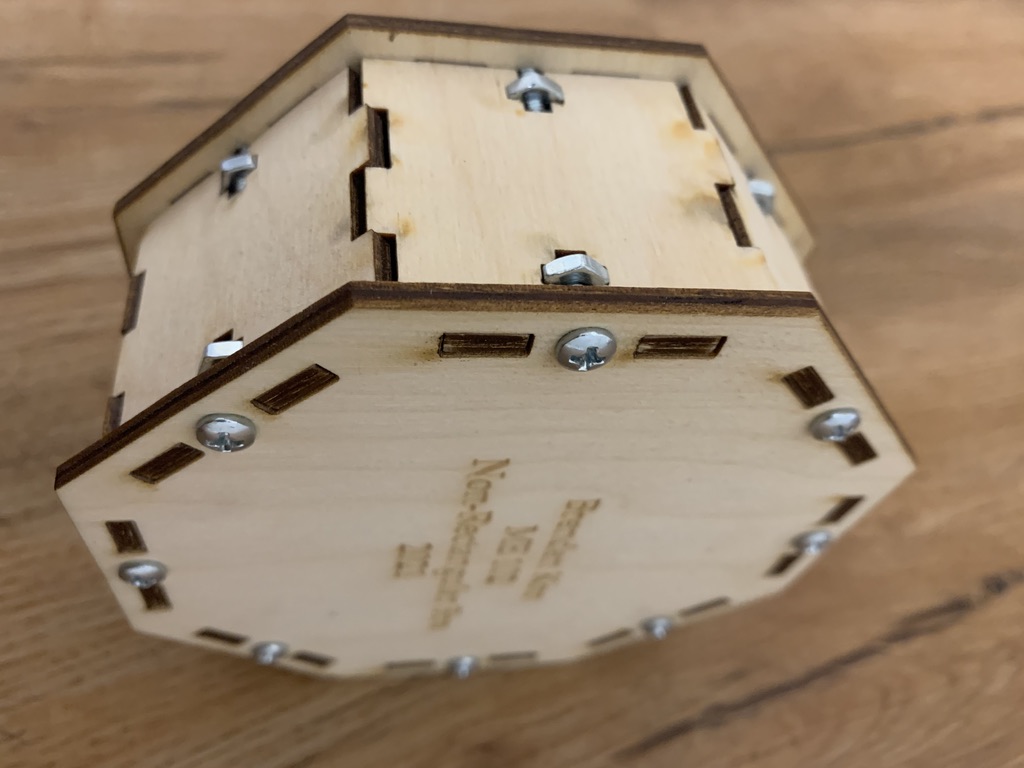
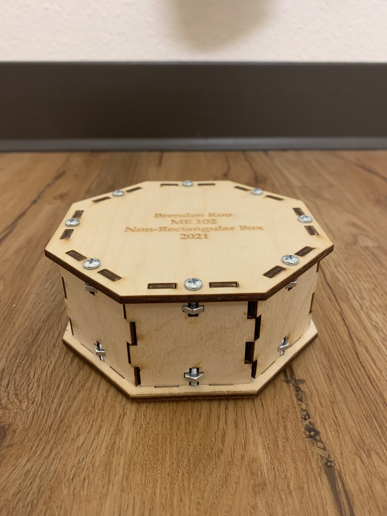
During the autumn of 2021, I was enrolled in ME 102: Foundations of Product Realization as part of the core curriculum for my Product Design major at Stanford University. One of the assignments was to use Computer-Aided Design to design, laser-cut, and assemble a non-rectangular box (meaning two or more sides needed to join together at a non-right angle) without the use of any adhesives. The only approved methods of conjoining the box sides were using interlocking tabs and fasteners, and both needed to be implemented somewhere in the box design.
Concept Sketches
The concept sketches for my truncated trapezoidal prism
The layout for the faces of my truncated trapezoidal prism
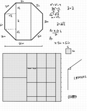
My initial instinct was to follow the non-rectangular component of the assignment by creating a truncated pyramid with trapezoidal sides and a square base, and the box sides would have been connected via tabs and nuts and screws (as pictured). In fact, my first priority was to fit the 2D faces of my box within a 10in x 12in piece of wood. I made sure to have the largest dimension of the box span 6in, and the design allowed for four unique cuts (the tops and bottoms, and two different types of sides (with alternating tabs)
I tested my prototype with scrap cardboard (saving resources), so here are my takeaways:
I had assumed that the dimensions of the box were the only important parts, but had neglected to consider the relevance of the angles
I had not included enough of an allowance on the base to accommodate the margin of the sides from the edge (i.e., all of my calculations on the previous slide were inaccurate)
The sides of the box, when assembled together, almost wanted to form more of a triangular base rather than a square base
When I forced the sides of the pyramid to accommodate the square base, there were gaps where the sides should have met
The cad design of the truncated pyramid, which ultimately failed because of my inability to properly join the angled sides of the box (as I had calculated)
I decided to revisit the drawing board and start from scratch. I didn’t want to completely start over, but realized quickly that calculating the correct angles of the pyramid would take too much time, and it might not be feasible given the necessary dimensions of the box.
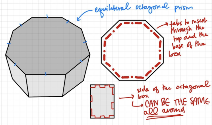
The trapezoidal prism would also make the process of using screws and nuts difficult because of the angled sides, so I needed a design with vertical sides
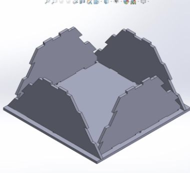
Decided to utilize the “prism” approach, created an octagonal prism with vertical sides
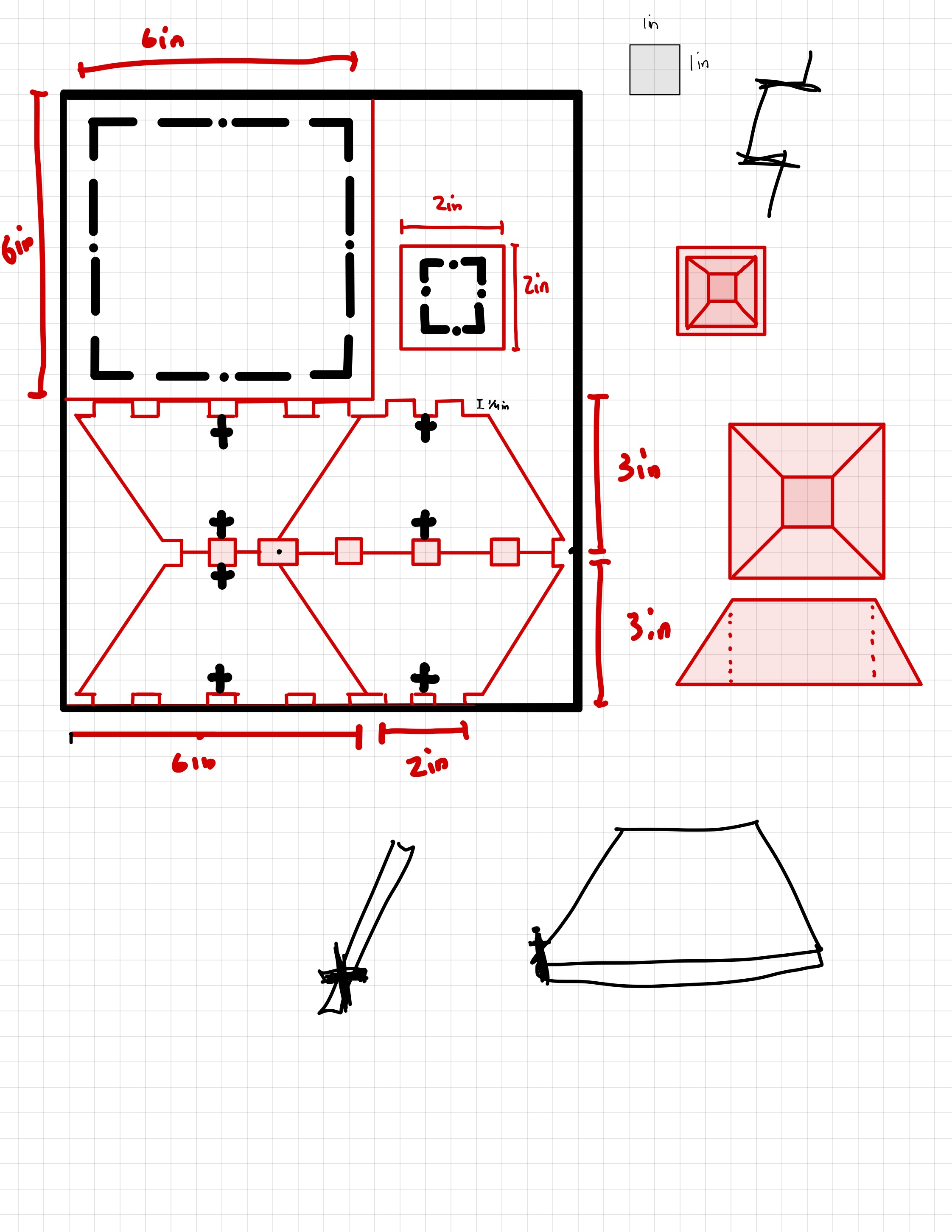
CAD Sketches in SolidWorks
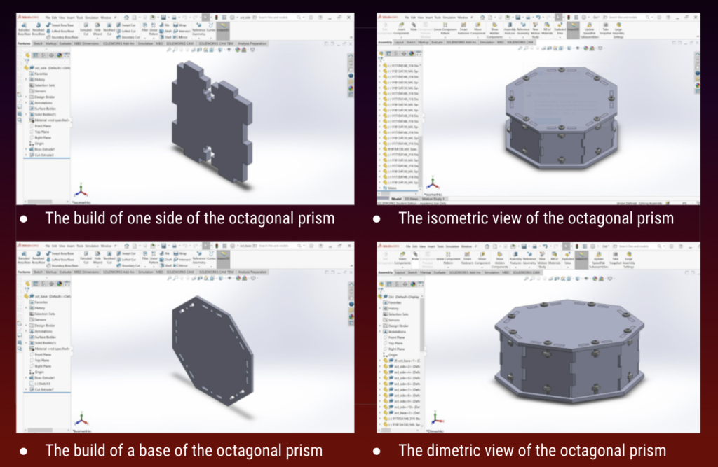
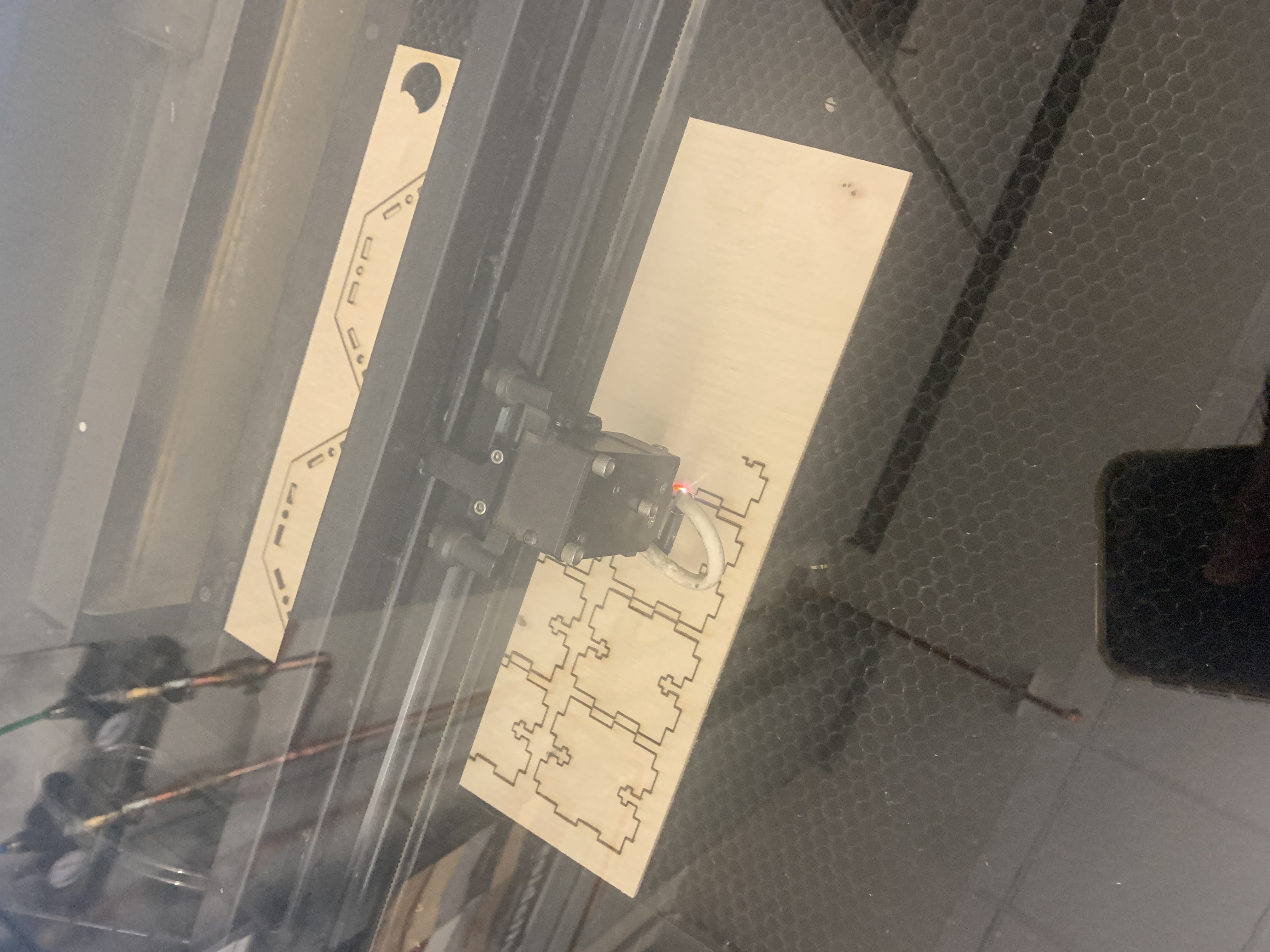
I used SolidWorks to create the CAD files of my non-rectangular box, and was able to fully assemble the CAD file of my Octogonal Prism, as shown below. The CAD files include the walls, base, and top of the box as well as 16 hex nuts and 16 screws.
Laser-Cutting and Assembly
After my CAD file was fully assembled, I was good to start laser cutting. I transferred my CAD files to Adobe Illustrator, sent them to the laser-cutter and started the laser-cut process. The whole laser-cut process took around 15 minutes, from start to finish.
The laser-cut worked beautifully! I had a couple hiccups with the thickness of the birch plywood (the slots for the tabs were intended to accommodate a plywood of ⅛ inch thickness, but the plywood was actually measured to be 0.136 inches. However, this was no problem that sanding couldn’t rectify.
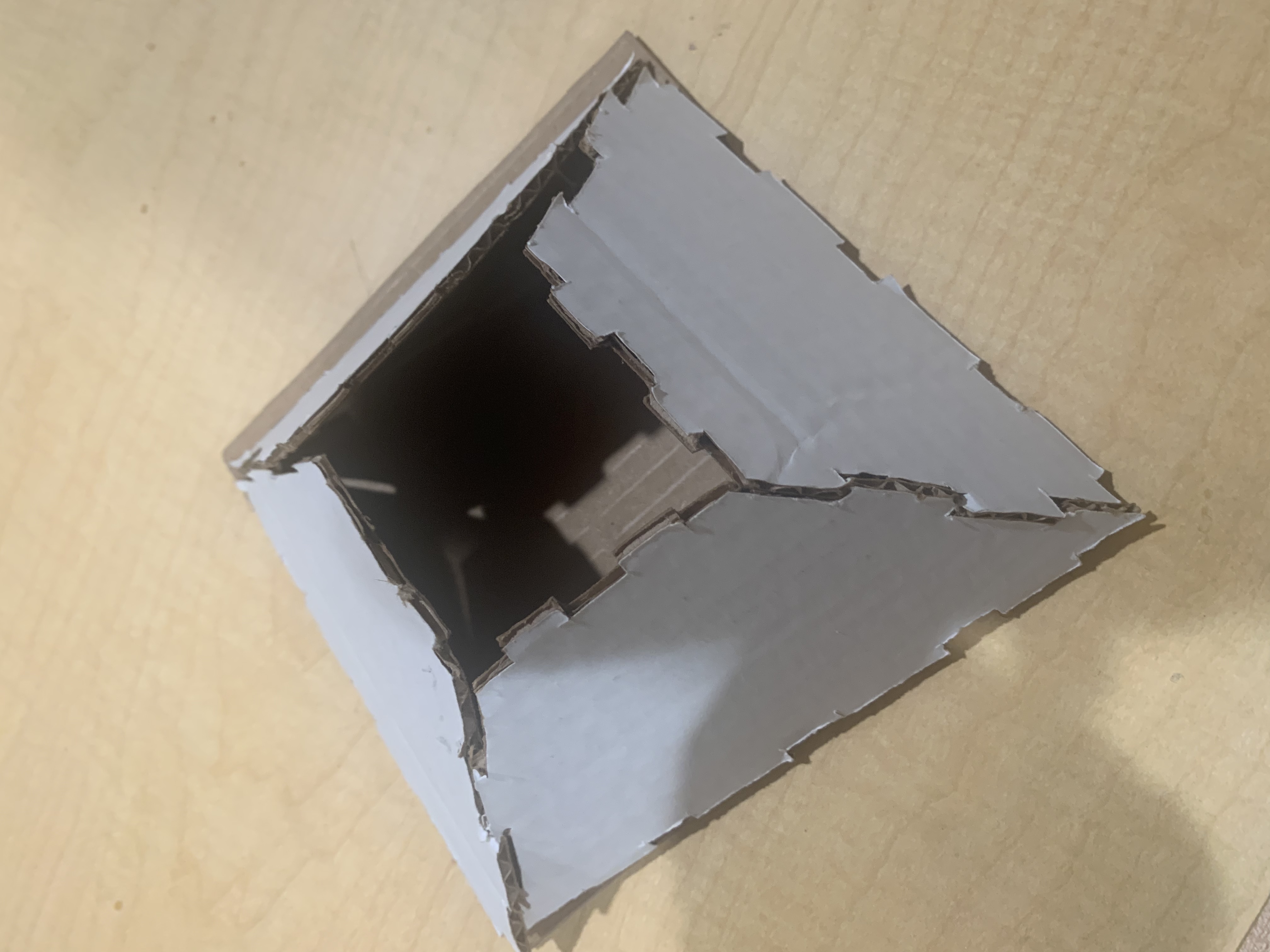
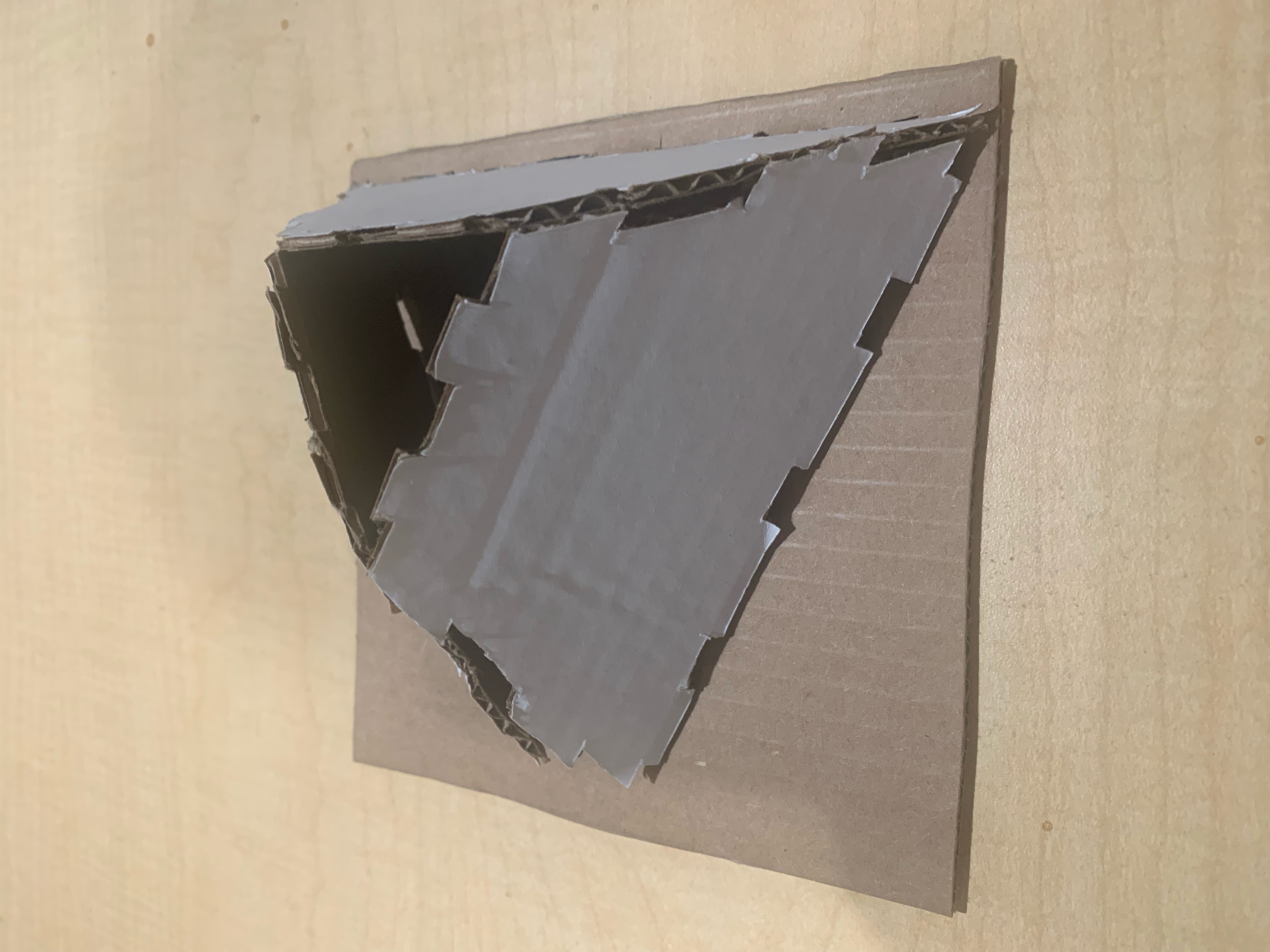
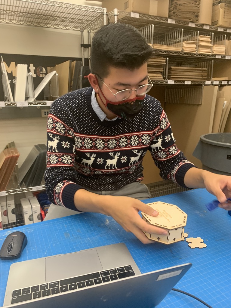
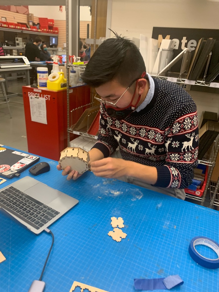
The Final Product
Analysis
From my sketches, I learned that sometimes a design does not need to be overly complicated, and simplicity often flourishes
From designing the CAD file of the truncated square pyramid, I realized that my calculations for the angles and sides of the model were not as fully defined as I thought they would be → led to misalignment of the sides
The slanted sides of the model would require a “slanted screw/nut joint” (not possible with the resources provided in Room 36) or more complex calculations to determine the inset of the screw/nut placement in the model so as to align a vertical screw with an angled box face
The CAD file of the octogonal prism was a lot simpler, and it came together a lot quicker in SolidWorks
When the pieces were laser-cut, the pieces of birch plywood were actually around 0.136 inch thick instead of ⅛ inch, so that led to some discrepancies in the sizing
The sides of the box were all perfectly fitted, so there was not enough of a tolerance for the walls to come together
I ended up resizing just one of the sides to create an allowance for the tabs to fit together
The 16 nuts/screws and all of the interlocking tabs might have been a bit redundant in my design, so I could have advanced it by minimizing the joints I used
Reflection
I learned from this experience that I don’t necessarily need to construct my box in such a complex manner. This is evident not only in my initial prototypes/designs but also in how many joints/fasteners I had utilized in constructing even my finalized non-rectangular box. I realized that as a designer, I need not opt for the most complicated designs, and sometimes the simpler and more straightforward options are equally successful and more efficient.
However, I will acknowledge that my decisions to step outside of the metaphysical “box” did allow me to experiment with different approaches, try out different configurations for the box, and ultimately fail before realizing that I needed to revisit the drawing board and think through the entire process of constructing the box, rather than thinking about it in a step-by-step fashion.
My biggest challenge with the construction of this box was with the calculations and allowances of the kerf when laser-cutting, as I initially somewhat inaccurately accounted for board thickness discrepancies as well as the seam allowance of interlocking tabs. This made the physical assembly of my box a little bit more difficult than I had anticipated. I overcame this challenge by using a little bit more patience in assembling the box, as opposed to utilizing brute force (which would have broken my box).
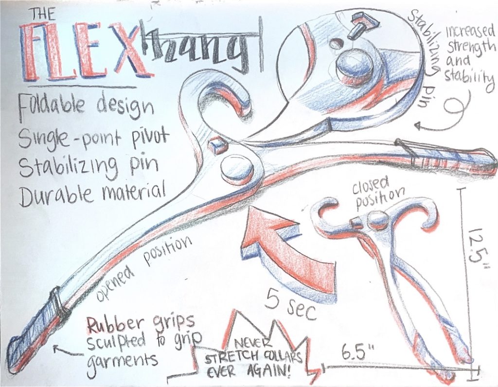
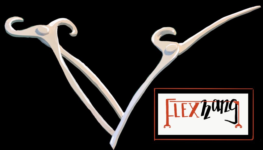
Clothing hangers are often tricky to work with. Wool sweaters and turtlenecks are often prone to stretching, and the rigid frame of the standard clothing hanger does nothing to preserve the life of these garments. As someone who wears sweaters and turtlenecks regularly, I wanted to create a solution to the wide and unforgiving shape of the clothing hanger. I thus designed the Flex-Hang, a retractable hanger that folds up to easily fit into the collars of more delicate shirts and opens up with enough stability to maintain structural integrity and form when displaying shirts.
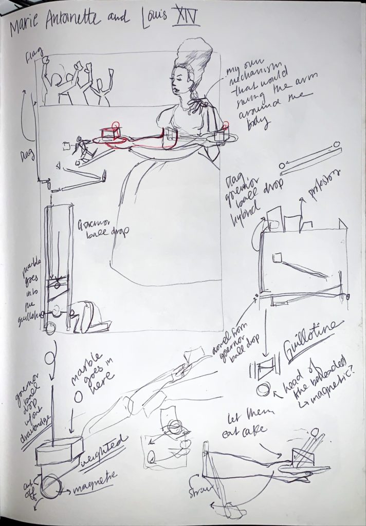
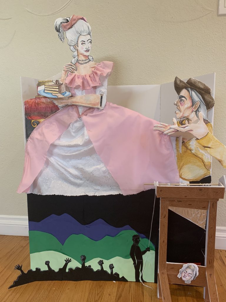
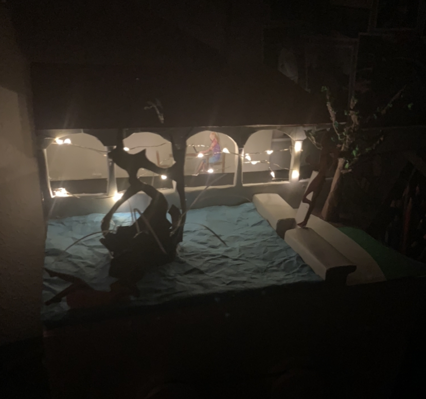
Fabric, Colored Paper, Colored Pencils, String, Marble, and Hot Glue on Foam Core
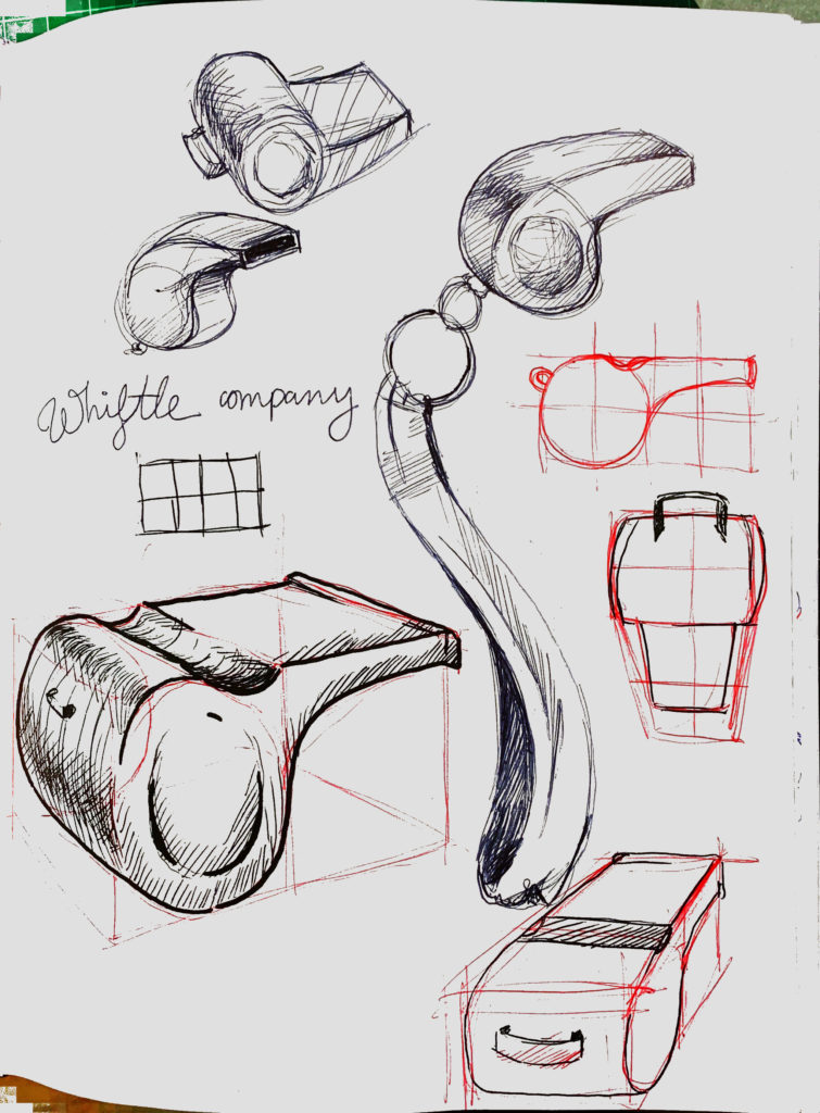
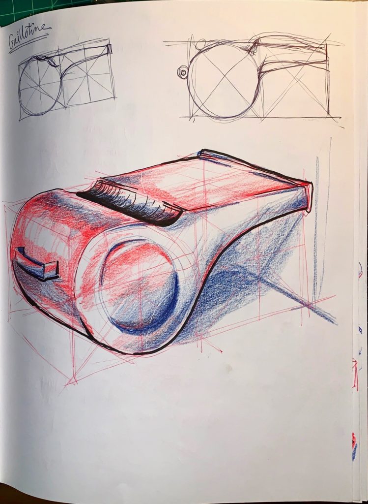
There is nothing new except what has been forgotten.
Marie Antoinette
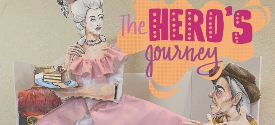
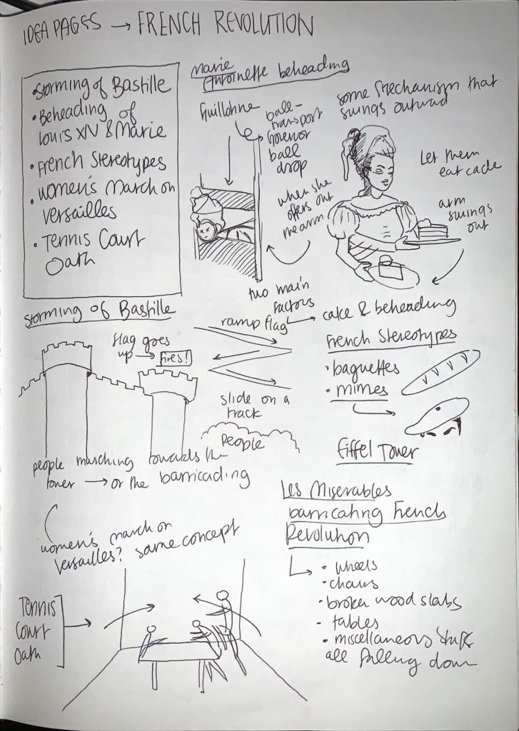
Marie Antoinette is a prominent yet controversial figure in French history for numerous reasons. Her love of a lavish lifestyle made her the epitome of glamour and sophistication, but it also demonstrated her thoughtlessness and vanity to the people who would ultimately become the French Revolutionaries. Antoinette eventually met her fate at the blade of a guillotine, an event that marked the start of the decline of the French monarchy.
https://brendenkoo.com/wp-content/uploads/2020/06/BF6FDFA8-D62D-41E7-AFD7-E0902BFF74AD_1_201_a.jpeg559928brenden_koohttps://brendenkoo.com/wp-content/uploads/2023/10/BrendenLogo-1-300x138.pngbrenden_koo2020-06-11 14:08:452021-11-03 23:35:31Design Problem 2: The Hero’s Journey, 2020
Construction Paper, Colored pencils, and Hot Glue on Foam Core
My freshman year of college was amazing, but what really made my experience outstanding was my firsthand witness to time-tested traditions such as fountain hopping in the White Memorial (Claw) Fountain. As the Class of 2024 was deprived of their Admitted Students Weekend to bear witness to such energetic moments on campus, I wanted to bring Admit Weekend to them with this interactive, fountain hopping experience.