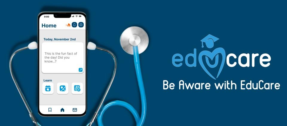
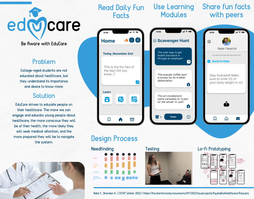
When I was enrolled in CS147: Introduction to Human-Computer Interaction, I devoted the ten-week class to developing EduCare, an app designed to educate young adults about their healthcare. For a project designed for groups of three or four, unprecedented circumstances led to my group being reduced to a team of myself and Nate Fleischli. Together, we used an arsenal of tools ranging from rapid paper prototypes to Figma to React Native and Expo to develop a fully-fleshed mobile application.
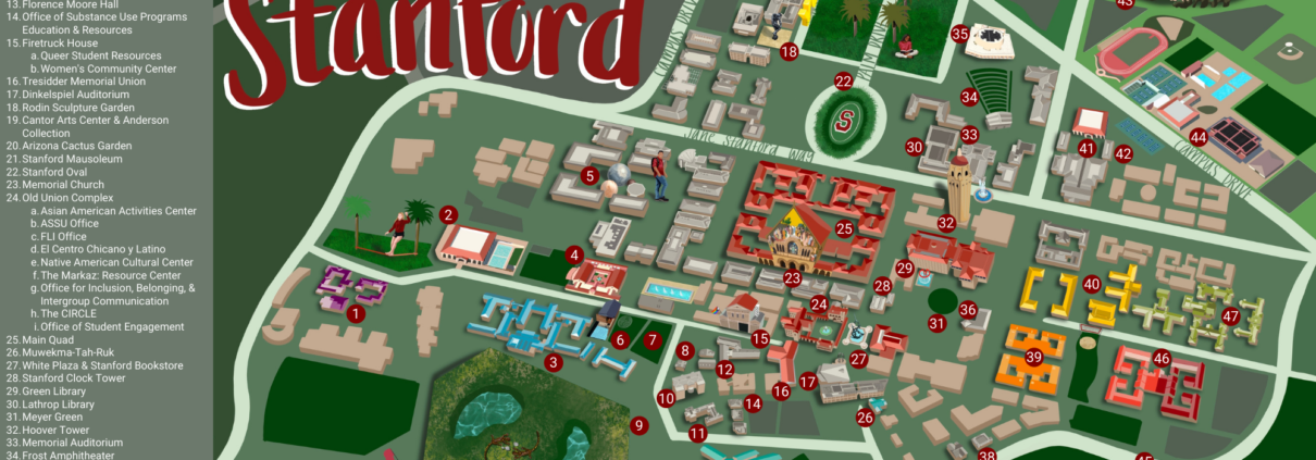
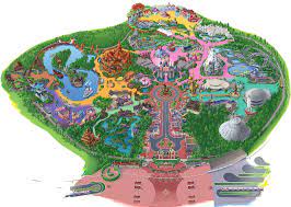
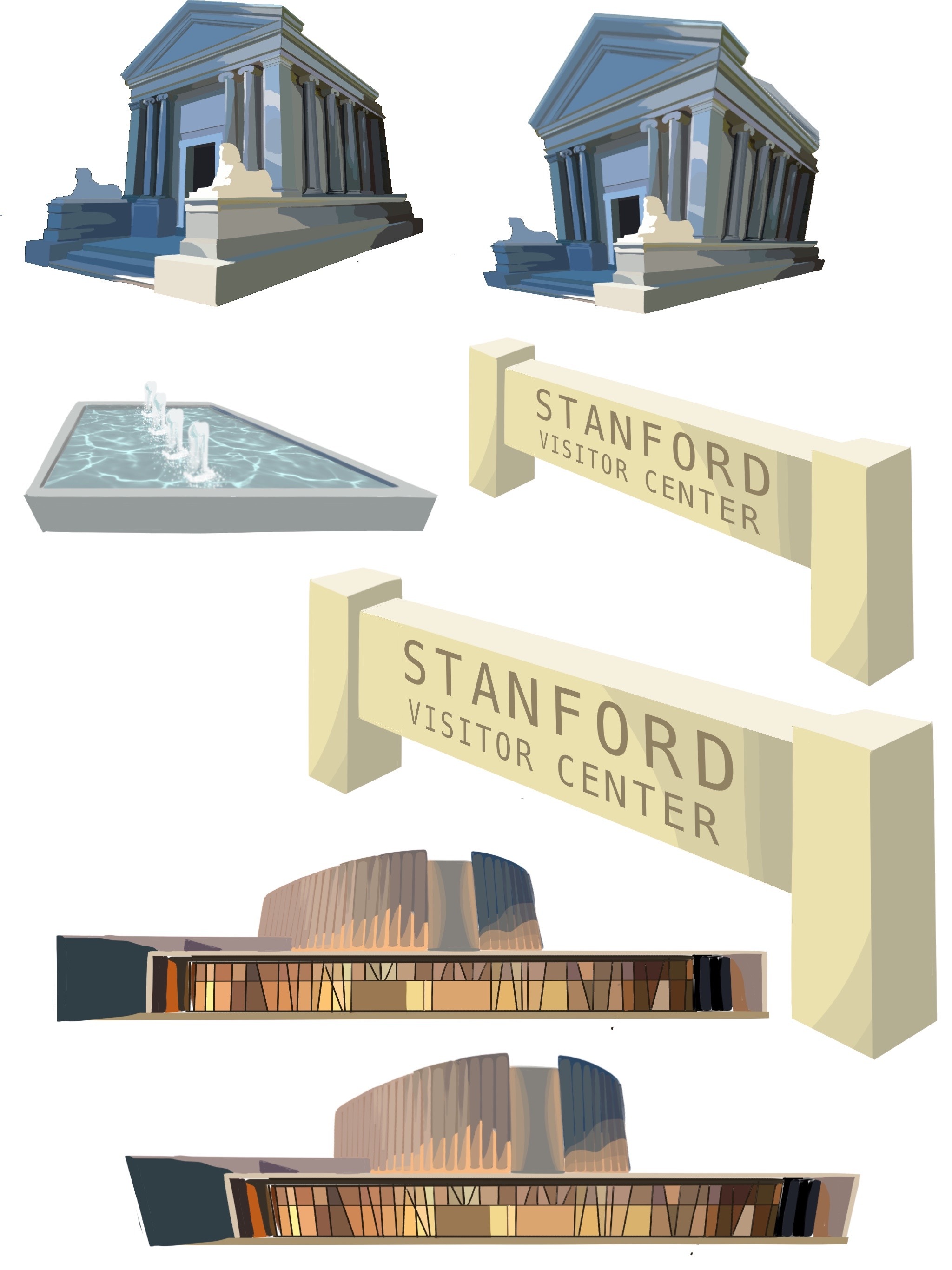
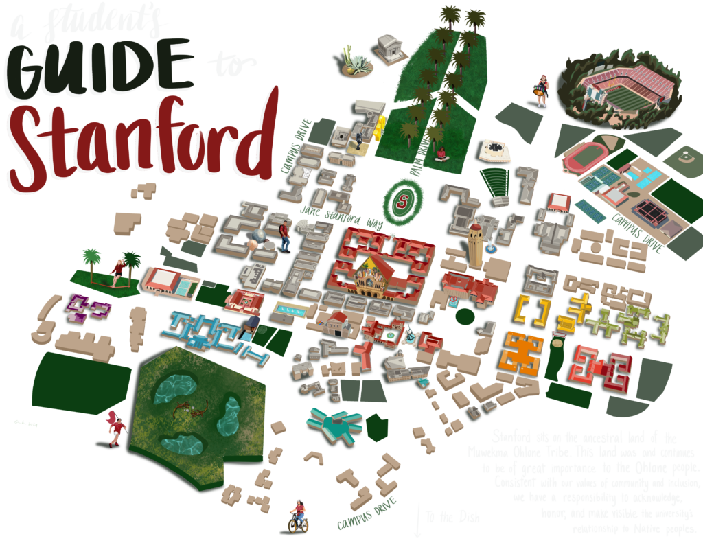
I designed this map of Stanford University’s campus for the New Student Orientation Scavenger Hunt (more information here!) and took inspiration from Disneyland maps, as seen to the right. However, after discussing with my higher-ups, I realized that the map could be something greater than itself (used for tours, major events, etc) and so I wanted to feature the most prominent spots on campus that Undergraduate students would frequent. I mainly designed this map in Procreate but ultimately compiled the map in Canva. Follow along with the progression of this Map below:
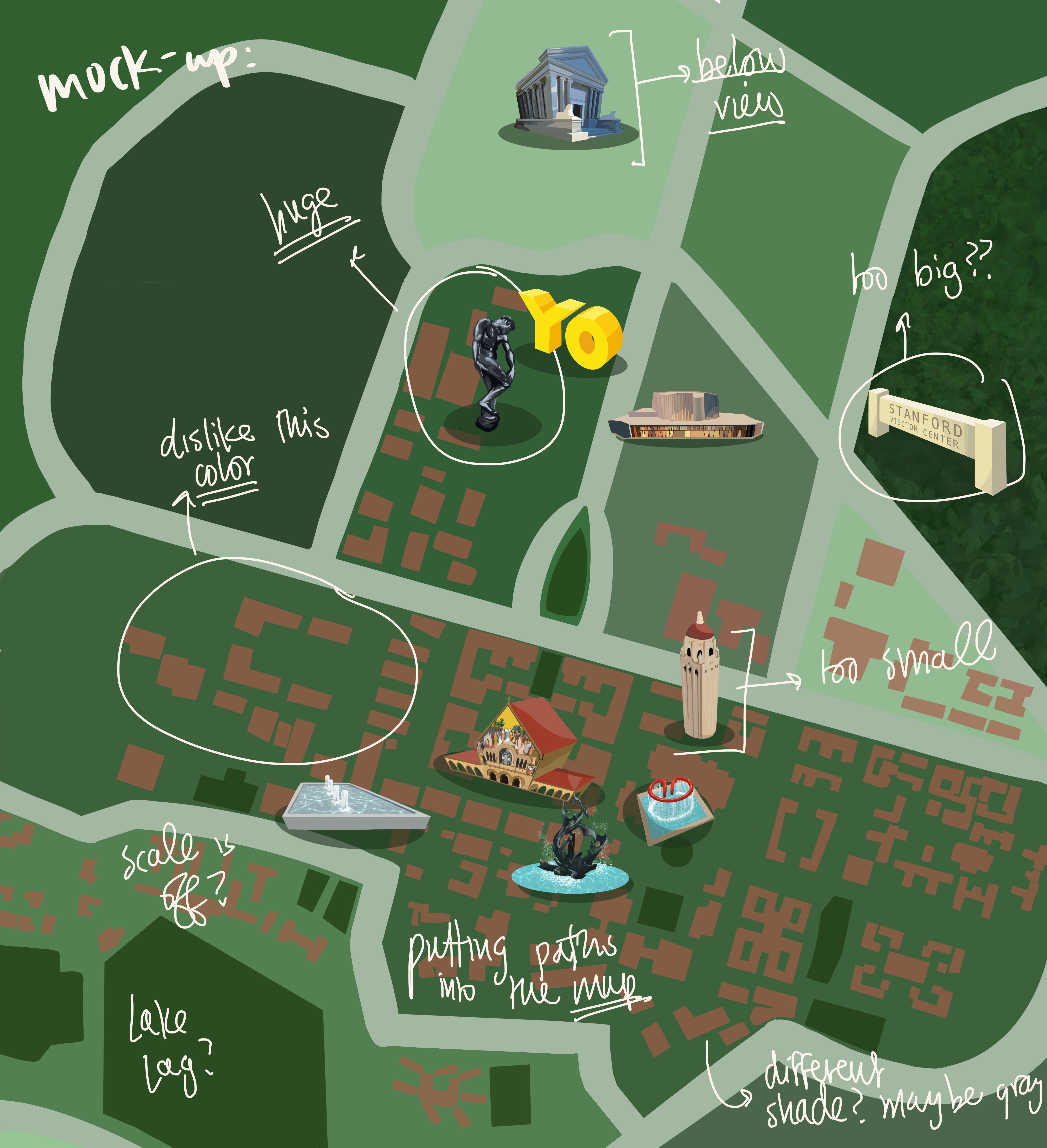
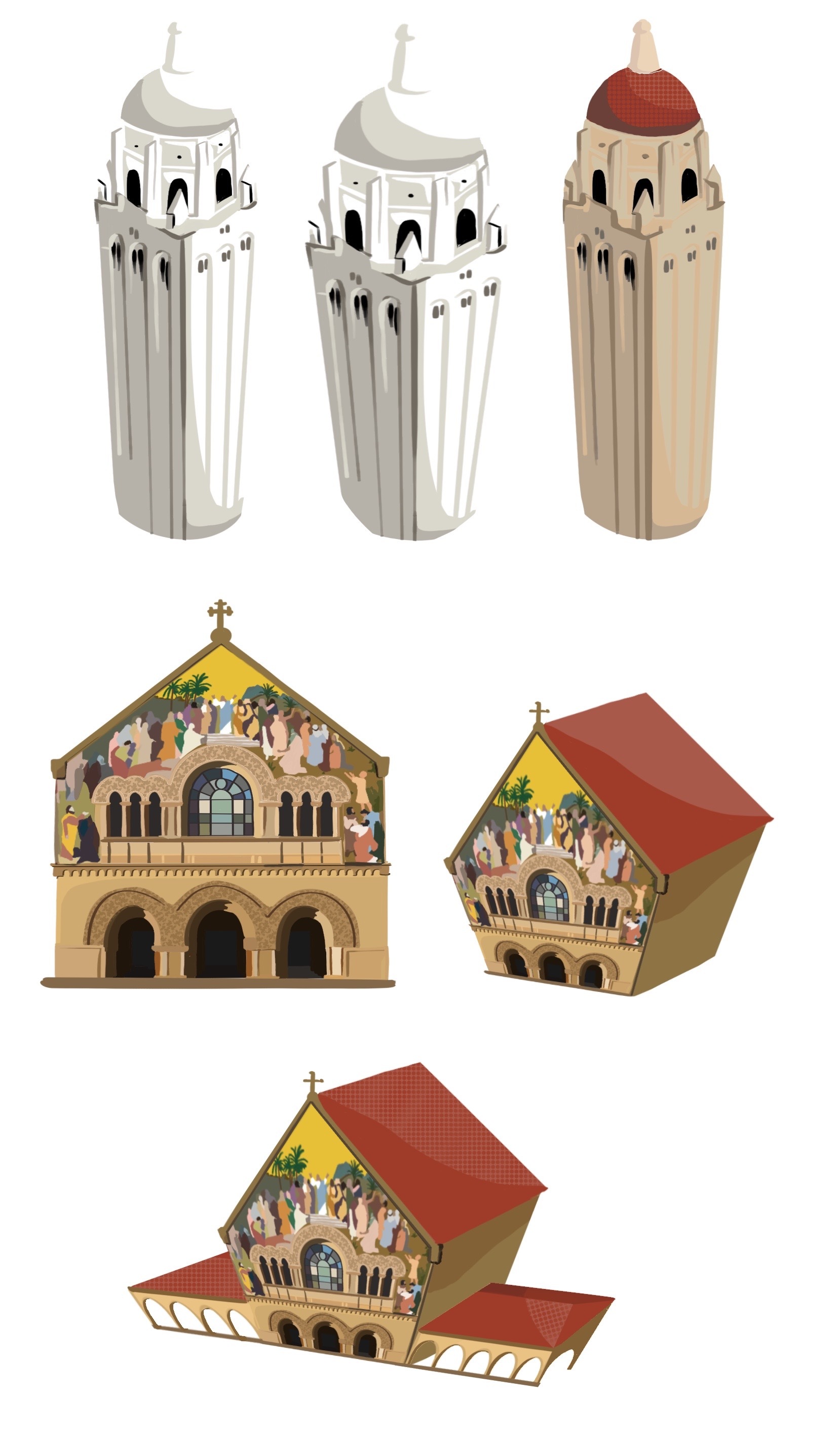
My first iteration of the campus featured a couple of the prominent locations on campus, ranging from the Rodin Sculpture Garden to Terman Fountain. The feedback I received from this draft was that there were inconsistencies with the perspectives each of the location images were in. The Stanford Mausoleum is viewed from a lower angle, but Hoover Tower is viewed from above. In fact, some of the more prominent landmarks were extruded in 3D, whereas the rest of the buildings in the background remained in a 2D aerial view. On top of this, there was a concern with the colors of the background buildings. Finally, there was an issue with the scale of the buildings on the map, as some were unsettled by the fact that the Rodin Sculpture was the same size as Hoover Tower.
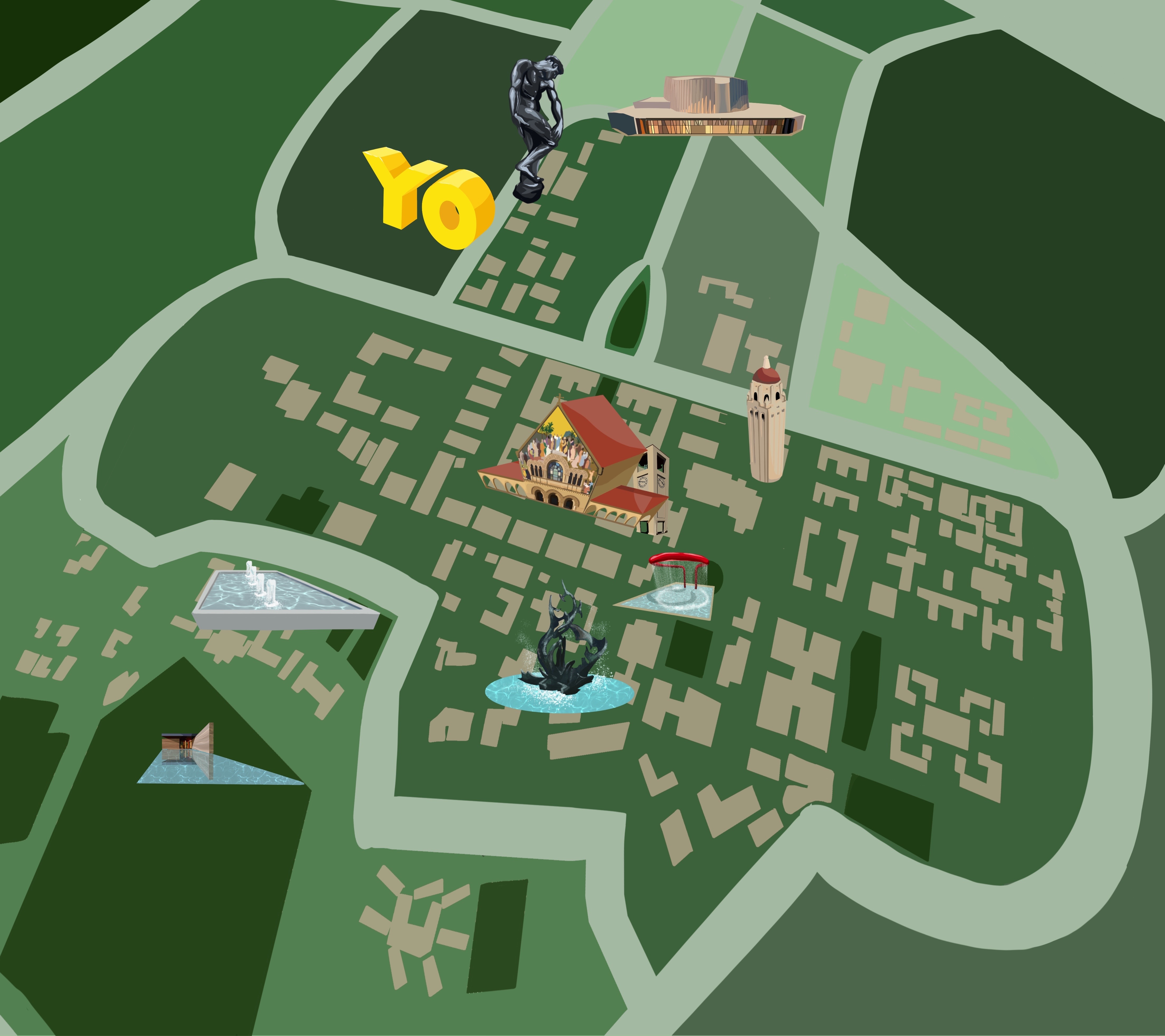
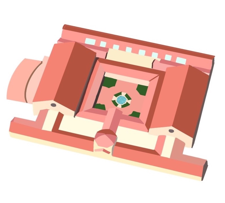
I tried to distort the base of the map in order to allow some of the buildings in the base to be viewed in a 3D plane, but it is evident that the distorted base plane did not align with many of the landmark icons I had designed. I realized that I needed to completely revisit the base of the Scavenger Hunt Map in order to maintain the perspective of the landmark icons and also have a consistent 3-Dimensional plane that the entire map rests on. Referencing a satellite image of Stanford’s campus, I re-drew the map of campus, incorporated depth into the backgrounds of the buildings, and added a couple more building landmarks (pictured below). This change was a bit more drastic than the previous drafts.
A couple of the Landmark icons of the Campus Map
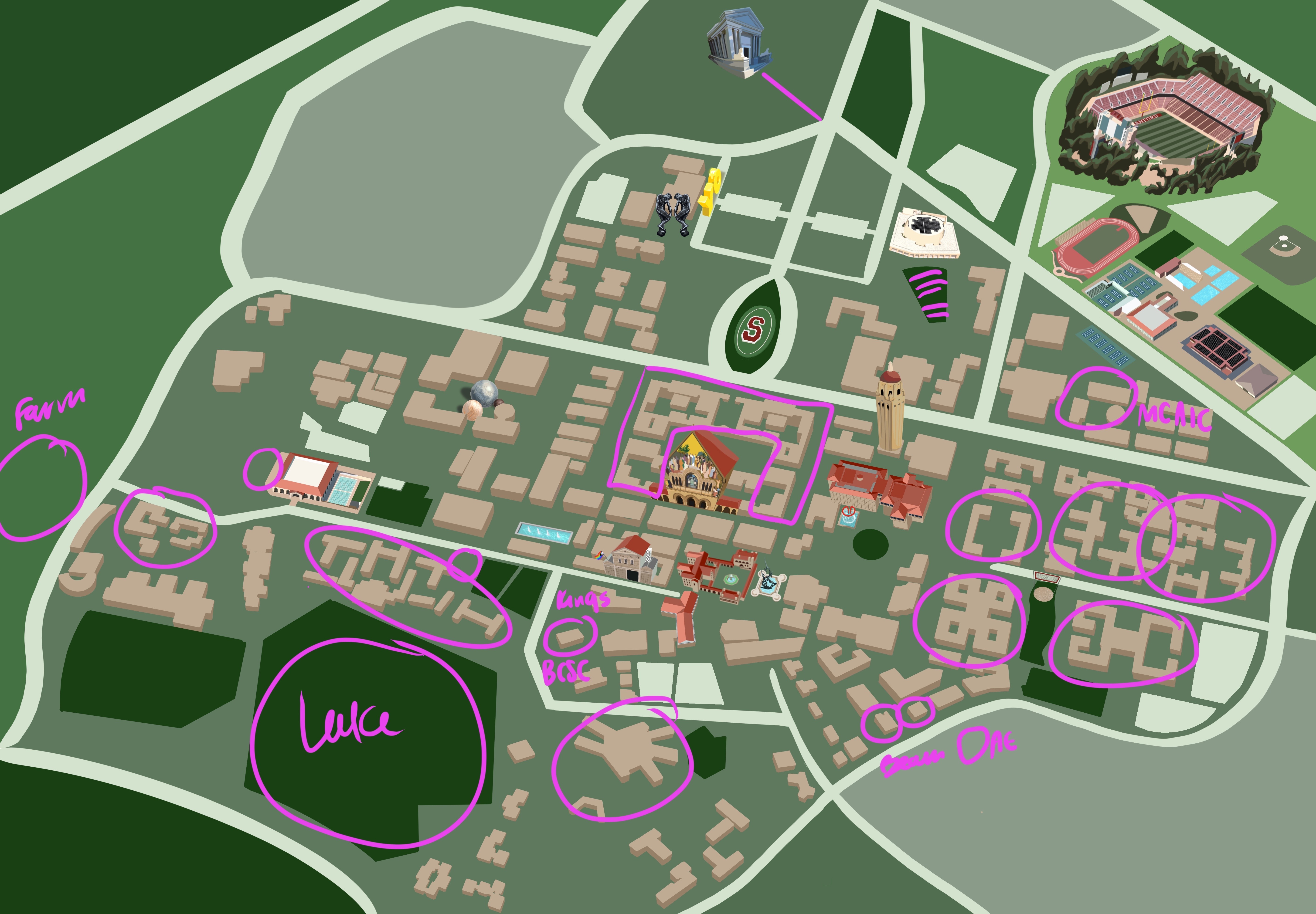
From there, I continued to add more buildings: I color-coded the Undergraduate Dormitory buildings as they aligned with the ResX neighborhood system, added other buildings that are relevant to the Undergraduate student experience, ranging from the Bechtel International Center to the Black Community Services Center to the Haas Center for Public Service. The map evolved to feature increasing numbers of buildings that were not a part of the Scavenger Hunt, as they were buildings that students should have been familiarized with.
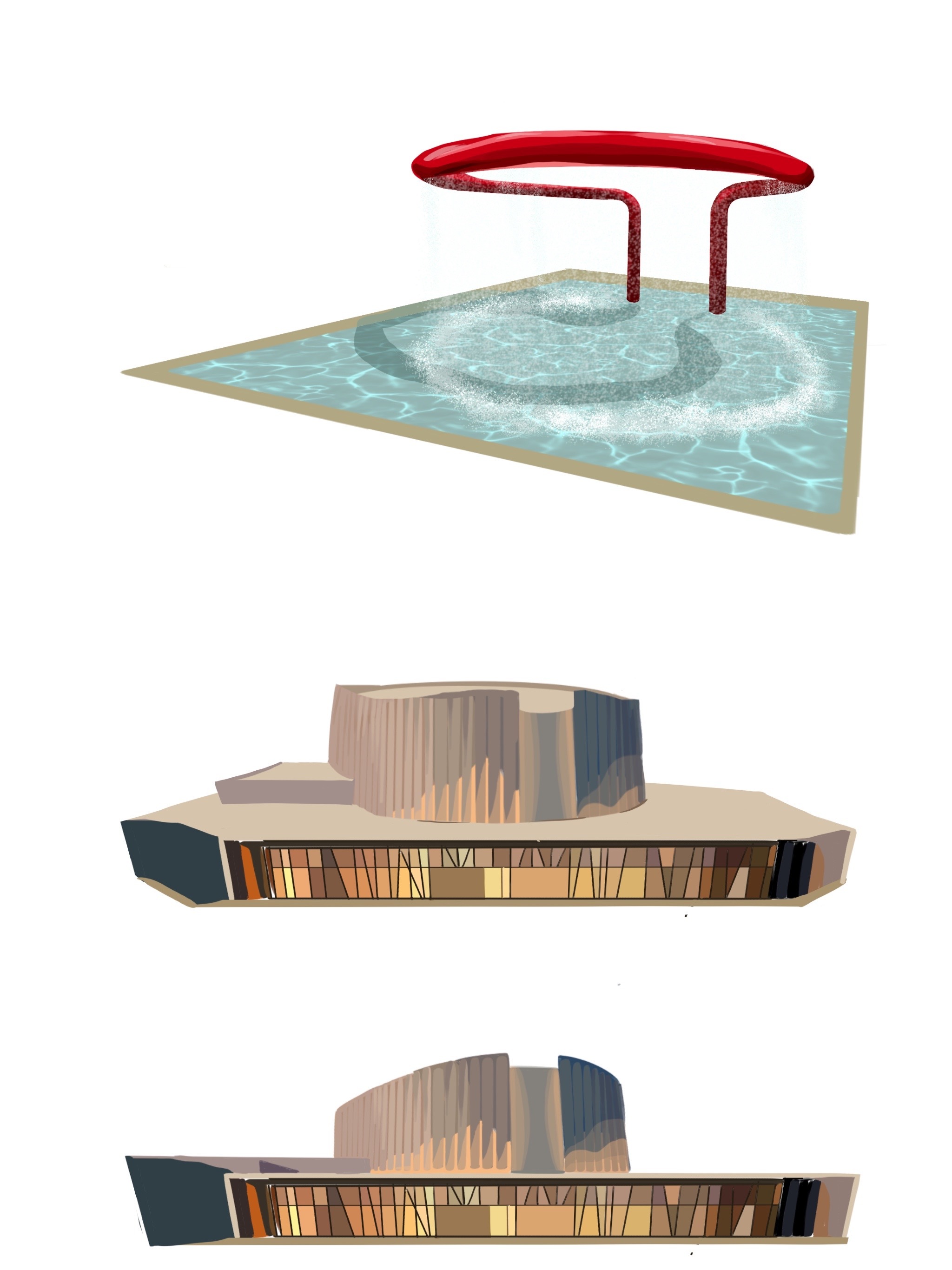
All of the final landmarks/buildings featured on the Campus map
From there, I overlaid the landmark icons on top of the map base, and included a left-hand margin that listed different locations around campus, complete with index numbers that indicated their position on the map. Furthermore, the map features the Stanford Land Acknowledgement, which is as follows:
We recognize that Stanford sits on the ancestral land of the Muwekma Ohlone Tribe. This land was and continues to be of great importance to the Ohlone people. Consistent with our values of community and inclusion, we have a responsibility to acknowledge, honor and make visible the university’s relationship to Native peoples.
Stanford Land Acknowledgement
The finalized version of the Campus Map!
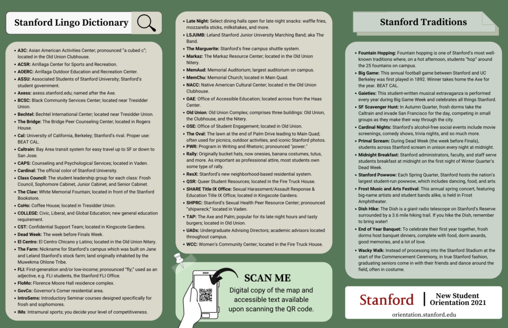
As the front of the map was nearing completion, my NSO coworkers assisted me in the development of the back of the campus map, which was complete with a Stanford Lingo Dictionary, a list of Stanford traditions, and a QR code that would give students access to the digital copy of the map as well as the accessible text.
The backside of the Campus Map
Once the frontside and the backside of the map were completed, we printed 3200+ copies of the campus map on glossy, 11in x 17in paper, and distributed them constantly throughout the week of NSO and even after the program was over.
During the summer of 2021, I worked full-time throughout the summer as an Orientation Coordinator for Stanford University’s New Student Orientation. Following the COVID-impacted academic year of 2020–during which many students opted to take a leave of absence–Stanford was ready to welcome its largest cohort in history: the Class of 2025, which consists of 2200 Undergraduate students.
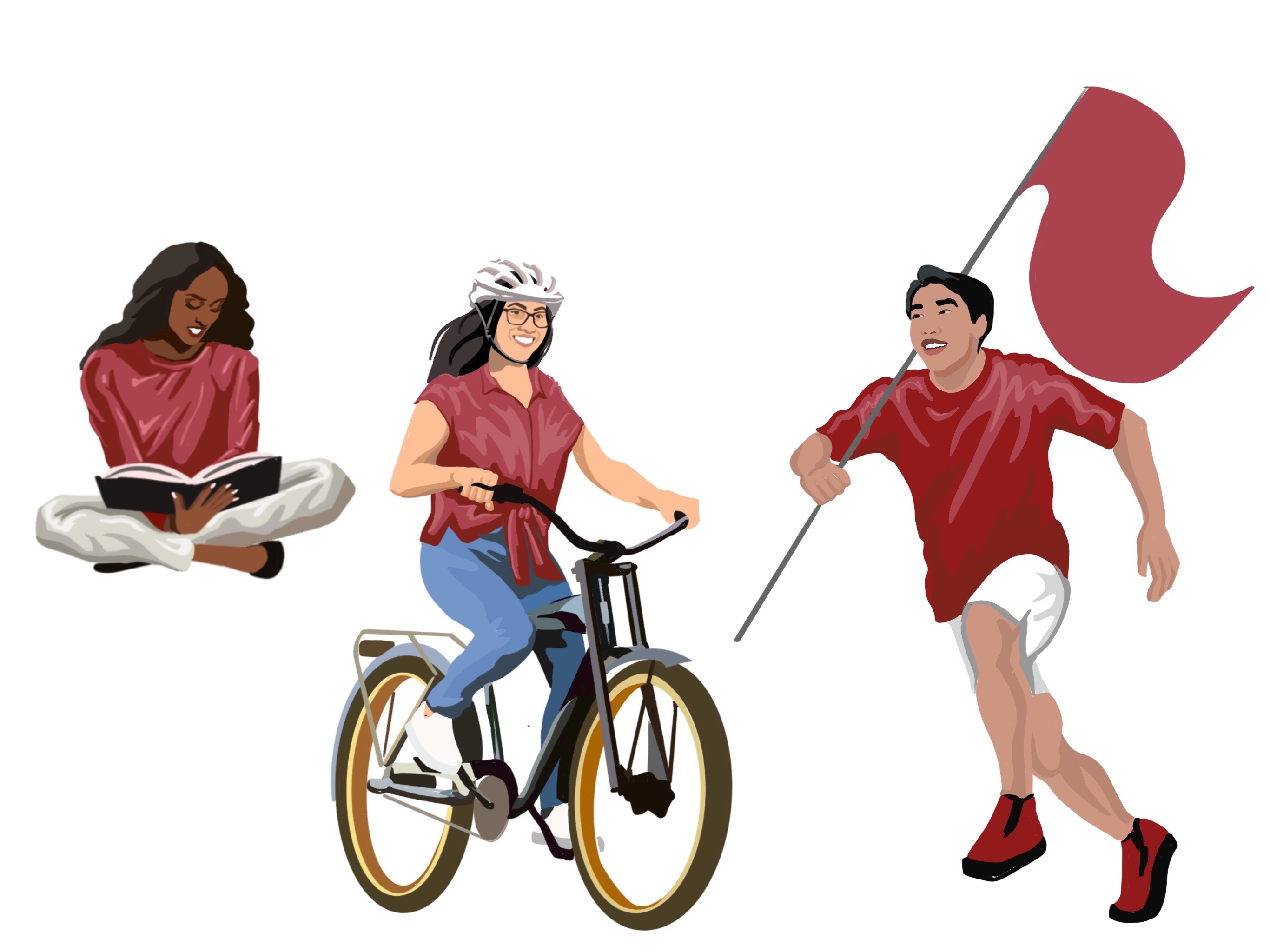
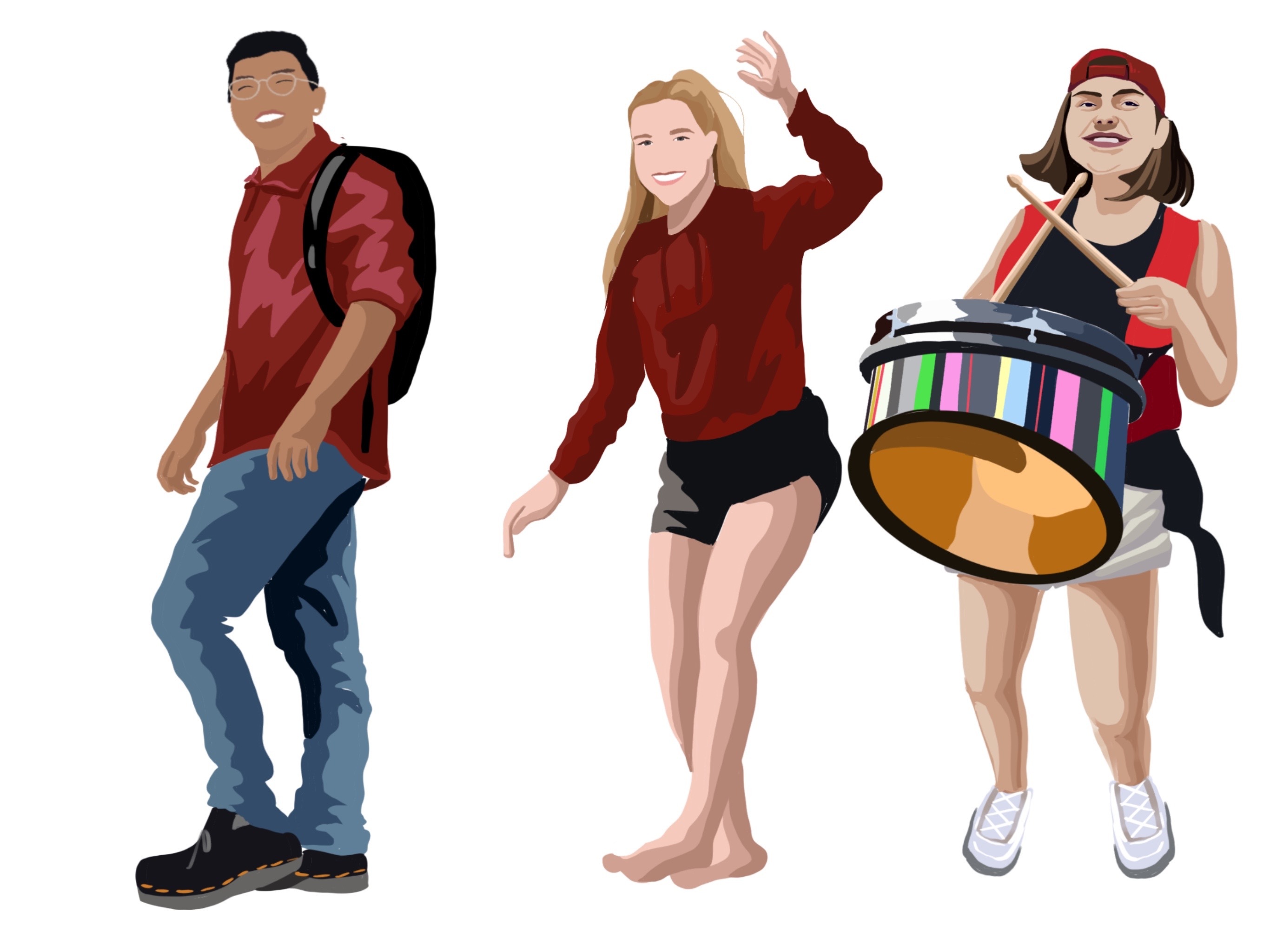
The New Student Orientation (NSO) team consisted of 6 Undergraduate students, who shared the tasks of outreaching to new students, planning numerous high-profile events throughout the week of NSO, and contributing to the blog that shared . However, with experience in Graphic Design, I–along with one of my coworkers–was assigned the responsibilities of graphic design. Below are some of the finalized digital art I have created, primarily using Procreate, Adobe Illustrator, and Canva.
Logo Design
I used Procreate to create the logo image that would ultimately adorn all of the team’s social media posts and become the NSO Instagram Profile Picture. I wanted to capture the essence of New Student Orientation as a pathway introducing New Students to the Stanford Community, all while adhering to Stanford’s Identity Guidelines–a strict set of procedures to follow whenever designing or using Stanford branded paraphernalia. I had to ensure that I was using the correct, approved colors all while establishing a clean, hand-drawn appearance to the logo design. After many, many different design iterations, I landed upon the logo design that features a silhouette of Hoover Tower and the rolling hills that rest beyond Stanford’s many acres of land.
Shirt Design
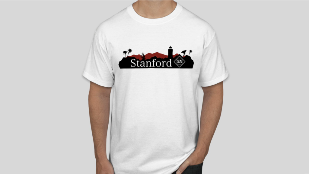
During my time working with NSO, I designed numerous designs that would be displayed on shirts worn by new students and staff alike. The primary shirt design that I want to highlight is the design that I created for the Class of 2025 t-shirt. I was partnering with the Stanford Alumni Alumni Association, who were sponsoring the production of the t-shirt, and I was heavily involved in the thorough discussion concerning the feedback to apply to my shirt designs.
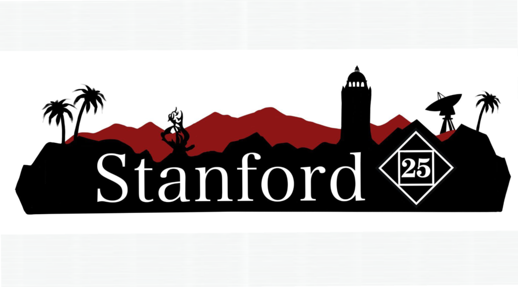
The final design features the silhouette of Stanford’s skyline, complete with the palm trees of Palm Drive, Hoover Tower, White Memorial Fountain, and the Stanford Dish.
In the process of designing the t-shirt, I started the design process by creating drawings in Procreate, the digital art software application built for the iPad. However, in printing these t-shirts, I converted these designs into .EPS files in Adobe Illustrator. I did this to vectorize these images via the Image Trace function, so that the photo resolution of the design would be preserved if the file size were to be increased.
The Stanford Scavenger Hunt Campus Map
In order to introduce new students to Stanford in a post-virtual-learning environment, one of my NSO coworkers and I spearheaded the charge to establish a campus-wide Scavenger Hunt where students can, either alone or with their friends, explore the key aspects of Stanford on their own terms.
In designing the Scavenger Hunt, we placed 28 signs all around campus, each bearing a QR code that led participants to a slide that provided a fun fact about each Scavenger Hunt location. In order to increase accessibility of the Scavenger Hunt, each QR code also led to an accessible version of a campus map, as well as an audio recording of each of the Orientation Coordinators describing the fun fact about the location.
The audio recording increased accessibility of the Scavenger Hunt for students who are visually impaired, and also allowed students to have a semblance of an in-person campus tour during the time of Social Distancing.
Furthermore, I wanted to design a campus map, not unlike that of a Disneyland Map, to accompany the Scavenger Hunt. To view further details, check out this link here.
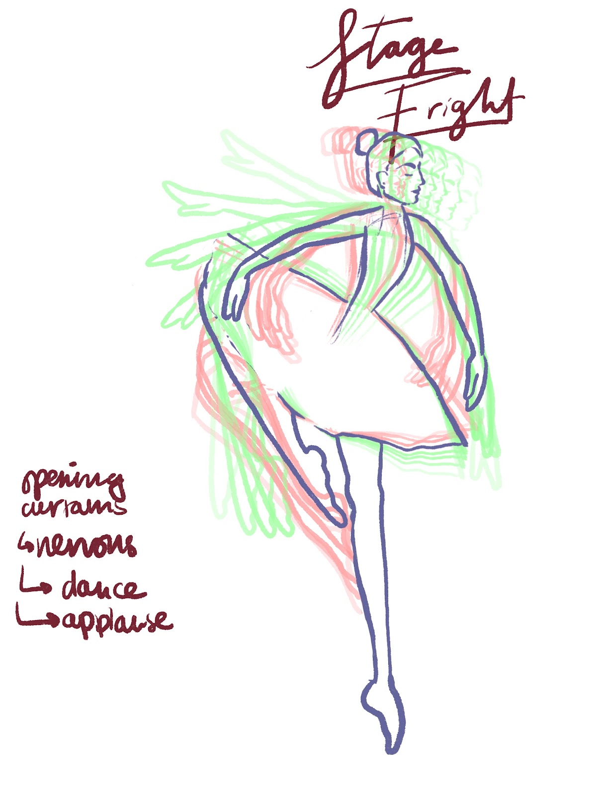
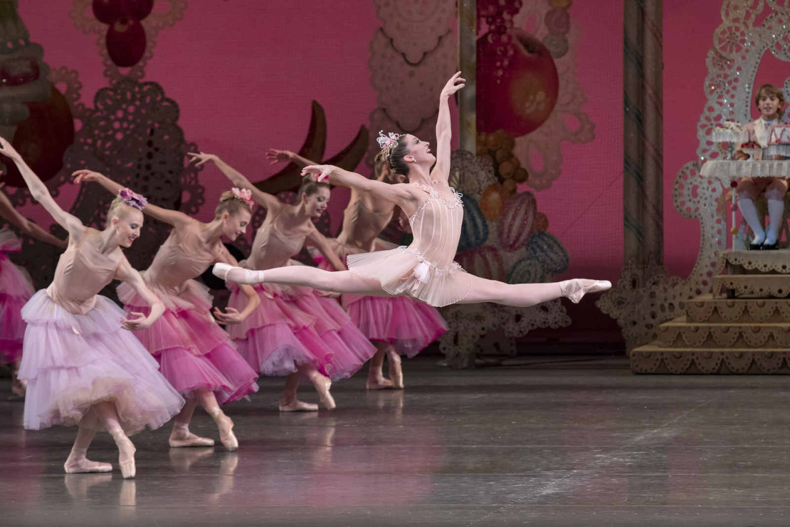
Similarly to my morph animation, Midnight by the Lake, this piece Stage Fright was heavily inspired by the 2010 film Black Swan, but the film definitely had less of a direct influence. I wanted to follow the theme of The Black Swan and continue through the animations of dance and movement in my final project. Animating dynamic, full-body movements have been difficult for me, so I was extremely interested in taking on this challenge. I started off by sketching simple ballet dance moves in a sequence and seeing if I could smoothly animate them frame by frame:
After I created a basic movement, I knew that I could continue. I made an animatic of different scenes I wanted to incorporate into my final animated film. I went a bit dark with the scenes in the storyboard, adding a scene where the dancer gets injured and bleeds all over the stage (inspired by Black Swan).
I wanted to use the song Waltz of the Flowers from Tchaikovsky’s The Nutcracker because I adore how the song has the qualities of any classical waltz, but the ending crescendo is one that swells so intensely where it has a touch of chaos that perfectly aligned with the concept of Stage Fright that I was going for: a kind of beautifully chaotic fear. My housemate is a ballet trained dancer, so I talked with her about ballet terms and key aspects of dancerly movement that would sell the image of a ballerina. In terms of the actual animation, I rotoscoped the movements of ballerina Ashley Bouder as she was the lead ballerina in the Waltz of the Flowers of George Balanchine’s The Nutcracker at the New York City ballet.
Following the rotoscoping stage, I imported a background and animated the dancer peeking through the curtains and even boil animated the title at the start of the film. I imported audio clips of audience applause and the song Waltz of the Flowers, and the film was completed. When I watched it over, I realized that the dancer’s movements timing could be improved a little bit, and the audience could be animated to have a little bit of movement when they are applauding the performance, to add another dimension.
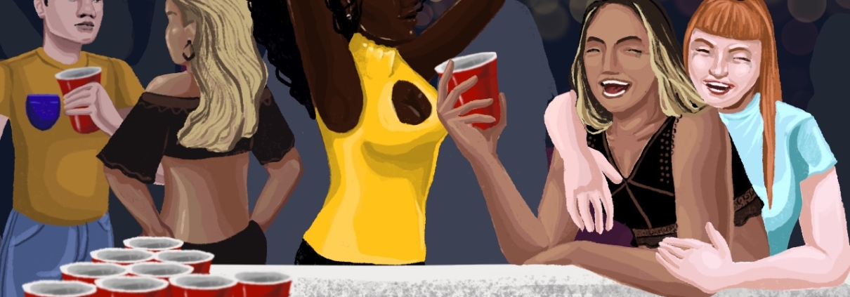
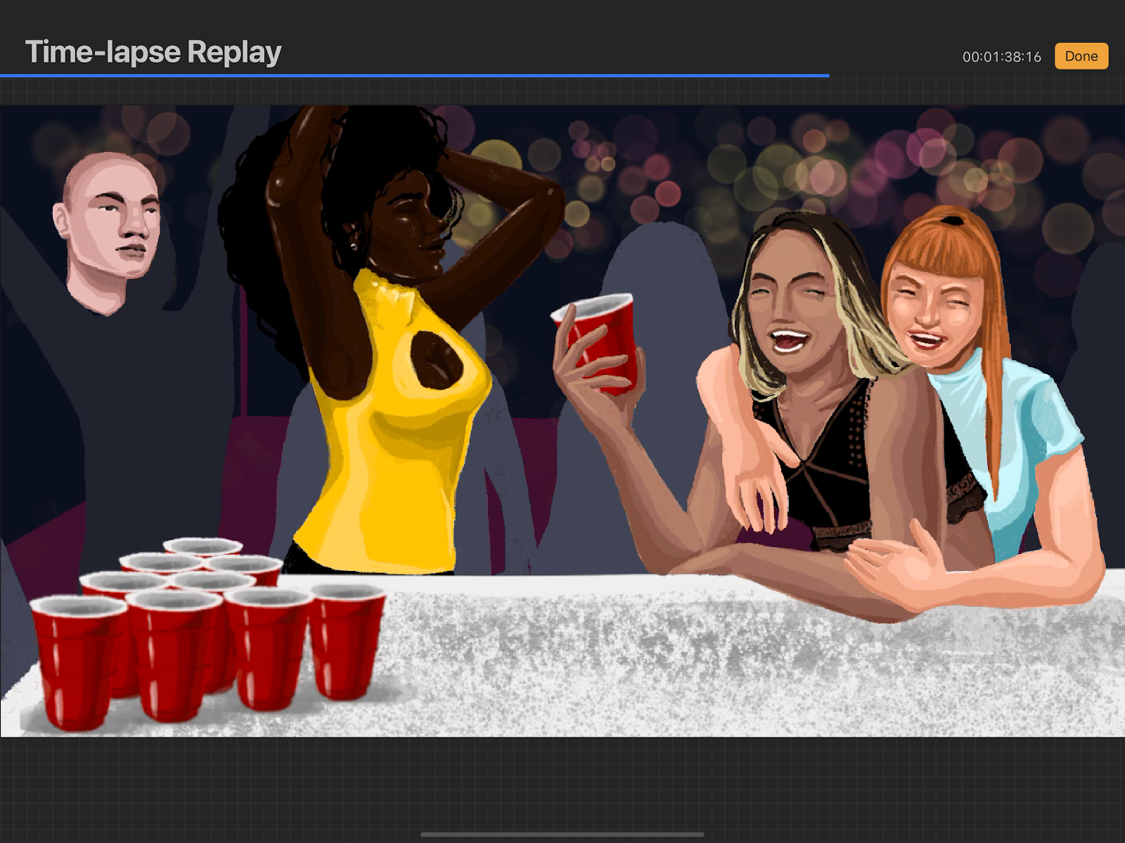
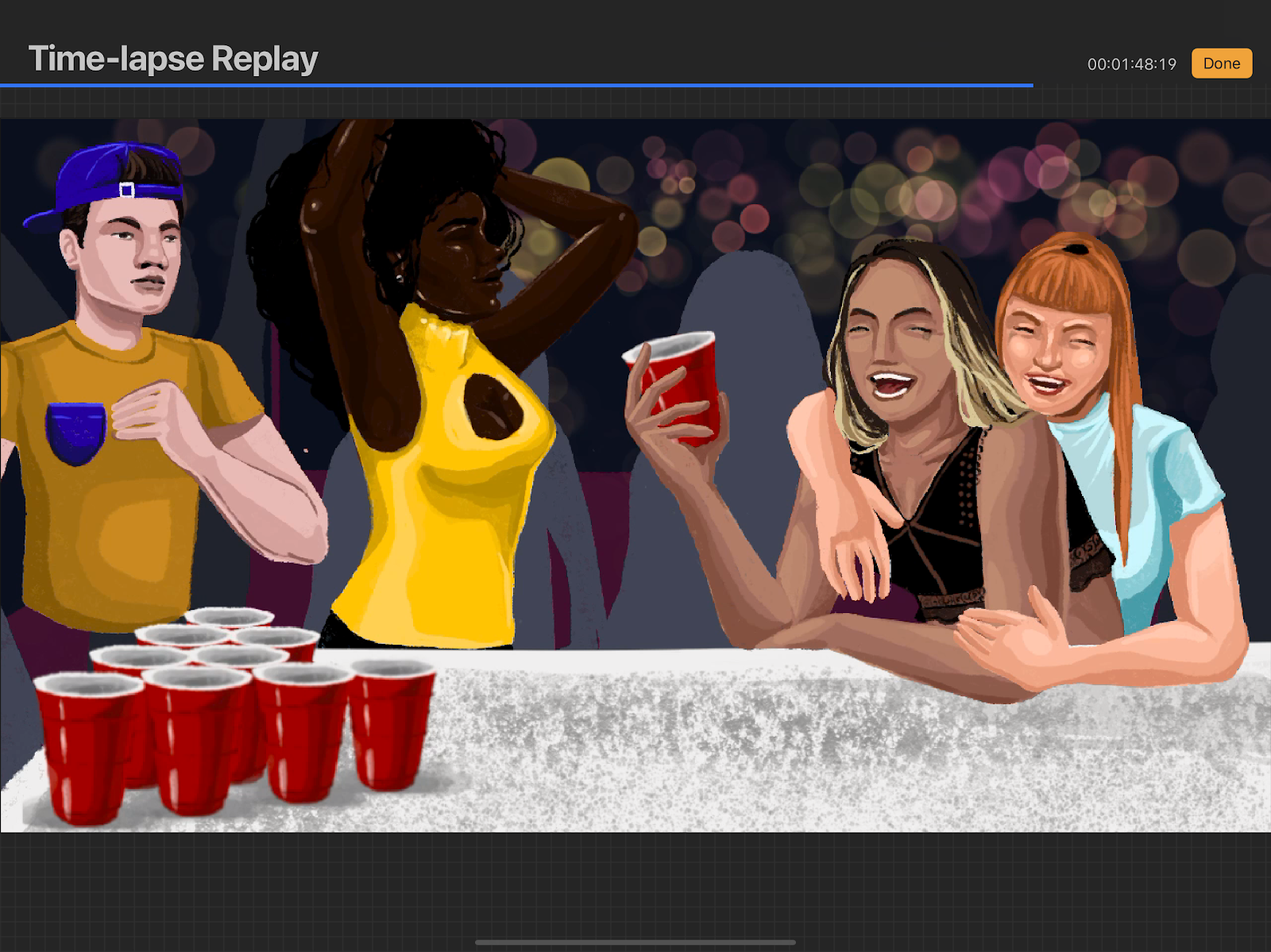
In the time of remote learning, we are deprived of in-person instruction but also in-person community. In this animation, I wanted to re-emulate the community and spirit of college outings with the bouncing path of a good old-fashioned game of Beer Pong. I created the background in Procreate, and imported it into Adobe Animate.
When I had showed some of my peers, I received mixed feedback. While people generally admired the level of detail–especially the splash as the ball enters into the cup, a number of my peers commented that the ball moved too slowly to be a ping pong ball. Following this feedback, I made numerous more versions of the animation as I increasingly sped up the movement of the ping pong ball.
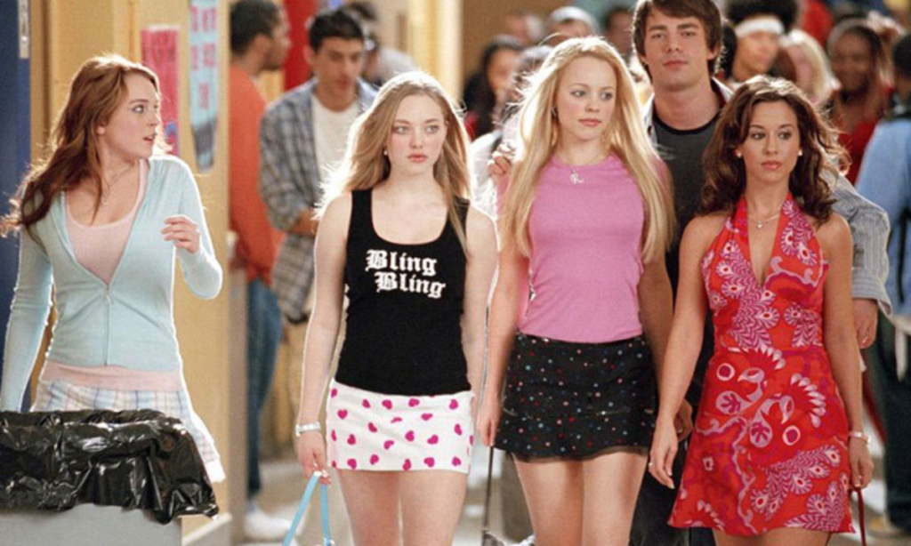
A lot of my pieces, especially those in my animated “series,” are influenced by pop culture and film. When I wanted to animate the steps of a figure walking across the screen, my initial instinct was to be inspired by the film, Mean Girls, with a puppet of the “Plastics” from the 2004 film walking across the screen through a mall.
However, as I was creating the puppet, I liked how much I could play with the proportions, with large breasts and long legs, almost playing up on the unrealistic body proportions of a Barbie doll. I changed the directions of my project, instead transforming it into my feminist project, Girl Lemme See You Walk (alternatively: Not Your Barbie Girl). I created the puppet figure in Adobe Animate, and imported a background in from Procreate.
https://brendenkoo.com/wp-content/uploads/2021/04/Screen-Shot-2021-04-24-at-11.30.27-PM.png9001442adminhttps://brendenkoo.com/wp-content/uploads/2023/10/BrendenLogo-1-300x138.pngadmin2021-04-24 23:31:082023-10-04 20:04:13Girl Lemme See You Walk, 2021
For another class, I had asked my friend, Kendall Ota, to film a short clip of her dissing my character and mocking our friendship, and she happily obliged. I decided to use this audio track–which I think is quite funny–as inspiration for this lip-synch video, which is very reminiscent of a catty high school drama scene. In creating this animation, I first designed the cartoon image of Kendall, and animated her blinks, her mouth movements, and her eyebrow movements on Adobe Animate. I then imported a background from Procreate.
During this process, I had the most amount of fun animating her facial expressions, and the way that her eyebrows raised and narrowed based on what she was saying. I exaggerated her movements, playing up the “mean girl” high school trope. My initial idea for this project was to animate a scene from the iconic 2004 film, Mean Girls, and this scene is actually heavily influenced by the scene where Regina George demonstrates her two-faced nature by complimenting another girl’s skirt to her face, but immediately insulting her as soon as she is out of earshot.
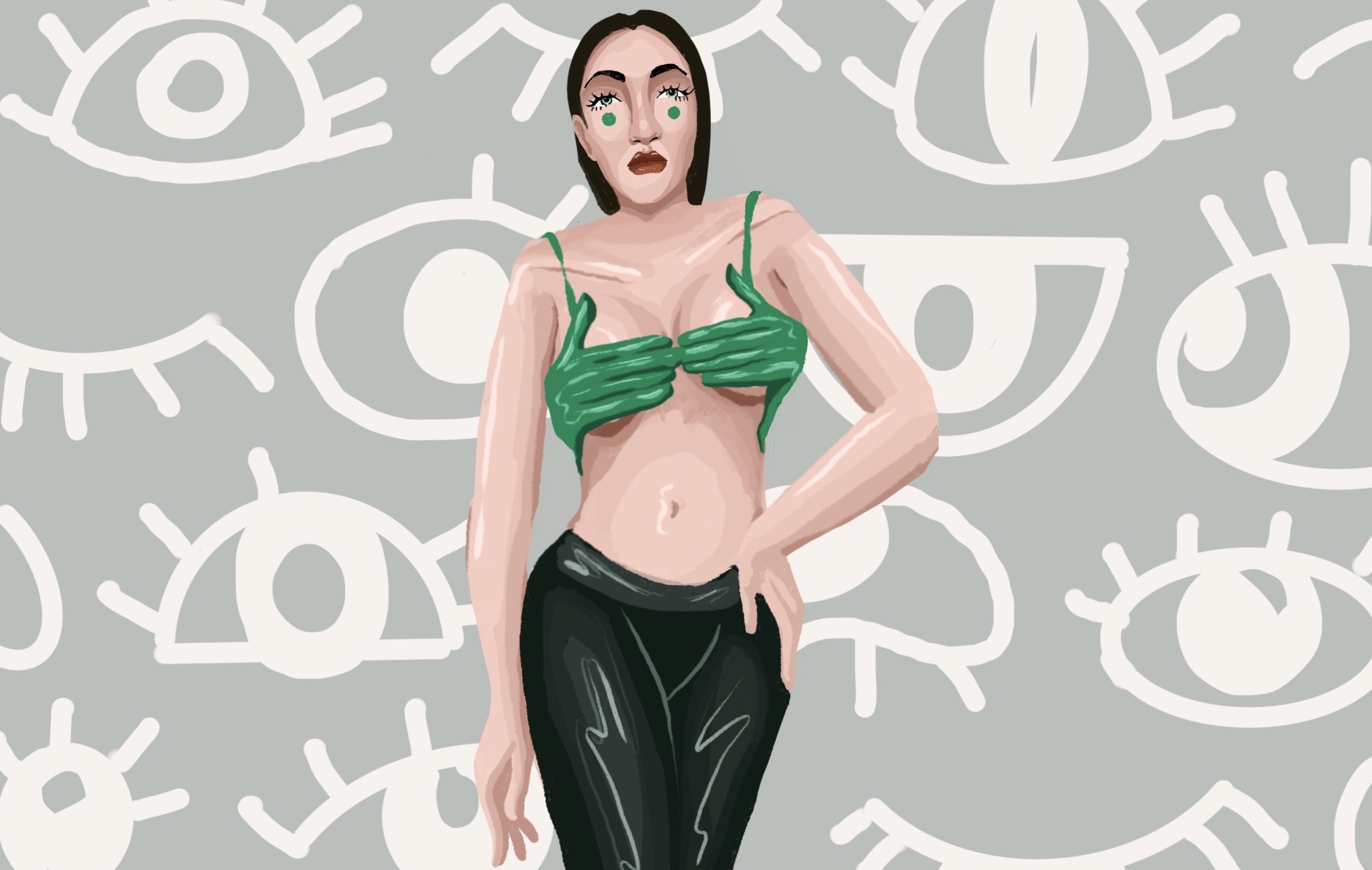
The piece speaks for itself: My Eyes Are Up Here. This loop animation adds another layer of depth to this retort; when the viewer zooms in closer to the breast of the figure, her top opens to reveal her unforgiving, disdainful stare. This piece really heavily utilizes imagery of eyes and is a play on the concept of the objectifying “male gaze,” throwing this concept back to the viewer of the piece.
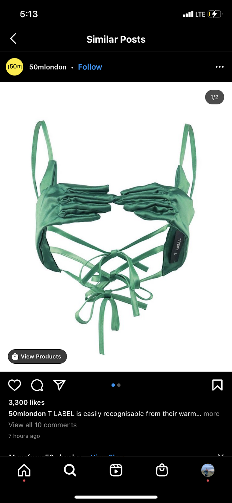
I was inspired by this top that I saw when I was scrolling on Instagram. This top resembled gloves that held the breast, and I thought it was an interesting choice, especially since it was both sexually empowering and censoring at the same time, almost suggesting something more sinister.
https://brendenkoo.com/wp-content/uploads/2021/04/49645D78-3D8B-4F0B-A549-B1E832DEA068_1_201_a-scaled.jpeg16242560adminhttps://brendenkoo.com/wp-content/uploads/2023/10/BrendenLogo-1-300x138.pngadmin2021-04-24 22:49:492023-10-04 20:04:37My Eyes Are Up Here, 2021
This animated piece is inspired by the 2010 Academy Award Winning film, Black Swan. This animation finds the intersection between the film and the classic Tchaikovsky ballet Swan Lake, juxtaposing the whimsy of the classical performance with the suspense of the psychological thriller.
The intention with this piece was to create a loop that would have the image completely transform into another and then back into the original image, all in one continuous video. Using Adobe Animate, I made the two different morphing styles different, with the figure transforming into the swan first by morphing, and then implementing a zoom technique to transform the swan back into the figure. The artistic choices of the animation: the direct eye contact with the viewer, the simple, blocks of color and almost minimalistic cartoonish style all highlight the dynamic transformation from person to animal and back to the person.
Additionally, the music is utilized in the video in an intentional manner, taking the song Les Danses des Cygnets from the original Swan Lake ballet. The song starts and stops in a manner so that it could loop with the video as well.
https://brendenkoo.com/wp-content/uploads/2021/04/Morph1018.jpg7201280adminhttps://brendenkoo.com/wp-content/uploads/2023/10/BrendenLogo-1-300x138.pngadmin2021-04-24 22:38:352023-10-04 20:04:51Midnight at the Lake, 2021
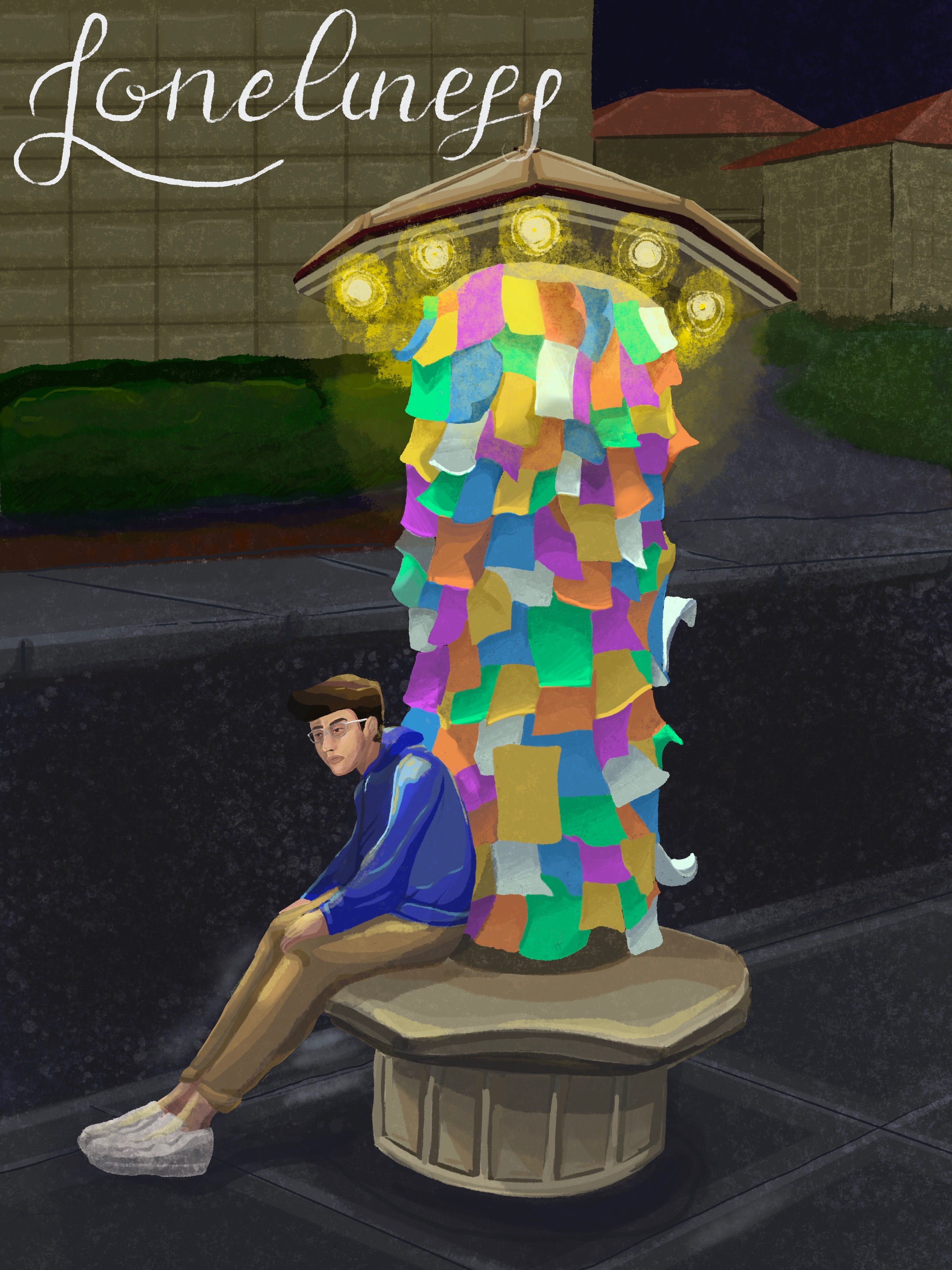
Inspired by a walk that I took in the middle of the night across the Stanford University campus. These flier posts stuck out in the darkness like small beacons, guiding me from one step to the next. But each step I took led me farther into the darkness, a void that was as consuming as death. But each step was also preventing me from being swallowed by the darkness behind me, as though there was a creature, a creature called loneliness following behind me.
But loneliness is not something to be avoided, it should be embraced. Because in our loneliness we begin to truly appreciate the world for what it is and we begin to understand ourselves beyond the people that we had so readily accepted that society was turning us into. Loneliness allows us to just sit.
and think.
And be.
The piece was created on procreate with the animation being rendered via a frame-by-frame animation.
Created in the Halloween Season and inspired by Ryan Murphy’s announcement of season 10 of American Horror Story, I used Procreate to create an animation of a transformation between two classic opposites: the angel and the devil. I refrained from using cliches in each scenario, emphasizing the nuances of bold color in regards to the polarity of good and evil–good is often brighter and more innocent, evil is more seductive and entrancing. The transformation was created via a frame-by-frame animation where I changed each layer individually.
I was heavily inspired by the promo poster for American Horror Story: Apocalypse.
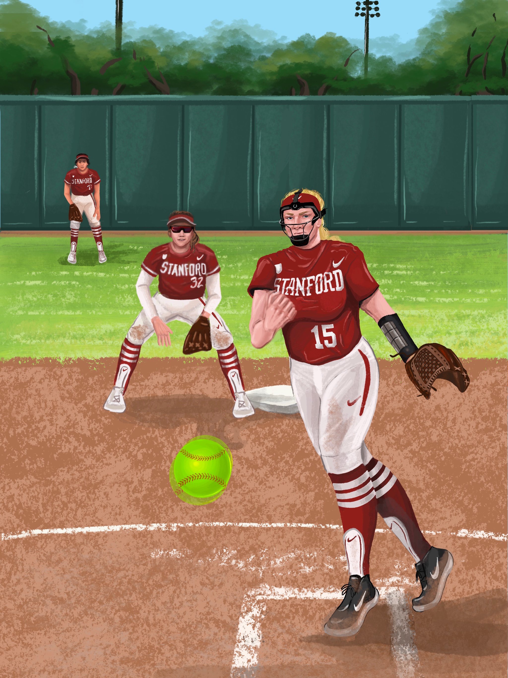
Inspired by the tenacity of three of my closest friends, whose dedication and passion to their sport have inspired me everyday to be the best person I can be.
Alana Vawter, #15 Sydney Steele, #32 Kaitlyn Lim, #21
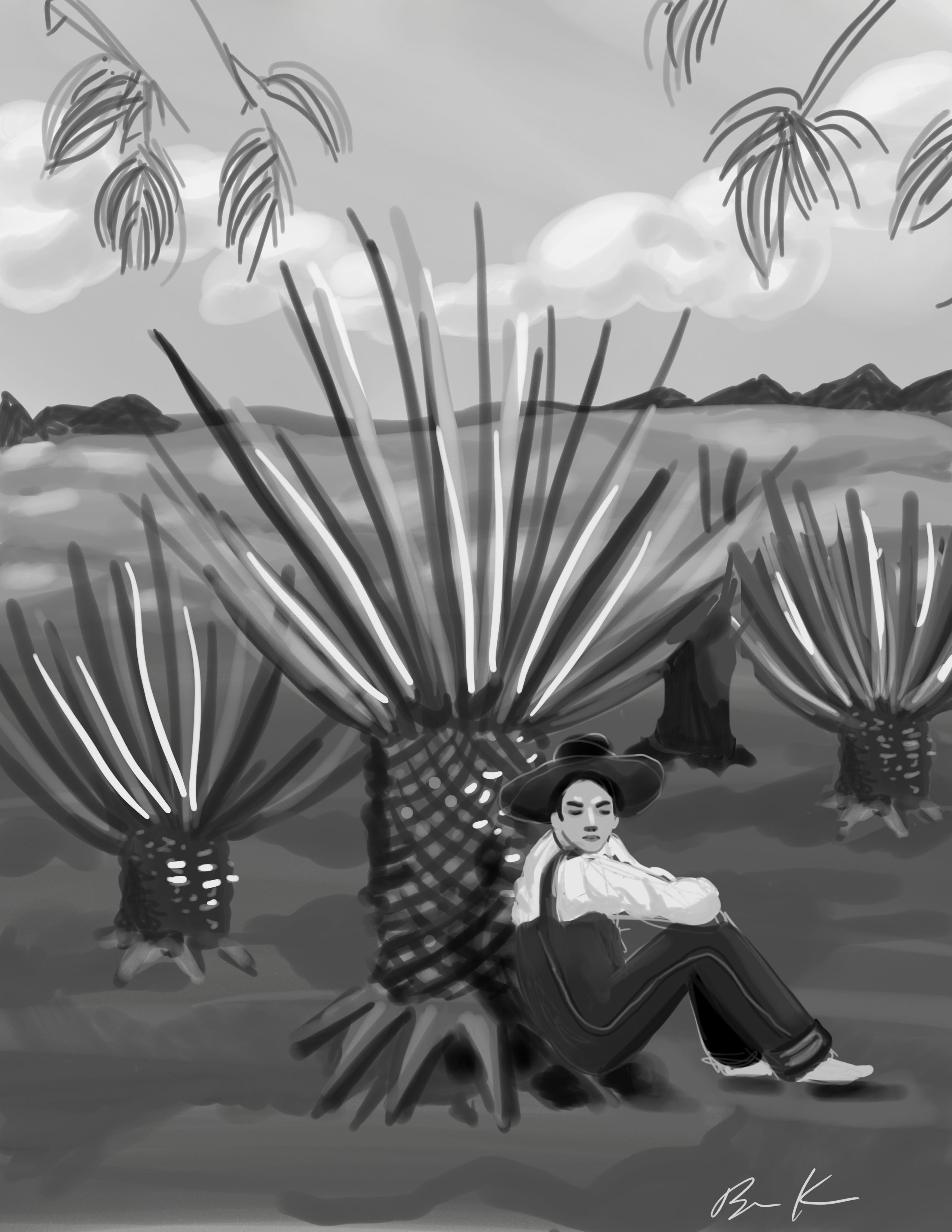
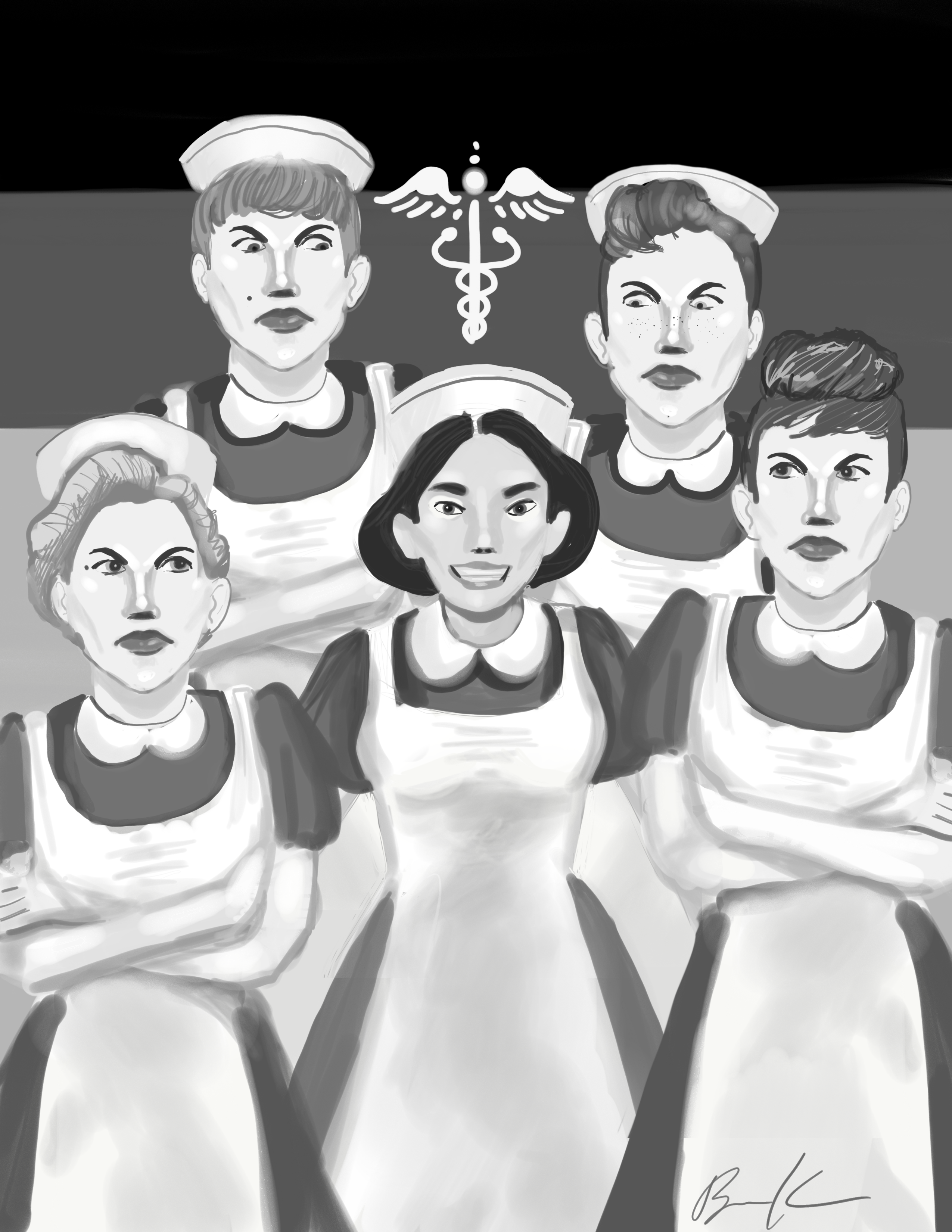
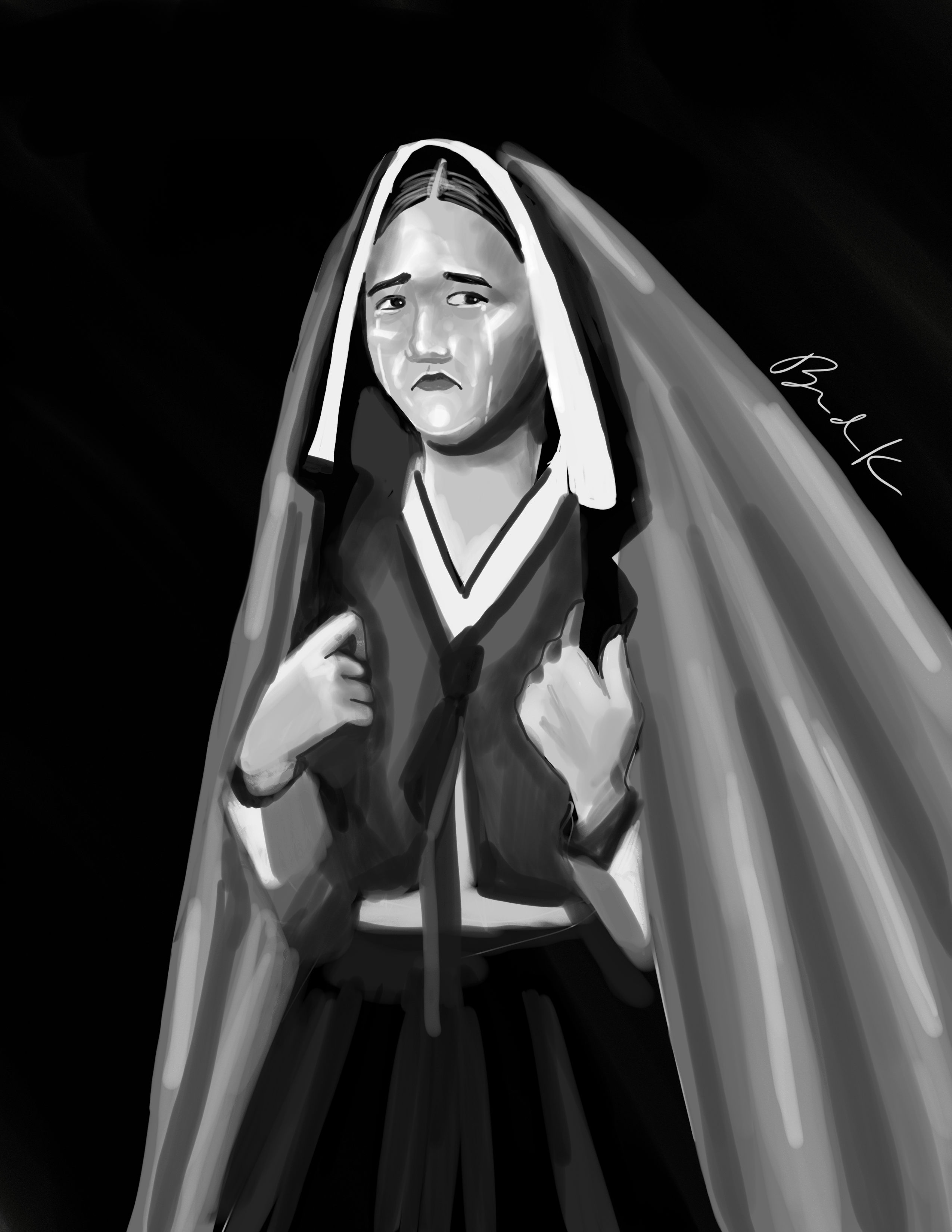
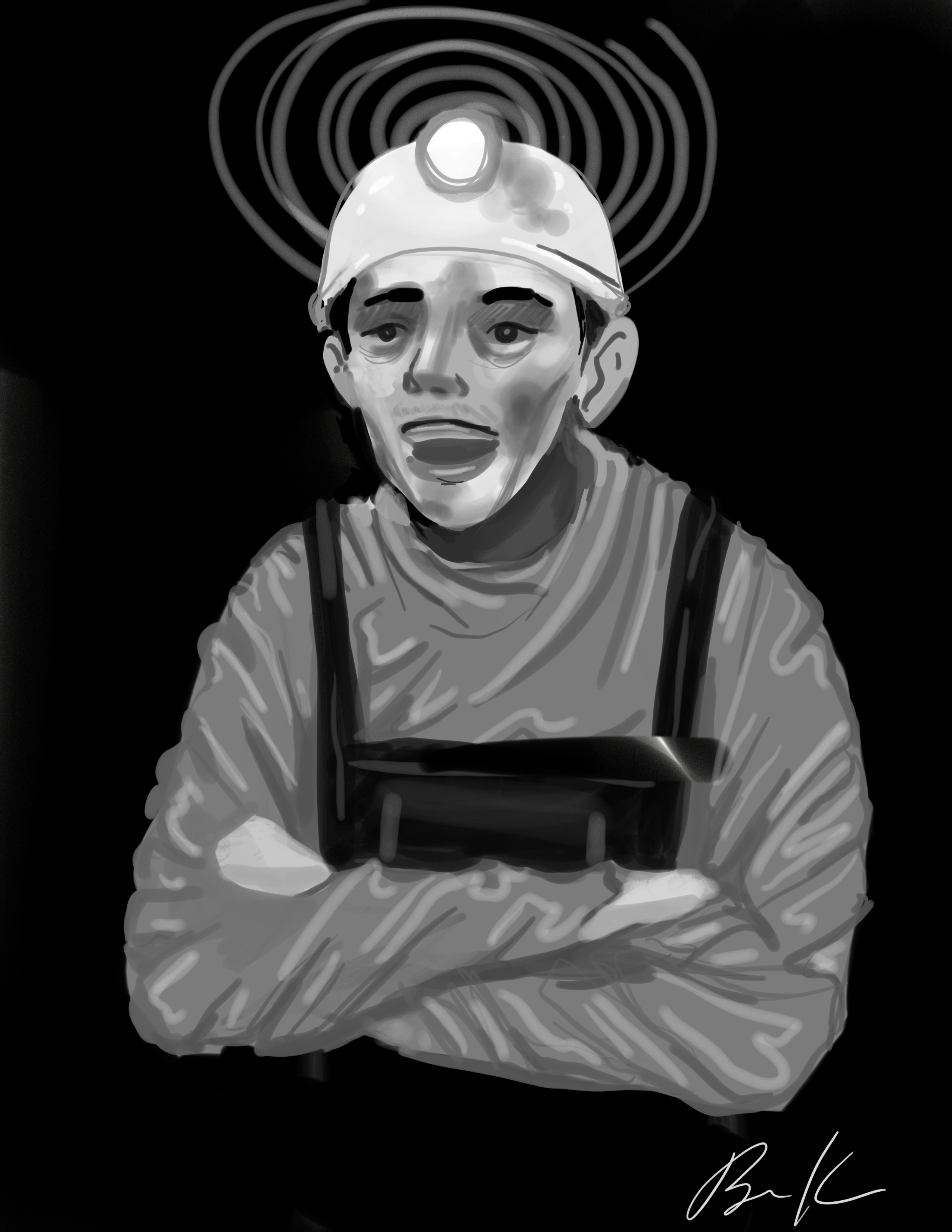
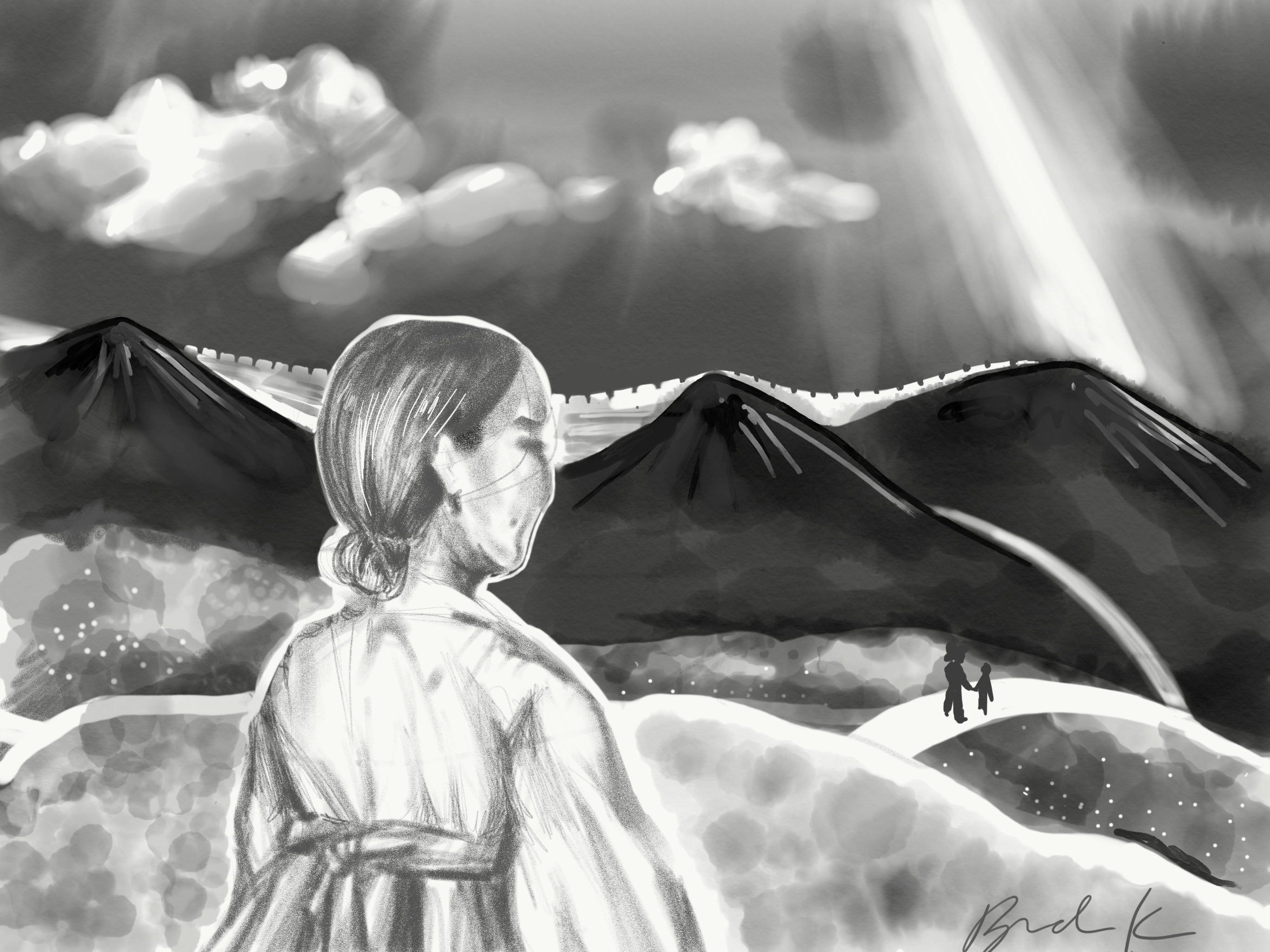
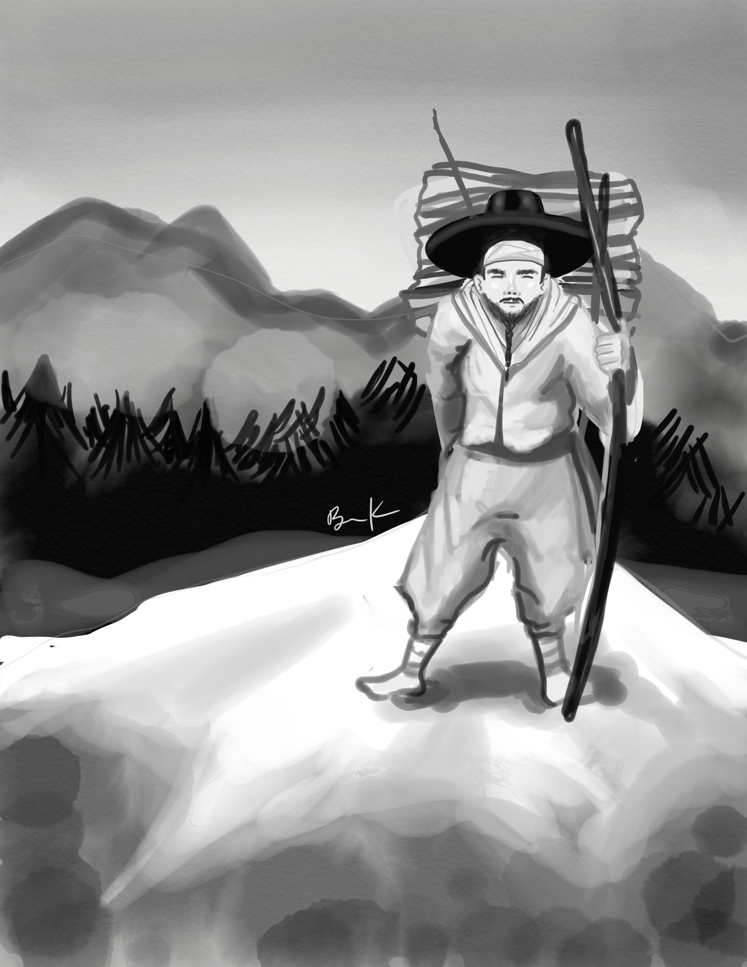
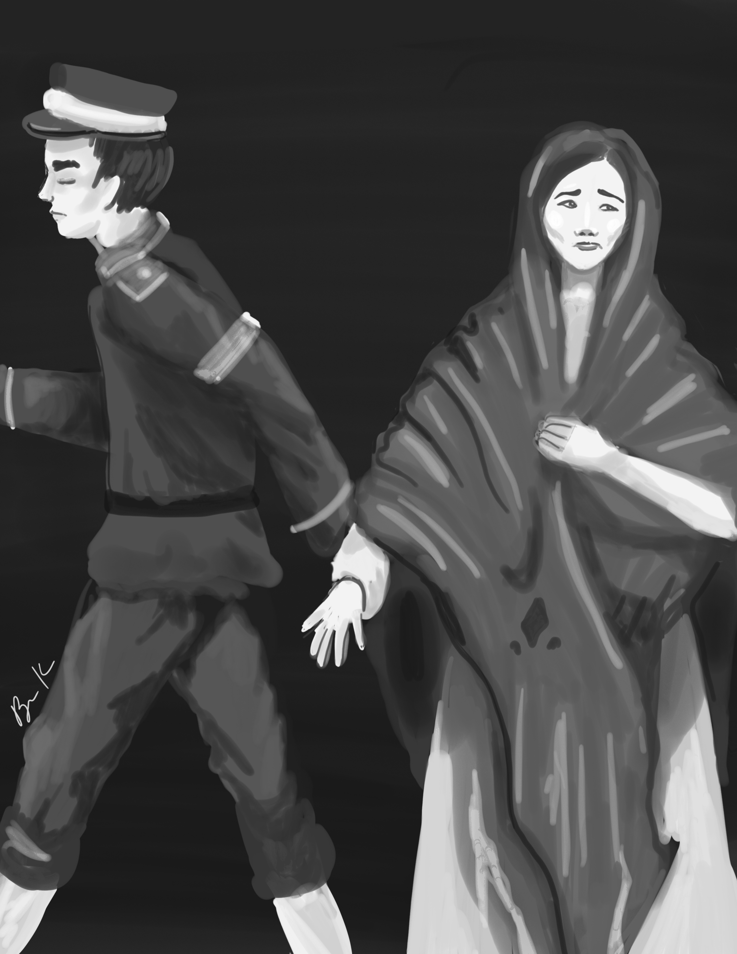
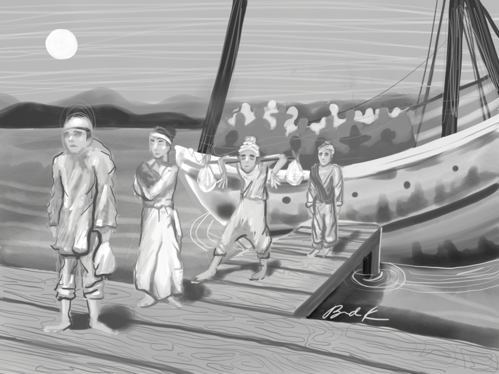
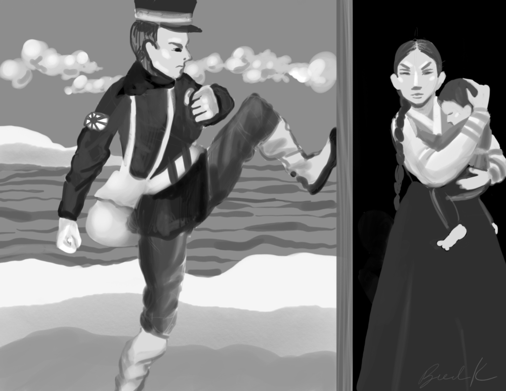
Japanese soldier leads a Korean woman as she fights to provide for her family as a comfort woman. Korean man traveling to Russia to find new work. Koreans seeking a new life disembark a ship that traveled from Korea to Cuba. Disheartened Korean woman watches her brothers travel to China in search of work following the Japanese occupation. Korean man content with his position in the mines that allows him to provide for his family. Korean woman wearing a traditional head-covering expresses her sadness at the departure of her family. Korean woman finds work in Germany as a nurse, much to the chagrin of the German workers who believe she is taking away their job opportunities. Depiction of the changes that can occur to a Korean man working abroad Korean sugarcane worker in Hawaii. Korean worker resting against a henequen plant that he harvests in Mexico. Japanese soldier kicks down a door of a Korean home during Japanese occupation. Korean man excitedly waves the Korean flag following the Japanese evacuation.