Although I wish to share my designs in their entirety, confidentiality agreements require me to block out all of the specific text and images, but I have done my best to maintain the design of the system I have worked on. If you have any further questions, please feel free to reach out.
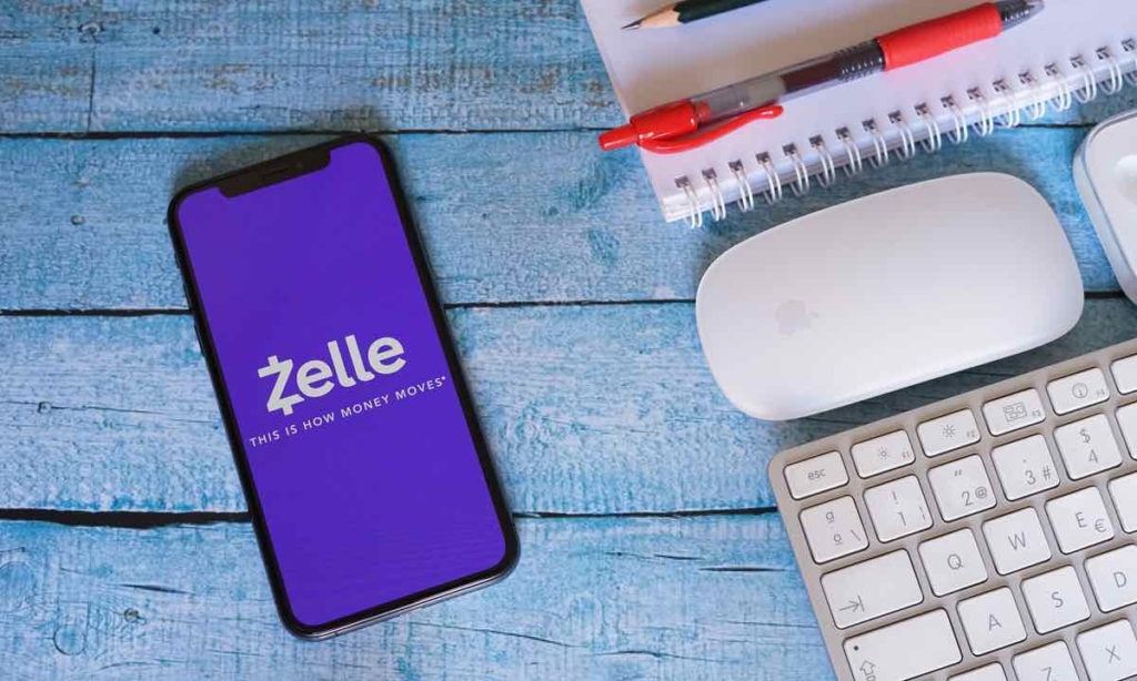
During the summer of 2022–from May to August, I worked as a Product Design intern for Zelle through Early Warning Services (EWS). I worked alongside a stellar team, comprised of EWS employees–Emily Tseng, Jonathan Carver, Megan Manley, Daphne Huang, and Sean Loosli–and Awasu, a design team of Craig Peters, Cara Adelmann, Varun Mehra, Eric Townsend, and Coco Ramgopal.
For one of our projects, we studied the user interfaces of other apps to develop a competitor matrix. After exploring other money transfer apps like Venmo, CashApp, and Paypal, we were able to create diagrams to pinpoint Zelle’s strengths and areas of improvement and identify a future trajectory for directions the system should move in.
Although the experience was remote due to COVID-19, I was nevertheless able to develop skills as a designer–I had the privilege of attending meetings with Early Warning Services executives and all-team Product meetings. I was even able to commute to work at the San Francisco meetings, participating in a design conference where the team flew in from different areas of the country to collaborate on our main project. Since Zelle is owned by the seven largest banks in America, we wanted to streamline the communication between Zelle and the banks that implemented the money transfer system within their respective mobile apps. The existing platform, also known as the dFIUX–or digital Financial Institution User Experience Guide–was experiencing numerous bugs and existed on a static content platform, meaning that any changes to the screens would require a complete re-upload of the screens into the system. Due to a number of discrepancies in the communications between designers and engineers, we were tasked to create a novel way to communicate the requirements of the dFIUX to the designers.
We started by conducting user research interviews with employees at Morgan Stanley and JP Morgan, and compiled these interviews into POVs and How Might We Statements.
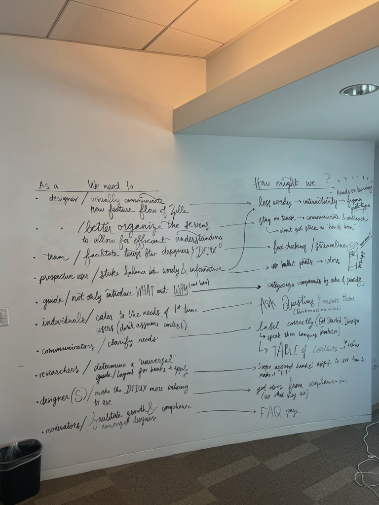
From the needfinding interviews, I determined that some notable pain points with the dFIUX were that the content was sometimes overwhelming due to wordiness and lack of engagement. There was also a desire for a clarification of requirements and needs and improved organization. Following the brainstorming sessions in the San Francisco office, we were then tasked with using Figma to develop a wireframe prototype for what this content management system would look like. Looking over my notes, I knew that I wanted to prioritize engagement and consistency as my design values when redesigning the dFIUX. I wanted to implement a text-to-audio feature within the system to allow people to engage with the content through their other senses, to reduce visual exhaustion and overwhelming amounts of visual text. I also wanted to condense the information into tabs to provide the designers with the content on a need-to-know basis, so that the user can have a better understanding of how to clearly navigate the guide. Most importantly, I wanted to see if I could gamify the dFIUX, not only to increase engagement but to also provide the content to the designers in an easily digestible manner.
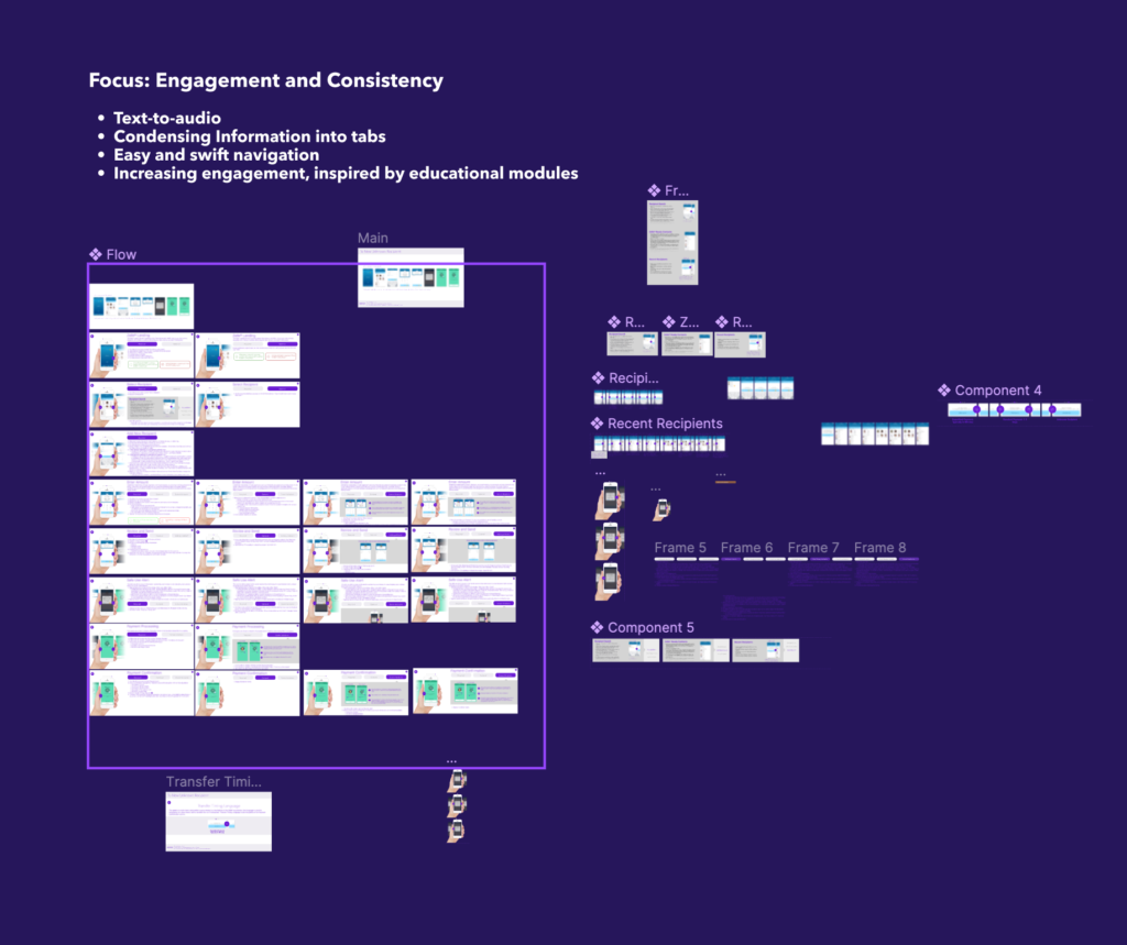
Although the text and images are blurred out in my interactive Figma prototype, you can still understand how to navigate between screens and pages within the dFIUX prototype. Here is a video of the prototype in action:
Here is the prototype in action: