During the summer of 2021, I worked full-time throughout the summer as an Orientation Coordinator for Stanford University’s New Student Orientation. Following the COVID-impacted academic year of 2020–during which many students opted to take a leave of absence–Stanford was ready to welcome its largest cohort in history: the Class of 2025, which consists of 2200 Undergraduate students.
The New Student Orientation (NSO) team consisted of 6 Undergraduate students, who shared the tasks of outreaching to new students, planning numerous high-profile events throughout the week of NSO, and contributing to the blog that shared . However, with experience in Graphic Design, I–along with one of my coworkers–was assigned the responsibilities of graphic design. Below are some of the finalized digital art I have created, primarily using Procreate, Adobe Illustrator, and Canva.
Logo Design

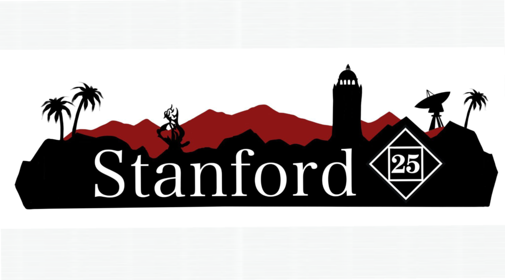
I used Procreate to create the logo image that would ultimately adorn all of the team’s social media posts and become the NSO Instagram Profile Picture. I wanted to capture the essence of New Student Orientation as a pathway introducing New Students to the Stanford Community, all while adhering to Stanford’s Identity Guidelines–a strict set of procedures to follow whenever designing or using Stanford branded paraphernalia. I had to ensure that I was using the correct, approved colors all while establishing a clean, hand-drawn appearance to the logo design. After many, many different design iterations, I landed upon the logo design that features a silhouette of Hoover Tower and the rolling hills that rest beyond Stanford’s many acres of land.
Shirt Design
During my time working with NSO, I designed numerous designs that would be displayed on shirts worn by new students and staff alike. The primary shirt design that I want to highlight is the design that I created for the Class of 2025 t-shirt. I was partnering with the Stanford Alumni Alumni Association, who were sponsoring the production of the t-shirt, and I was heavily involved in the thorough discussion concerning the feedback to apply to my shirt designs.
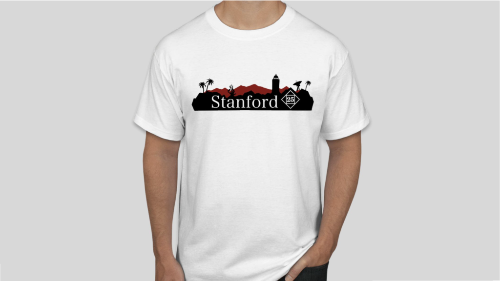
In the process of designing the t-shirt, I started the design process by creating drawings in Procreate, the digital art software application built for the iPad. However, in printing these t-shirts, I converted these designs into .EPS files in Adobe Illustrator. I did this to vectorize these images via the Image Trace function, so that the photo resolution of the design would be preserved if the file size were to be increased.
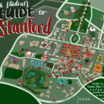
The Stanford Scavenger Hunt Campus Map
In order to introduce new students to Stanford in a post-virtual-learning environment, one of my NSO coworkers and I spearheaded the charge to establish a campus-wide Scavenger Hunt where students can, either alone or with their friends, explore the key aspects of Stanford on their own terms.
In designing the Scavenger Hunt, we placed 28 signs all around campus, each bearing a QR code that led participants to a slide that provided a fun fact about each Scavenger Hunt location. In order to increase accessibility of the Scavenger Hunt, each QR code also led to an accessible version of a campus map, as well as an audio recording of each of the Orientation Coordinators describing the fun fact about the location.
The audio recording increased accessibility of the Scavenger Hunt for students who are visually impaired, and also allowed students to have a semblance of an in-person campus tour during the time of Social Distancing.
Furthermore, I wanted to design a campus map, not unlike that of a Disneyland Map, to accompany the Scavenger Hunt. To view further details, check out this link here.